How to start screen design and 8 principles you should consider
Probably the most common question about UX is how to start screen design and what principles should we care about? Designing screens starts with sketching. We at our UX company start with quick paper sketches, then build wireframes and clickable prototypes, test and iterate them, and finally get to the pixel-perfect, detailed design plans. In this article, we present the 8 most important rules of thumb one needs to take into account when designing screens.
.png)
Eight basic principles of screen design:
- The three questions all screens need to give an answer to
- The importance of visual hierarchy
- The copy is part of the design
- Conventions are important, we should use them
- When designing for the mobile phone, we design for our hands, too
- Pay attention to the effective surface area ratio
- Aim at simplicity and transparency
- Be careful with animations and motion
Let’s have a look at these in more detail.
1. Three guiding questions of screen design
When we arrive at a new screen, we are looking for the answer to three questions:
- Where am I?
- What can I do here?
- How can I move forward?
After arriving at a new screen, we instinctively take a look around to see where we are. Many clues help answer this question.
For example, we may instantly see the logo of the page. Or, when we are moving between pages within one application, similar structures, and colors may reassure us that we are on the right track. If we click on a link, and the text of the link is echoed in the title on the next page, we know we have arrived at the right place. It is also usually highlighted in the menu which page the user is on.

The “Where am I?” question seems too simplistic, but in many applications, the users don’t get any feedback about what just happened.
Just like when moving around in real life, in digital space, they have to know what they reached at any given moment, what processes are going on or have ended. Applications which do not give continuous feedback about their status are very annoying to use.
After coming to understand where I am, the next question is what I can do on this screen. What content can I see? What functions can I use? If I do not get a clear answer to this question, I would rather step back and retreat from the interface. The more things one is able to do on a screen, the more difficult it is to understand what the given page is for.
Users usually find the answer to the third question (“How can I move forward?”) in a form of a call-to-action button. They don’t just ask this question having already played enough on the page and wanting to move forward – it’s useful at arrival, too, to see where we can go from there.

Most news pages get a passing grade on the three-question test. Let’s take a look at NBC. When we arrive at the page, we instantly see in the upper left corner that we landed on the page named NBC News. From the way the content is displayed on the page, we immediately realize we are on a news page. It becomes obvious we can move forward by clicking on the titles.
2. Visual hierarchy and user experience
Visual hierarchy is one of the most important parameters in screen design. We can rank the elements of a given screen according to how bold they are, how emphasized, and how easily we spot them.
This is what we call visual hierarchy. The bold and highlighted elements are at the top of the hierarchy, and the tiny stashed elements are at the bottom.
Visual hierarchy helps lead the eye. It determines what order we notice things. This is why it’s important to develop this hierarchy consciously. Thnk carefully about what the goal of a given page is, what the user wants to achieve, and what we want to call attention to. The previously introduced three questions can help you with this.
The illustration which follows is a very simple school example of visual hierarchy: we read the title in capital letters before we read the text in brackets.

The hierarchy also helps to understand. When our eyes run through a river of concise text, there is no chance we will understand what it is about. If, however, we scan through a text full of subtitles, we get an idea from them about the content.
How do we create a visual hierarchy?
Most beginner web designers are only concerned with emphasizing certain elements. And it’s even worse if they try to highlight too many elements.
Unfortunately, only one or two elements can be at the top of the hierarchy, and it is up to us which these elements will be. To make the right decision, we need to know what the most important goal of the screen is.
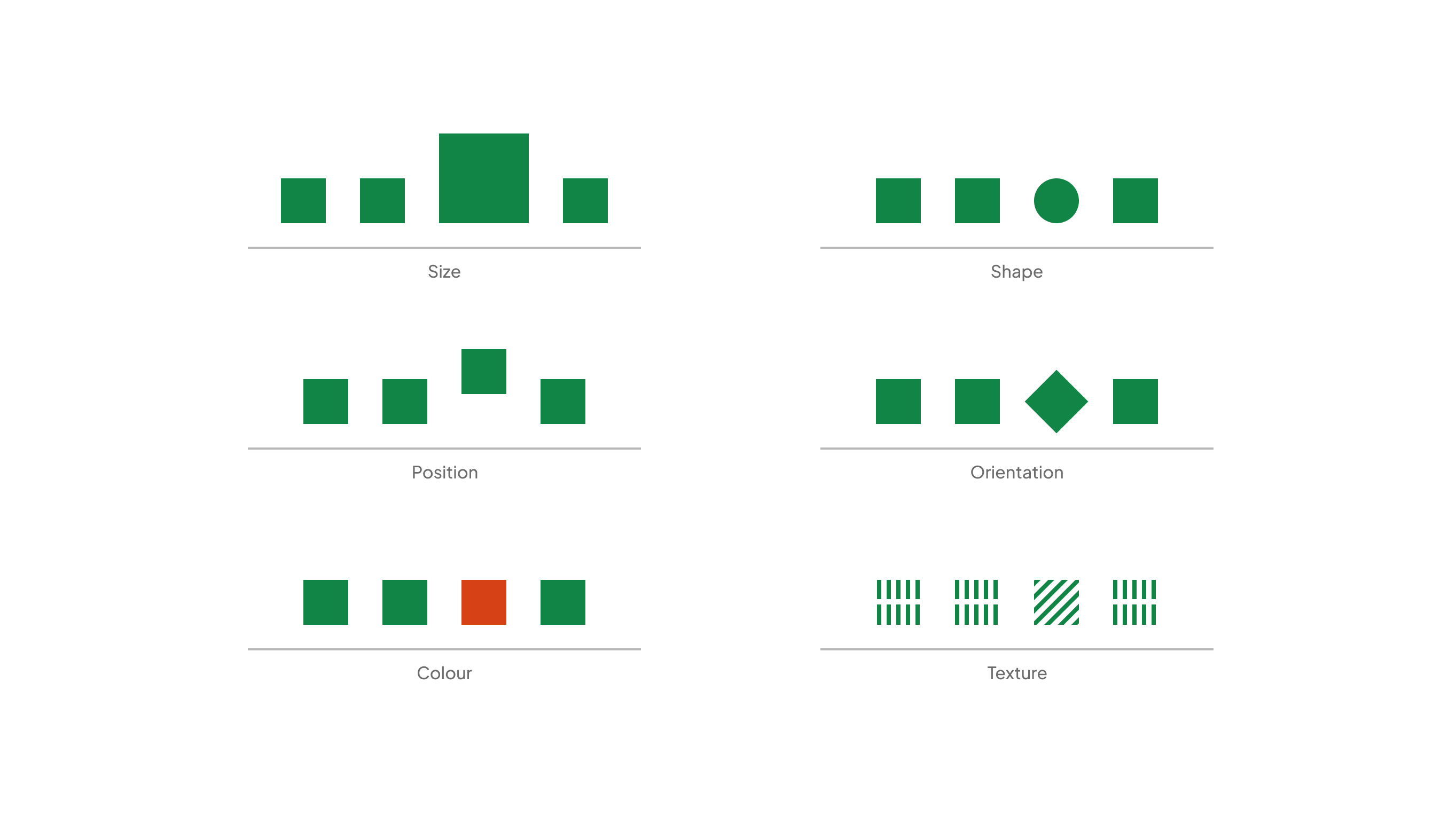
We can highlight certain elements like size, color, position, texture, form, and orientation.
Eye camera studies revealed precisely how we scan a page. When we arrive at a page, we browse through it twice from left to right at the top of the page, and then we scroll down.
This also shows that things in the upper left corner are more likely noticeable. Also, the left column and the part above the fold (accessible without scrolling) are more emphasized.
3. Copywriting is part of the design process
Many designers think writing is not in their job description, but this could not be further from the truth. Copywriting is part of the design.
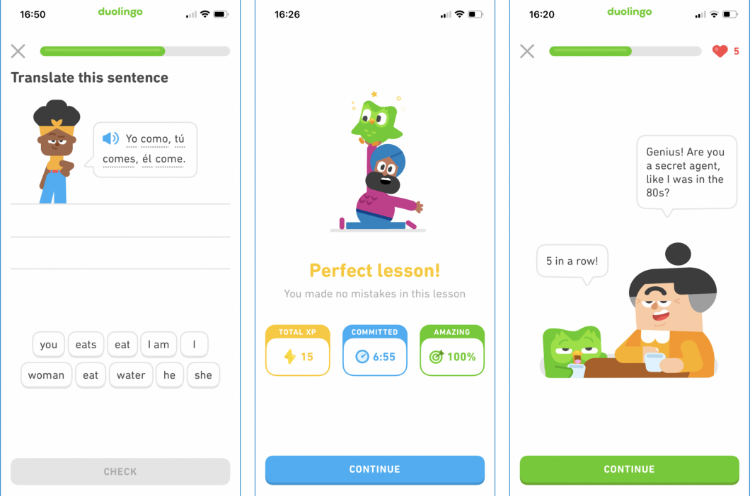
Sketching the copy
During the screen design process, the best method for writing is similar to the one in the case of drawing: we need to make sketches first. In other words, you should write down at least 6-8 versions of the copy.
If we are ready with that, we need to choose the best. It's worth spending time on formulating the text. The best results usually come out from melting the previous versions together.
You should make your colleagues read the copy as well, so you will discover if something is incomprehensible or weird. It also helps a lot if you read it out loud. The most important goal of the copy is to be comprehensible. And we can ensure this one way only: if we test it with real users. We will talk about this more in the chapter about research.
The next is to use the expressions people use during the tests. When doing interviews, we need to note the words used by our interviewees so that we can use their own words later in the product or marketing.

Microcopy – part of the screen design
We call the copy you can read on interfaces microcopy. It’s the text on a button, a tiny piece of instructions, or the label on a form field.
In our experience here at UX studio, you should avoid using terminology as much as possible (except when designing only for professionals). An informal tone is useful, but do not exaggerate and become cheesy. Well-written microcopy has a human touch. It gives the feeling that there’s an actual person on the other side. In short: it builds trust.
These principles of microcopy are relevant in any screen design scenario. The copy of a form should be encouraging. Assuring you that you don’t need much to finish the form.
Write error messages with empathy and solidarity. Be careful with being funny in a stressful situation, and never blame your users. There always has to be a sense of us all being in it together. And don’t forget to offer a solution.
Create a style guide
If there is more than one person writing a copy for the same product, you should create a short style guide that describes the tone of voice they should use. You can collect adjectives and list a few good and bad examples.
It’s also useful to search for other websites or blogs with the same tone of voice and read them frequently. When you have to write, you can hit them up to get in the mood. Granted, the copy also needs testing.
Microcopy is just a few words but with a huge impact. That’s why many people think UX writing is the new superpower.
4. Use conventions!
The web and the mobile world are the most recent achievements of humankind, but even during this short period of time, plenty of solutions were born, which the majority of apps use in general. These de facto standard solutions are called conventions.
Conventions for better user experience
Conventions in screen design are like this: “logo goes in the upper left corner”, “links should be in blue”, the “links should be underlined,” etc.
Most users are already used to these conventions. We use them because they shorten the learning curve. Solutions different from conventions usually get on people’s nerves.
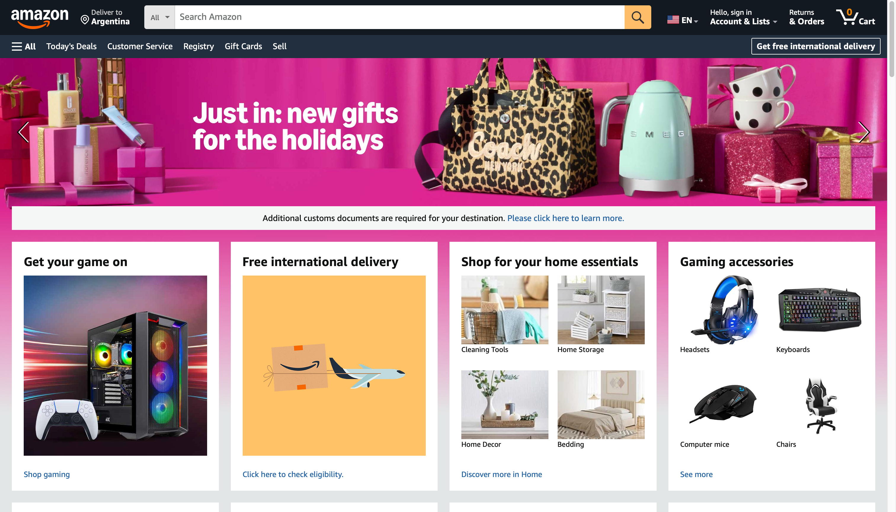
Innovation versus convention
People often ask if this contradicts innovation. The answer is simple. It is not the conventions you need to be innovative about. We don’t have to reinvent the wheel, and we don’t have to change proven, tested things. We should build new castles with these building blocks instead.
5. When designing for touch, we design for our hands (too)
When designing for touch screens, the most important parameter is our own hand, with which we are using the product. We can only design an easy-to-use interface if we take into account the size of our hands and how they function.
We especially have to pay attention to the size and movement of our fingers: what can we reach and when can we safely tap on certain buttons?
Can we safely tap on a button?
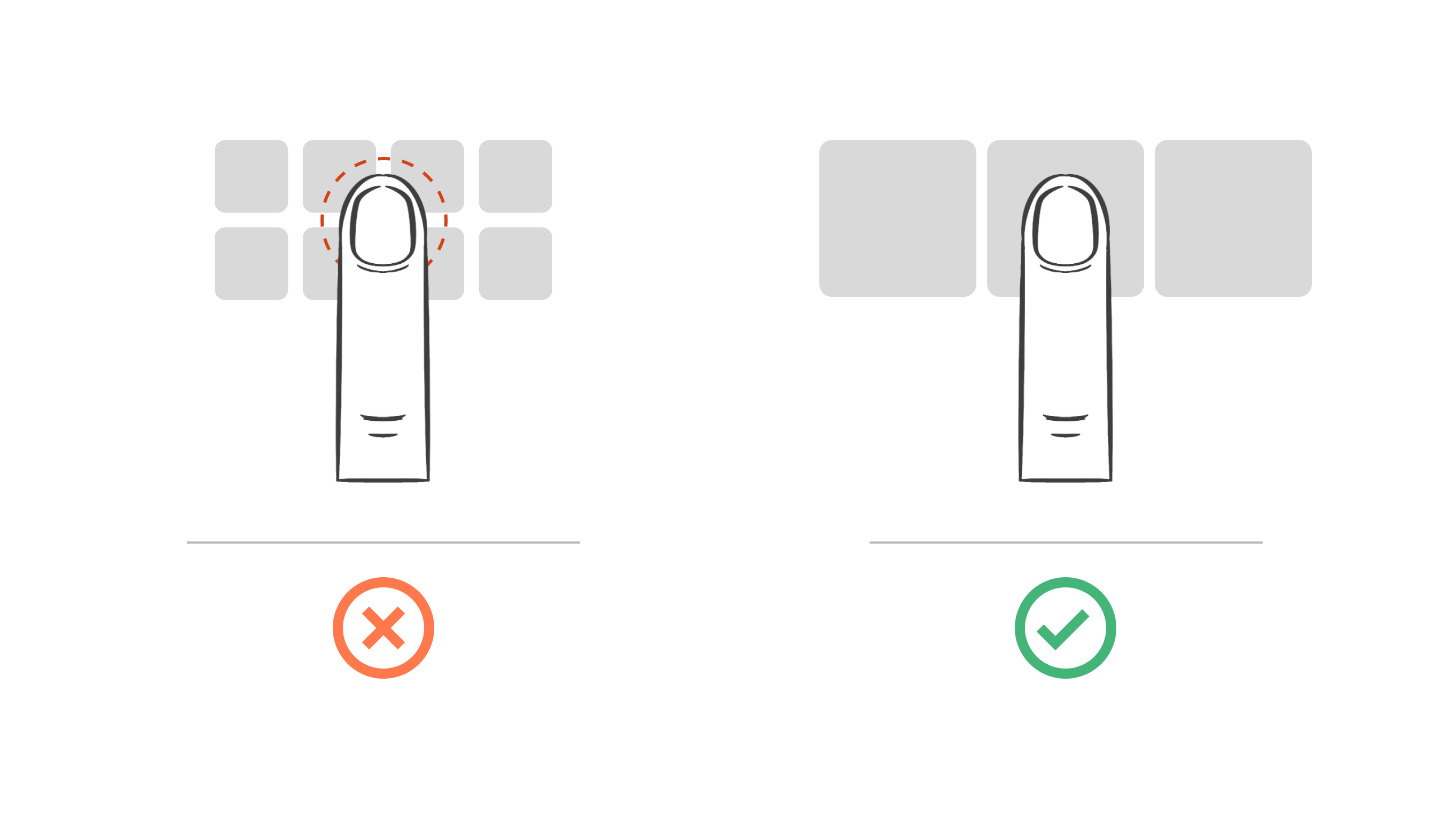
Let’s start with the latter. When we tap on something, our finger covers a fairly large space on the screen. In order to feel it is safe to click, we have to have only one thing under our fingers when we click. If our finger covers more elements, we will feel discomfort because we can never be sure enough about what we clicked on.
If we study a modern phone’s screen and look at how many times our thumb fits the screen breadthwise, we see that we can put 3-4 clickable things in one row.
Can our fingers reach the button?
Another interesting point is reachability, namely, what we can reach with our fingers. There has been an observational study: notes were made about people walking on the street and holding their phones. There were three basic positions – nothing new here.
The first is when we hold our phones with one hand. The sub-versions are supporting the phone with our small finger and one where we hold the phone fully. The small finger support gives a sense of safety, but in return, we can only reach the lower bottom of the screen.
Another position is holding onto the phone with both hands. This way, we are safe because of the helping hand, but in return, we do not always have the possibility to hold it in both hands.
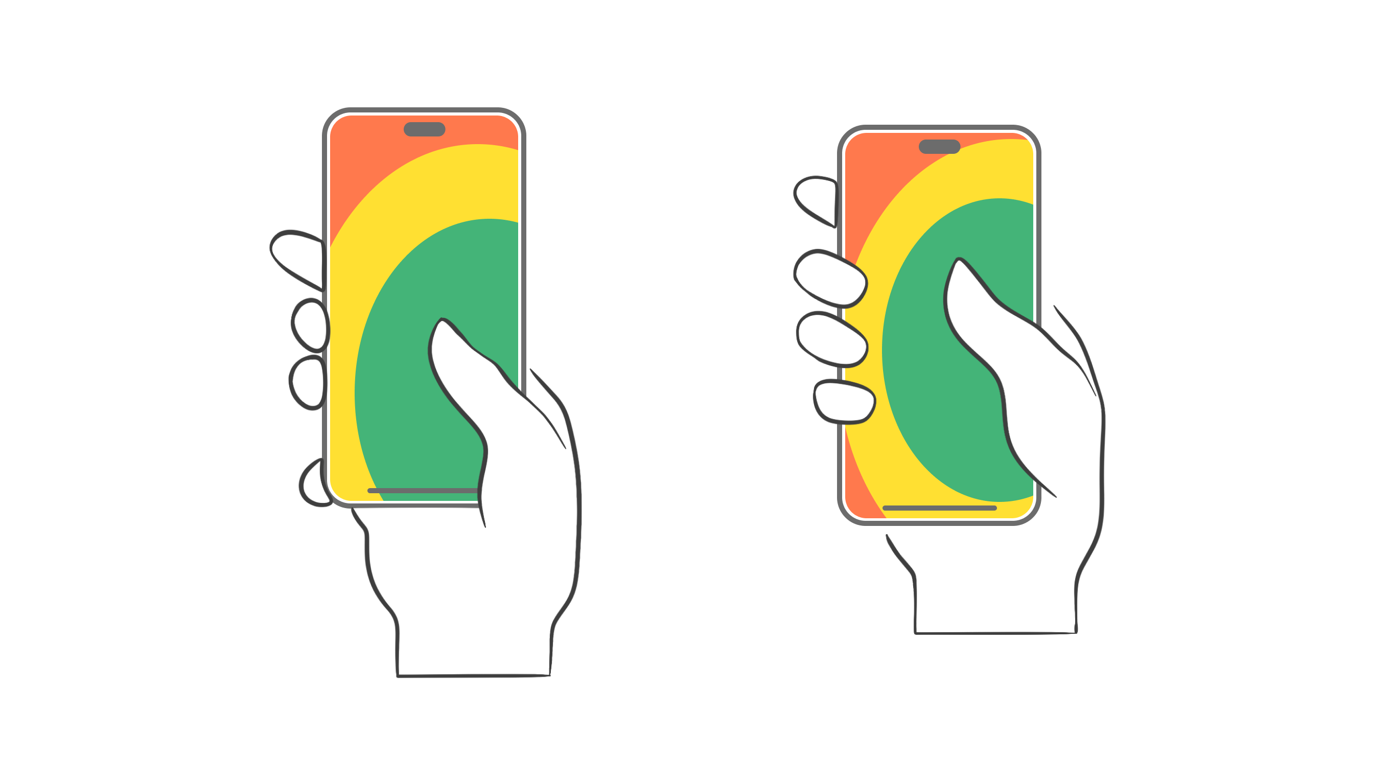
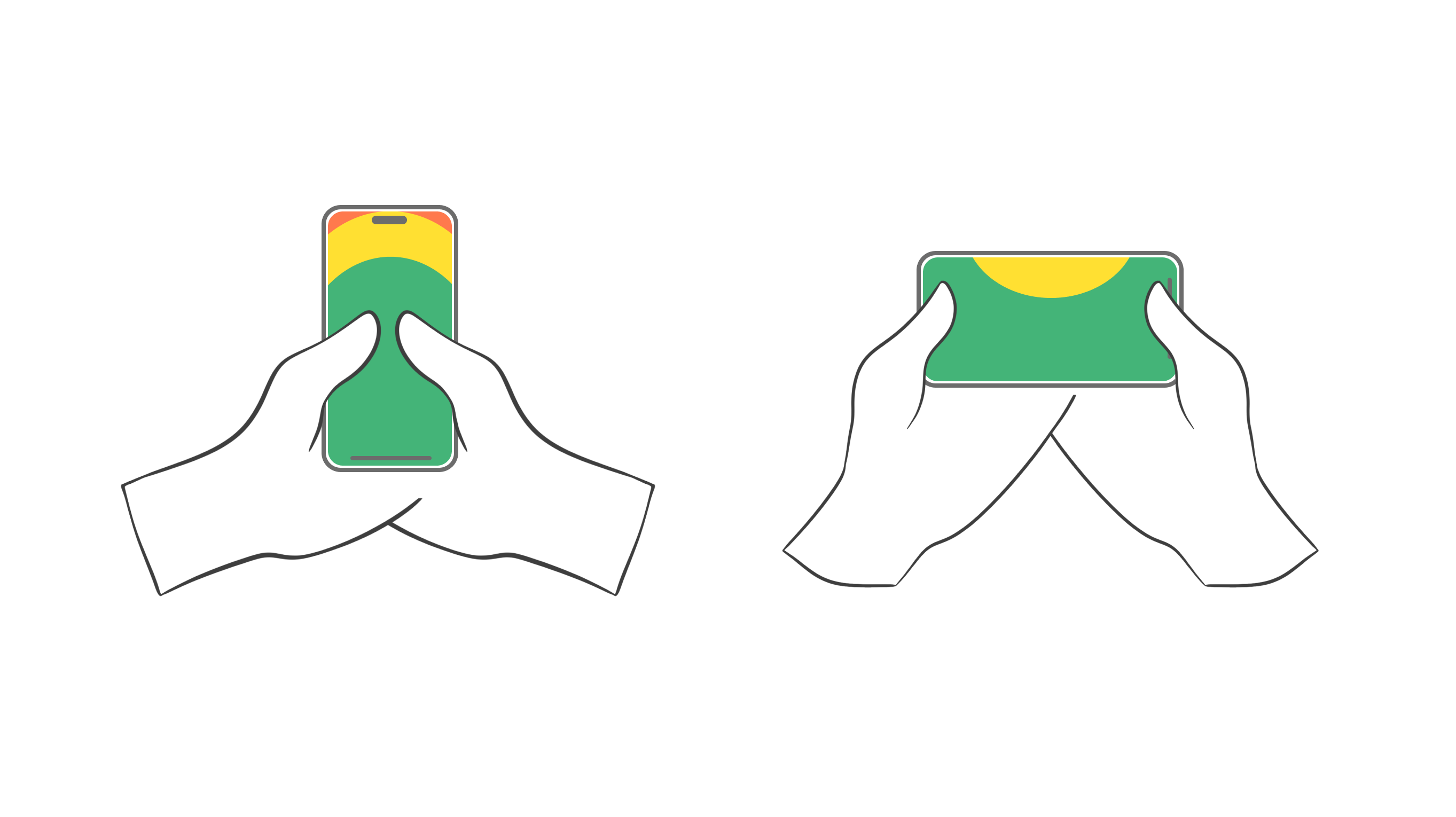
The third version: both hands holding the phone at the same time and both thumbs used at the same time.
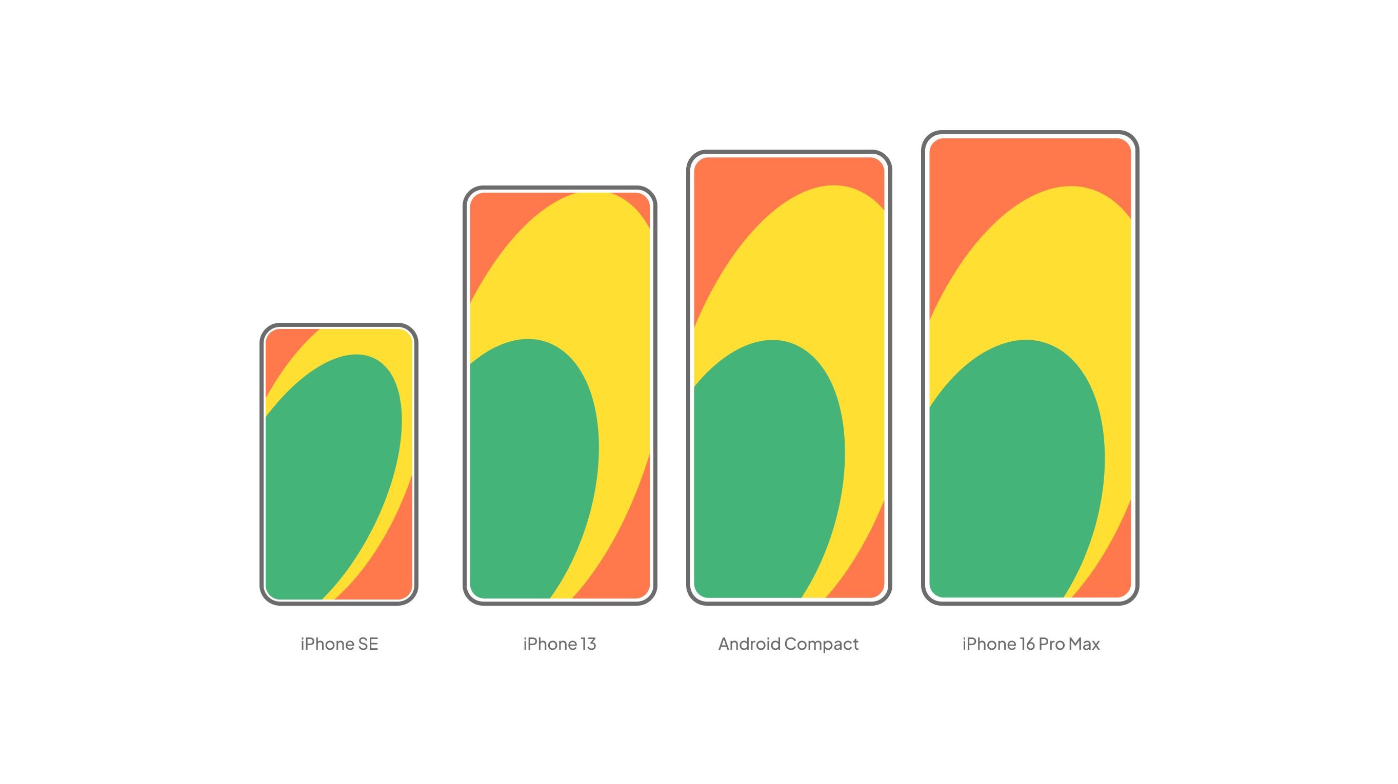
When designing for mobile, we cannot know how the users will hold the phone, so it is worth creating interfaces that can be used in the majority of cases. In other words, we should not design clickable elements which aren’t reachable in certain positions. Looking at all the illustrations, this is the upper-left part of the screen and the lower right corner, which is only reachable by bending the thumb uncomfortably.
Growing screen sizes
The situation is even more nuanced if we look at how these positions have changed due to the growing size of phones. Reachable spaces are becoming smaller on large screens. We have to get our second hand in to reach things in the upper third of the screen.
Consequently, the screen design needs have to be controllable from the lower half of the screen. Frequently used functions should not appear on top of the screen.
Want to learn about the specific challenges of designing text-free interfaces? Read our designer Luca’s take on the subject!
6. Effective surface area ratio
During the screen design process, we have to work with the space at our disposal. The first obvious question to answer is for what device we should design, which depends on who we are designing our screens for (design for your audience first, the masses second). Responsive web design and development help solve the old dilemmas of what is the most common screen size for website design or mobile.
The aim of the game is to see which content element appears where in what form and how big of a space it takes up. Note how small the effective surface area ratio is on a given screen!
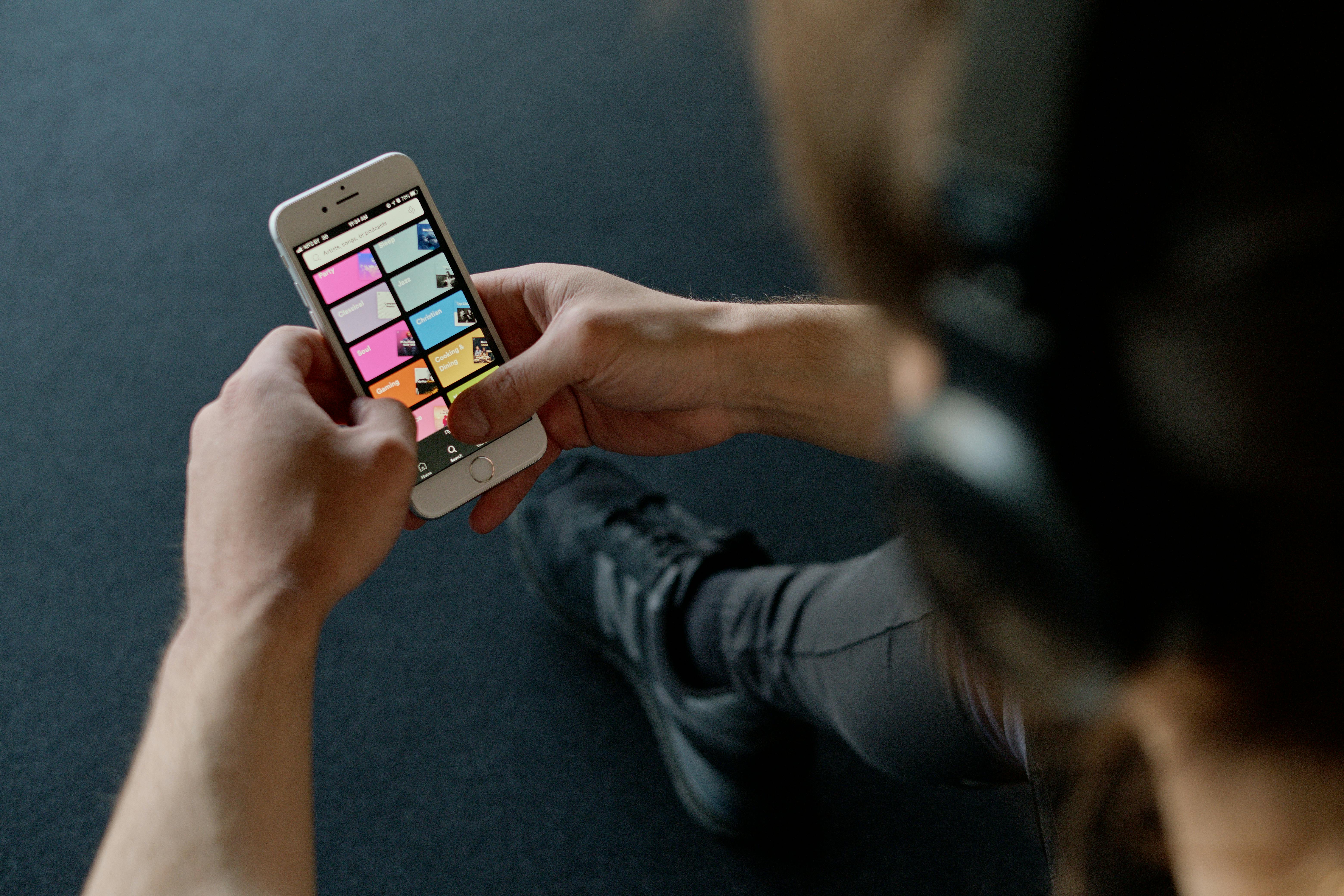
Menu or sharing buttons are only secondary functions on Spotify. Nobody arrives at this page to read the menu. Visitors come to browse music by genre. Consequently, everything else is a “necessary evil”, especially when we open the page.
7. Simple and clear screens
The best user-friendly interfaces are simple and clear. Interfaces like these are easy to understand, people get familiar with them easily, get used to using them, and feel joy when opening them the next time, too.
This simplicity in screen design is not easy to reach, though. In a design project, new ideas and new information need to appear on the interface appear one after the other. It may be the case that the different departments of the company (or the different participants in the project) consider different things to be important to appear.
The designer’s responsibility
The responsibility of the designer is to govern the participants during the planning phase to achieve a clear, easy-to-understand interface. You probably guessed that in the majority of cases, this is only possible if the designer reaches a consensus among the participants which makes this possible. This is a diplomacy or management task but still remains the designer’s task.
But what do you need to make all this possible? First of all, straightforward business objectives and a very clear idea of what the given product’s goal is. If we have these, the interfaces can be easily managed. Then, it’s also more simple to determine which elements are important and which are not so much.
Defining goals
Not knowing what the product is for may appear as a huge problem for the first time during the design of the interfaces. It is the designer’s responsibility to realize that this is the real reason for problems and to convince others to step back and establish the main goals.
The designer’s second important task is to educate other team members continuously. He needs to explain the difference between a packed screen and a beautiful sleek minimalist screen. The designer is the one to dismiss ideas and manage related fears. (For example, a huge logo at the third step of the sign-up process is not relevant since branding doesn’t happen here.)
An example of setting user goals
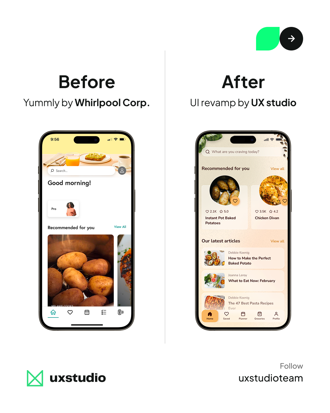
An example: the next picture shows two different versions of a mobile application screen.
At first glance, the screen design on the left seems a bit more clear due to the big pictures, unlabeled icons and familiar elements, but when we try to understand exactly what the page is for, the one on the right is more useful. Here the same content appears in a more clear and simple structure.
Note the difference between the two screens and how the one on the right achieved this.
8. Motion and Animations
UI animations are one of the most controversial areas of screen design. Many people just want to use animations because they look cool. I don’t recommend that. Others use them to communicate how the interface works or have some emotional impact on the users.
Google’s material design guide has a wise, moderate standpoint of animations, but even some Google products use them so heavily, it is annoying.
The first and most important rule: don’t use animations for just the sake of animations. People are wired to focus on moving objects. We needed this reflex to survive when a tiger surprised us in the jungle.
It’s easy to distract people with some moving objects from their original goals. So you have to be very careful with motion and use it with purpose. Every animation has to be meaningful.
Animations can explain how your interface works. One of the well-known examples is how you minimize the window in your desktop operating system. The window shrinks down to an icon on the tray, so you will know where to find it later.

When you select an item on a list, it can grow and expand to full screen. This animation will tell the users that they see the detailed view of the same element.
In many mobile applications, the menu slides in from the left side of the screen, and it hides back there too. The sliding animation shows where the menu panel is, and it teaches us to swipe from the left to get it back.
Animations can also add to the character of your application. Cartoon animators are very good at expressing feelings with just the motion of characters.
You can also do movement in a playful, aggressive, or modest way. This can amplify the style of your app. But still: be careful. As always in design, less is more. Keep animations for the best moments only.
Take the next step to improve your product's UX
We’re a SaaS-focused UX/UI design and research agency that embeds dedicated product teams into B2B companies to diagnose what's broken in complex interfaces and fix it with research-driven design. Get in touch with us, and let’s discuss your current challenges.


