User attention: 10 psychological facts to help you design better UX
Our environment has become noisier than ever. People have to carefully select what they pay attention to in their overstimulated daily lives. As a business, you not only compete with other businesses but basically everything your audience pays attention to. How can you have their undivided attention? Can we even ethically drive people's attention? In this article, I will introduce some basic psychological principles about human attention, and give guidelines for creating usable and delightful products.
Year by year, more and more content gets pushed at us. After reaching a threshold, it just cannot get through the bottleneck of attention.
Humans behave in extremely complex ways. This means we cannot reliably predict our own or even our users’ behavior per se, not even as UX researchers.
To know how to get through the bottleneck, we have to understand how human attention works.
- First, we’ll look at some facts and concepts.
- Then, we’ll take a look at what we designers and researchers can do to create the optimal fit for their attention with our product.
Using psychological principles in design
“Digital innovations must survive the psychological bottlenecks of attention, perception, memory, disposition, motivation and social influence if they are to proliferate,” says David C. Evans in his book.
Using psychological principles, by the way, also speaks to the sustainability of UX research. Of course, we shouldn't skip talking to customers. Still, we can solve some challenges in product design simply by keeping aware of psychological principles related to attention.
I recommend it to every UXer. I strongly believe that becoming knowledgeable about these theories in context and then putting them into practice for screen or service design can result in a better fit for your customers while saving you a lot of time and energy.

10 psychological facts about human attention
Our mobile devices come with their data connection and endless possibilities available 24/7. This makes it ever more difficult to concentrate on a meeting. Or to wait for your order in a restaurant. Or to watch a movie on TV.
Some teachers take away mobile phones in class. We UXers cannot and should not do that. When we want the user to interact and focus on our app, we can’t remove their moms talking to them or turn off the Netflix playing in the background.
Rather, we should design products with this context in mind and optimize tasks, user flows and the interface design for our users’ hypothetical level and type of attention.
In this section, I’ll introduce you to 10 psychological facts about human attention to keep in mind when designing digital products.
1. Attention comes in different types.
Let me explain about the different types of attention. What makes this important? You have to think about the context your product will be used in.
Can people really concentrate and pay attention to your product? It depends on the type of attention needed in the specific context.
1. Sustained attention
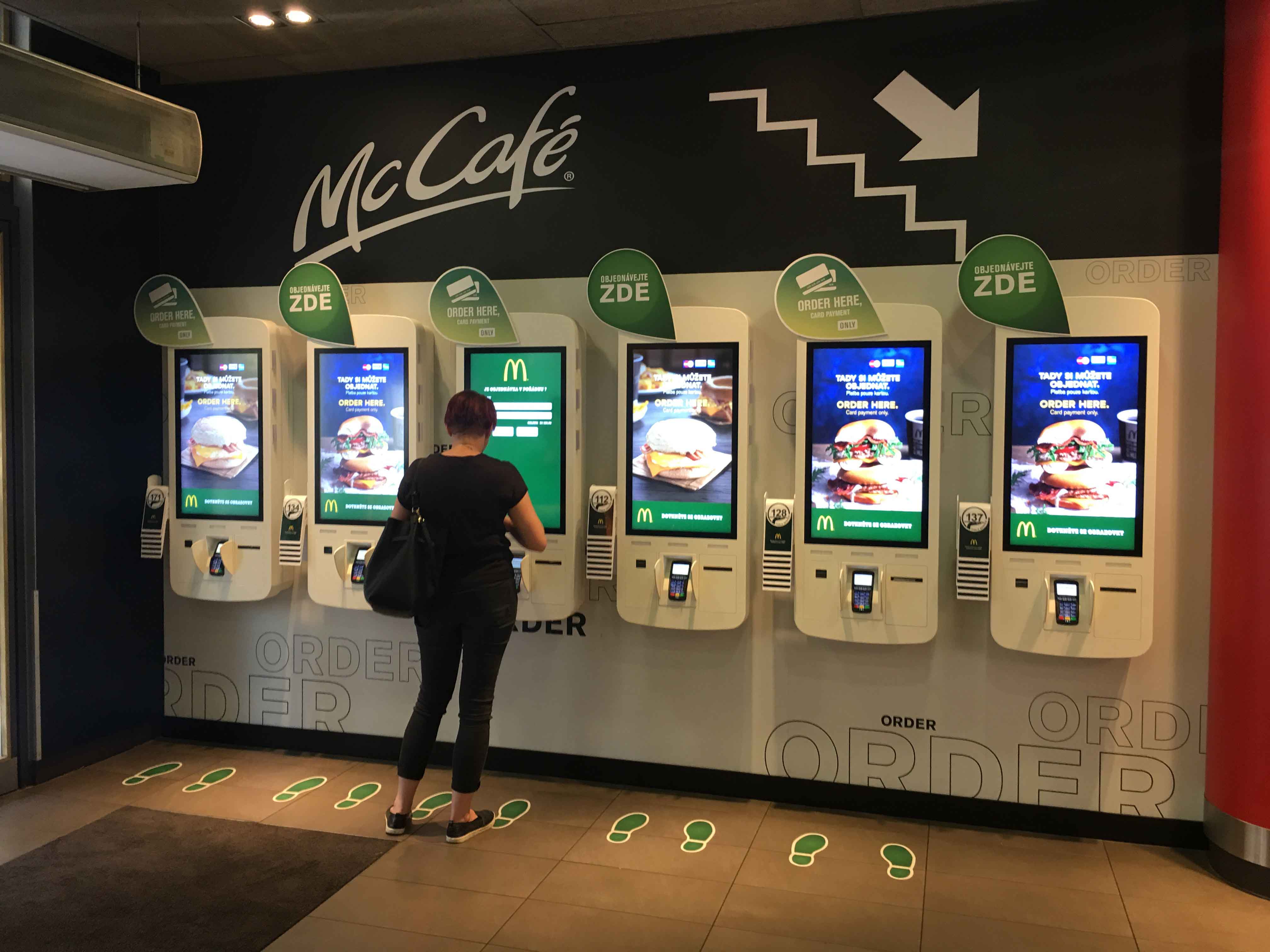
Let’s consider a kiosk which customers place their orders with in a fast food restaurant. Imagine yourself in this situation. OK, this busy place has lots of noise and other stimuli, but also consider the social aspect.
People are waiting in line behind you; you want to eat and so do they. They would likely get angry if you lost focus, wandered around and took more time than necessary to complete the task everyone is waiting to do.
Most people in this situation would like to avoid confrontation, so they probably won’t pull their phones out to check their Instagram feed while placing the order. The design of these kiosk programs purposely makes the flow easy, simple, straightforward and fast. They don’t steer attention away with unnecessary newsletter signup popups.
2. Divided attention
Now let’s explore another scenario on the other end of the spectrum. Imagine you’re using a navigation app.
In this context, the focus of your attention can determine life and death. You can’t constantly stare at the screen – sometimes you have a split second to look at the navigation. That gives you long enough to see whether to go left or right, but your focus needs to stay on the road.
Because you can’t look at the screen, you pay attention to what the navigation tells you. It might even prompt you to look at the screen quickly to double-check that you are taking the correct exit while still focusing on the technicalities of driving: putting your indicator on, steering the wheel to slightly turn left and switching to a lower gear.

2. Not much differentiates us from a goldfish.
Your mind has wandered off by now… Did a Slack message pop up? Or did you remember something you wanted to check? Did you just smell freshly brewed coffee and steer away? Anyhow, if you are still keeping up with me or focused on reading this, give yourself a pat on the back! These days, this might qualify you as extraordinary. Even superior to a goldfish… Wait, what?

A Time article titled, “You Now Have a Shorter Attention Span Than a Goldfish” didn’t exactly boost our self-confidence about our cognitive capacities. It features a Microsoft study that found that our attention span had dropped from twelve seconds in 2000 to eight in 2009. A fun fact for comparison: A goldfish goes nine.
Should we just accept this depressing data and deal with the fact that we have to live and do our best with this ridiculously short amount of time for which we can focus on one thing?
3. Our attention might be shrinking … or evolving.
Despite the outcome of this research, many specialists doubt that our attention span is shrinking. Many argue that our attention span is not decreasing, but the way we pay attention is. Some would say that because of the mobile age, our ability to multitask has improved.
Others very firmly dispute this and say no such thing as multitasking exists. We can switch to another area to focus on or shift our attention. We can’t purposefully and actively pay attention to multiple things at the same time and process that information.

Those who say that our attention spans are not shrinking believe we merely react to technological advances and our overstimulated environment. We do that by evolving and developing better selective attentional processes. We learned to tune out things better and shift more quickly.
Another important argument measures up against the catchy but inaccurate “goldfish example”. It says the span of attention depends greatly on personal characteristics, but even more so on context.
Your products’ target audience most likely will have both the extremes. Some want bite-sized content and usually disengage with content in a matter of seconds. Others instantly look for substantial content backed up by a lot of detailed information with reliable sources and statistics.
Most people fall somewhere in between. Only continuous research will tell you how your audience interacts with your product in its context of use.
4. Content helps capture attention.
The Hungarian presentation platform Prezi released their 2018 State of Attention report. It found that for all generations, the key for engaging content lies in providing a compelling narrative and stimulating, animated visuals.
People participating in the survey reported improved focus over time in spite of all the distractions around them. Another important finding relates to multitasking or multi-device usage: “52% of responders admitted that splitting their attention across two or more pieces of content has caused them to watch, read or listen to something multiple times”.

Also, we constantly need to improve our ability to focus in order to retain information and get things done quickly and effectively. Out of more than 2000 respondents, 49% said they'd become more selective about the content they consume.
5. Attention-related differences have arisen between generations.
Besides the overall numbers, generations differ noticeably. Baby Boomers, Generation X, Millennials and Gen Z, who in some situations have to work side by side, develop very different patterns when it comes to attention.
The study showed that Millennials generally shift their attention away, multitask and lose focus more often than Boomers and Gen-Xers. However, they also felt subjectively that they could concentrate and focus more effectively and for a longer time.
That said, we shouldn’t turn a blind eye to the opportunity there. Millennials expect and enjoy a great story or a theme, as well as visuals representing and backing up the information. One-third reported they only engage with content if it has a great story, as it keeps them interested. Gen Z is believed to be less picky.

6. Attention and memory go hand in hand.
When it comes to information-processing, a lot goes on in our brain until we actually get to the point of making sense of the information presented to us.
Our working memory plays a big role in what we can process and the amount of information we can manipulate. But before all that, we need to divert our attention to the stimuli for us to perceive the sensory information – whether auditory, visual or even olfactory.
To sum up, attention links closely with short-term memory and working memory. The ability to manipulate information we work with makes up a mutual effort between focusing our attention onto something and also keeping those units of information in our working memory.
7. The brain: A biological machine with the best compression algorithm.
Many researchers set out to measure and learn about the human information processing capacity to learn how our nervous system transmits and decodes messages.
Shockingly, they found that even though 11 million bits of information come through our sensory system every second, at maximum capacity we can only process 50 when performing conscious activities such as reading or playing the piano.
This huge discrepancy between the portion of transmitted and processed information does not mean that more than 99% of the information just goes missing. This involves powerful compression. How does that happen? How can we compress all this information in such a short time?
First, note that we don’t have to make a conscious effort to process information and do this compression. It happens unconsciously, automatically. Second, a half-second delay occurs between the processing and the compression. Thanks to the multitude of connections between our 100 billion brain cells, that gives us just enough time to make that powerful compression happen. Amazing, right?

8. The cocktail-party effect
We spend so much time online that we begin to safely assume we’ve developed new ways and techniques to filter out the irrelevant. We face countless marketing messages a day, personalized advertisements target us non-stop, and fresh new content bombards us every second.
Saw something mildly interesting in your feed? Too late. You switched apps because it couldn’t keep your attention. Or you didn't have time to read that article at that time. Next time you open it, the feed refreshes. Good luck finding your post. The bottom line: No one has it easy. Not the user, the provider, nor product or content creator.
That said, we do have an amazing innate capability to tune things out and focus on what we consider important at that moment. The famous psychological phenomenon of the “cocktail-party effect” backs this up.
Usually, people at a party tune out the background noise and perceive it as a murmur in order to concentrate on their conversation partner. If they wish to, however, they can eavesdrop on other people’s conversations. But at that point they are not paying attention to their conversation partner anymore.
This proves that humans can only focus on one stream of attention and can’t divide it, at least when it comes to understanding speech. You can have a dim awareness of the music playing in the background or the approximate number of people around but still you can only perceive and pay attention to one stream on the level of assigning meaning.

9. Inattentional blindness: We don’t see everything in digital products.
So you have carefully crafted the design and the user experience of your mobile app or website. You didn’t want to burden and overstimulate users. Also, your business model didn't even require ads. Uninterrupted flow, clean, simple, flat design – everything to think that your users will easily complete their task efficiently and without interruption.
But unfortunately, it doesn’t work that simply. Putting something on the small or large screen doesn’t mean they will process everything that has been going on in there.
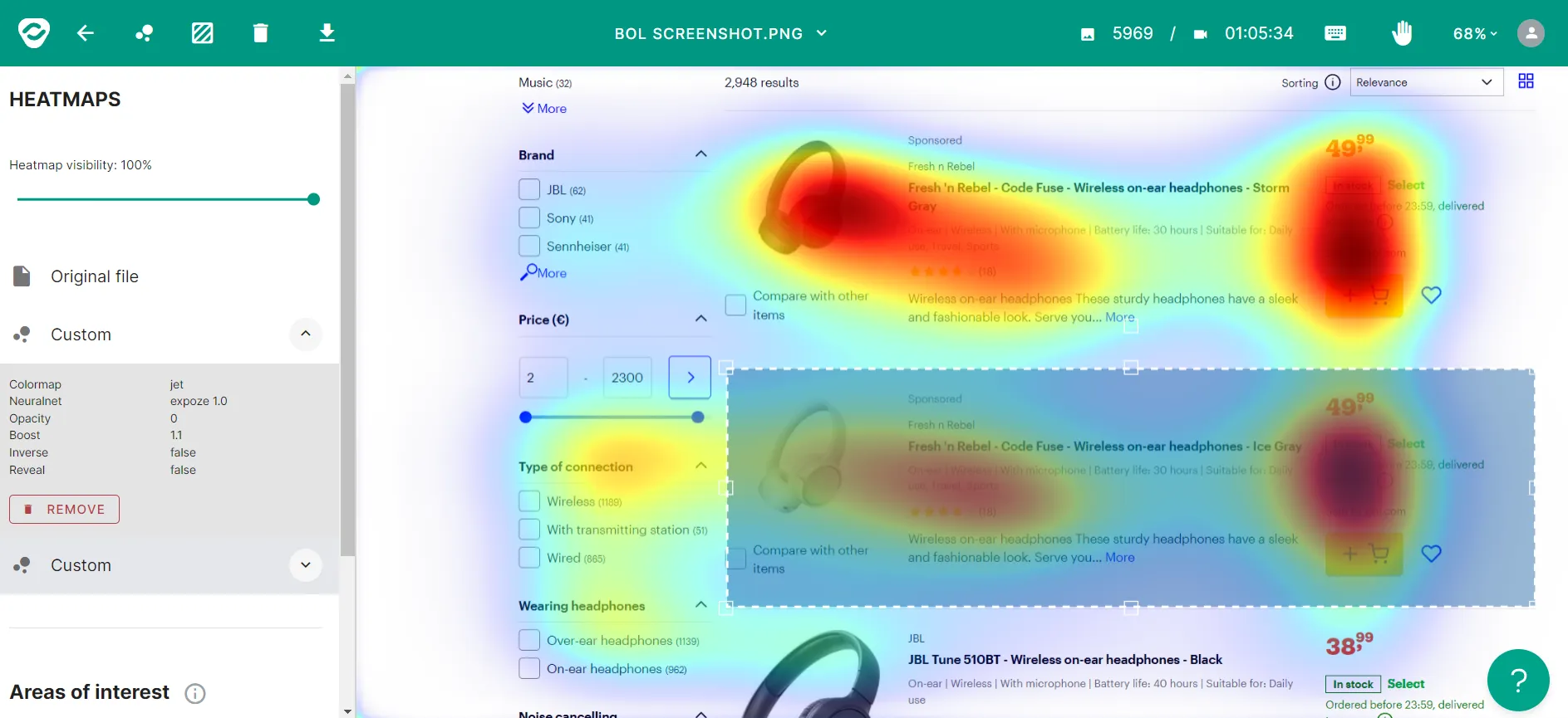
Like with reading, even though we focus our eyes and attention on a small amount of space with only two bits of information per letter, we cannot process, notice and interpret all the written content on that page in a matter of seconds.
We typically don’t process the information from areas and functions on the screen that fall outside our attention.
10. Netflix and cooking go well together for balancing cognitive load.
I think we all have examples like that from our daily life. Most days, we face the challenge of finding the things we direct our limited and valuable attention to. Sometimes all the talking, visual cues and messages overstimulate us. In those situations, we learn to tune out many things and do some of our recurring tasks completely automatically.
Some of the inputs go together well enough. To mention a personal example, I can listen to music while reading or working or watch a series while cooking. I can’t, however, look at the screen of my tablet to check the recipe and do some precision work with my carrots in the meantime.
Two conscious processes with a considerable amount of cognitive load don’t go well together. Essentially, you cannot multitask two demanding tasks.

Designing for attention
Think about how the time we spend daily on the internet increases every year. Even though more and more stimuli surrounds us, with technologies taking a bigger part of our lives in general, our attentional capacity is not changing
From an evolutionary perspective, it could take centuries before neural pathways in the brain change significantly.
So we have to design for what people can do cognitively. We have to accept and take into account when designing digital products that human attention has its limits as a resource. Our ability to pay attention for a number of seconds is not changing.
Our actual activity is.
Profit-focused vs. user-centered design
The way we pay attention and how quickly we switch from one source to the other has a big effect on professions like marketers and UXers.
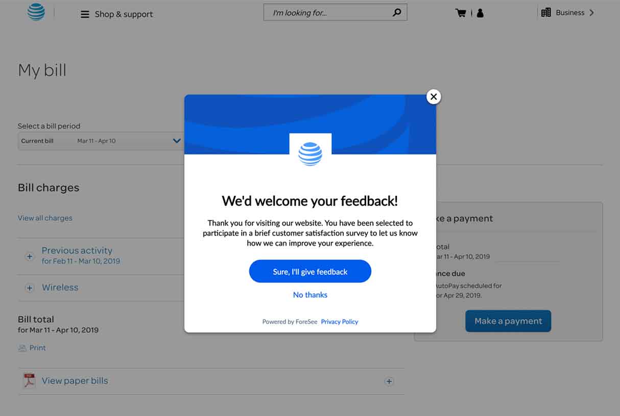
As one way to get their attention, we can simply force content and products on users with pop-ups, push notifications and sounds. With another, we empathize with them and alleviate the stress of over-stimulation at least inside our product, service or webpage.
This presents a great challenge: You want your business to strive, so you’d have to get your product in front of the user. But you also want them to have a delightful experience.
Designing for limited attention
UX designers have the responsibility for exactly what happens to the user inside of a product, how they comply with the human psychological bottlenecks, and how to align their product design with it.
We don’t want to take their attention away from more important things, and we don’t want to rob them of their attention. We just want to alleviate the cognitive load by requiring exactly that amount of attention required in that context to accomplish their goals. So, what can we as designers do?
I’m not going to tell you how to grab user attention. I’d argue that we can’t do it ethically. First, really understand how your users feel in the various contexts of using your product and service and design for that specific situation.
That said, some basic principles can help you not make your user think more than they should. People don’t like when they have to do more things or contemplate more than necessary.
1. Remember: The dial-up internet era has ended
Back in the day, we had to plan carefully what pages we wanted to visit and for how long. We had to “call in” to connect to the World Wide Web, and it had its limits.
Nowadays, most people don’t live with these limitations thanks to wifi and unlimited data plans. Because our habits have changed, how we interact with our devices has too.
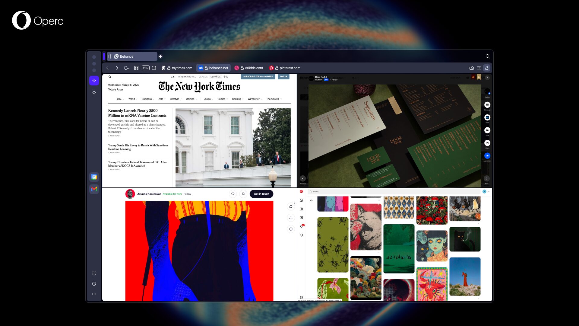
We have to keep some changes in mind. We no longer have barriers and limitations like in the time of dial-up. So in creating your design, we have to remember that the user can go away and switch tabs in a browser or apps on their phone anytime in milliseconds.
2. Provide your users with only what they need
Clearly state what pain your product solves so you know their desired outcome precisely. But how do we find that out? With research, of course.
You need to gather data on users from the most channels and methods possible: usability tests, user interviews, surveys, observations, heatmaps, recordings, AB tests, click tests and so on. Read about the UX research methods our design studio uses most here.
When you have found out users’ desired outcomes and identified their focus, you can highlight the information they need to accomplish the task at hand. Then weed out the distractions from the flow and the interface design.
3. Find out your users’ goal – if they have one
Our goals direct our attention. That means that if we have a clear goal at hand, we will direct our attention towards those signals in the environment we find essential to move towards our goal. We tune out the rest like noise and consider it a frustrating distraction. We call this functioning task-positive.
However, if we don’t have a clear goal, we don’t know exactly what to ignore and what to focus on. These situations make us receptive to anything that comes our way, except when it requires a lot of our cognitive capacity, conscious effort and concentration. The latter “mind-wandering mode” supports a broader, non-linear processing of the information around us – in other words, a task-negative mode.

4. Vary the types of content
Spice up long texts with images, GIFs, or videos – an app or a website or a presentation. No one wants to read long texts with no visual relief. We have books for that.
Also, a clear visual hierarchy makes the content easily scannable and comprehensible. For the visual hierarchy and the content you present, use very well-crafted and thought-out words. You can achieve it with UX writing and microcopy.
We know that people tend to willingly keep their attention on something they find more exciting. Scientific evidence shows that a page full of relevant visuals – images, infographics, catchy videos – provides much more excitement than a full body of text.
It has also shown that executives who don’t have the time or drive to read through corporate websites will much more likely dedicate time when presented a video. One with captivating, informative visuals that convey all the information but not more than needed at a certain time can make all the difference.

5. Pare it down
Give your users the minimum information they need to process. Even if you initially think you need a certain amount of text, minimize it. Remove words and even sentences.
Removing the clutter also helps you achieve that pared-down effect in your interface design. Provide that breath of fresh air for your user between all those crammed-in products and other stimuli from the environment fighting for their attention.
6. Reduce users’ cognitive load – Use patterns
People already have a hard time determining where to direct their attention. Sometimes they struggle with unintentionally steering away because of all the distractions.
We UXers have to take it easy on them! Minimize the cognitive load for users while they interact with your product.
You don’t have to reinvent the wheel here. Rely on patterns, users’ already existing mental models, and design principles. Apply Gestalt principles, use on well-known UI patterns, and go for that intuitive design!
But beware! Before you test it with real users, you can only assume they’ll find your interface intuitive. So make sure you see how it resonates with users and ask about their subjective experience.
7. Use observation and exploratory research
Without experience research, you can’t know if you have nailed the previous steps.
For measuring attention, don’t ask your users in a survey or make them think out loud in a usability test setting. Instead, conduct exploratory research and observe people in the natural context in which they will use your product.
Although no one has clearly laid out the methodology yet, lightweight EEG headsets like Emotiv can help capture attention levels amongst many other useful variables. Users wear the headsets while they perform tasks on a digital product and we get clear data on their attention level and cognitive load from brainwaves.
8. Always keep ethical concerns in mind
We can’t consider the topic of the intersection of human attention and design without taking a look at it from an ethical aspect. Many people say that tech giants today aren’t trying to sell to us anymore. The roles have changed, as we get sold and our data and digital profile has become that product.
I think many of us can’t help but notice this as emails, pop-ups, push notifications and nudges constantly bombard us. Keeping business goals in mind, we still have to put the user first. Not robbing them of their attention span by overloading them unnecessarily makes up part of that. If you want to read more about how to produce successful but ethical designs, check out this article by my designer colleague Attila.
The article ends here, but don’t go yet!
If you made it this far, you deserve the highest of fives! You can also rest assured that you possess a greater average attention span than a goldfish. Phew, what a relief. If you can still hang in here and have some more attention for UX content, check out our related articles:


