Why customer journey mapping feels broken in SaaS

Customer journey mapping is a really good method for turning a complex, messy customer experience into a clear, actionable picture. It helps companies build products and services that actually work for the people using them.
Still, when it comes to SaaS, creating a customer journey map often yields disappointing results.
It’s because most teams who do customer journey mapping in SaaS usually borrow the framework from somewhere else, perhaps a marketing funnel or a generic template for e-commerce.
Successful customer journey maps for a SaaS business look fundamentally different. The stages are different, the emotional texture is different, the touchpoints are different, and critically: the map never really ends.
So, don’t give up on this great method: learn how to apply it to your context.
SaaS customer journey mapping differences
The main differences to pay attention to when mapping SaaS customer journeys are summed up in the following 6 points.
1. The stages
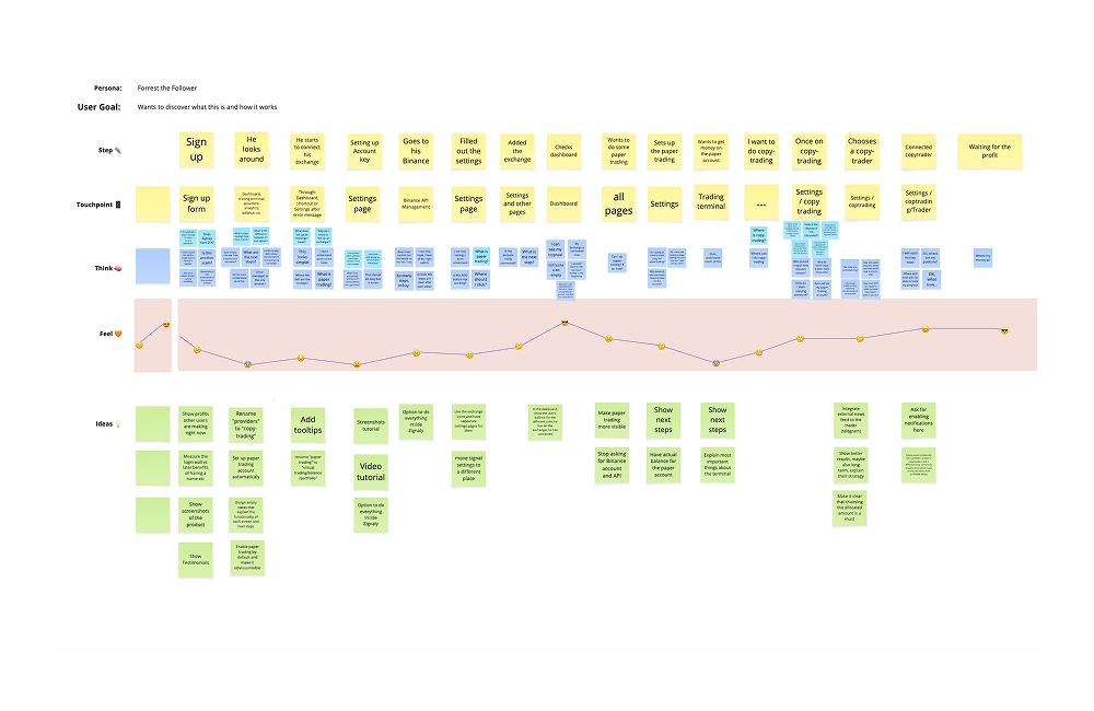
The SaaS customer journey stages work fundamentally differently from what we usually see in traditional customer journey maps. SaaS journeys are not fully linear. SaaS journeys combine linear progression with recurring evaluation cycles (e.g. renewal, retention, re-evaluation or expansion/contraction). In many ways, they’re never really finished.
In a non-SaaS environment, the journey often reaches a natural resting point after purchase. Even when loyalty or repeat purchase loops exist, the “main” experience usually culminates in conversion. SaaS flips this logic.
The SaaS cycle restarts at every renewal. Each renewal becomes a new decision point where the customer actively re-evaluates the value of the product. Retention, therefore, is not a post-sale KPI sitting somewhere in customer success dashboards but a core UX design challenge embedded directly into the journey itself.
This changes where the real pressure sits.
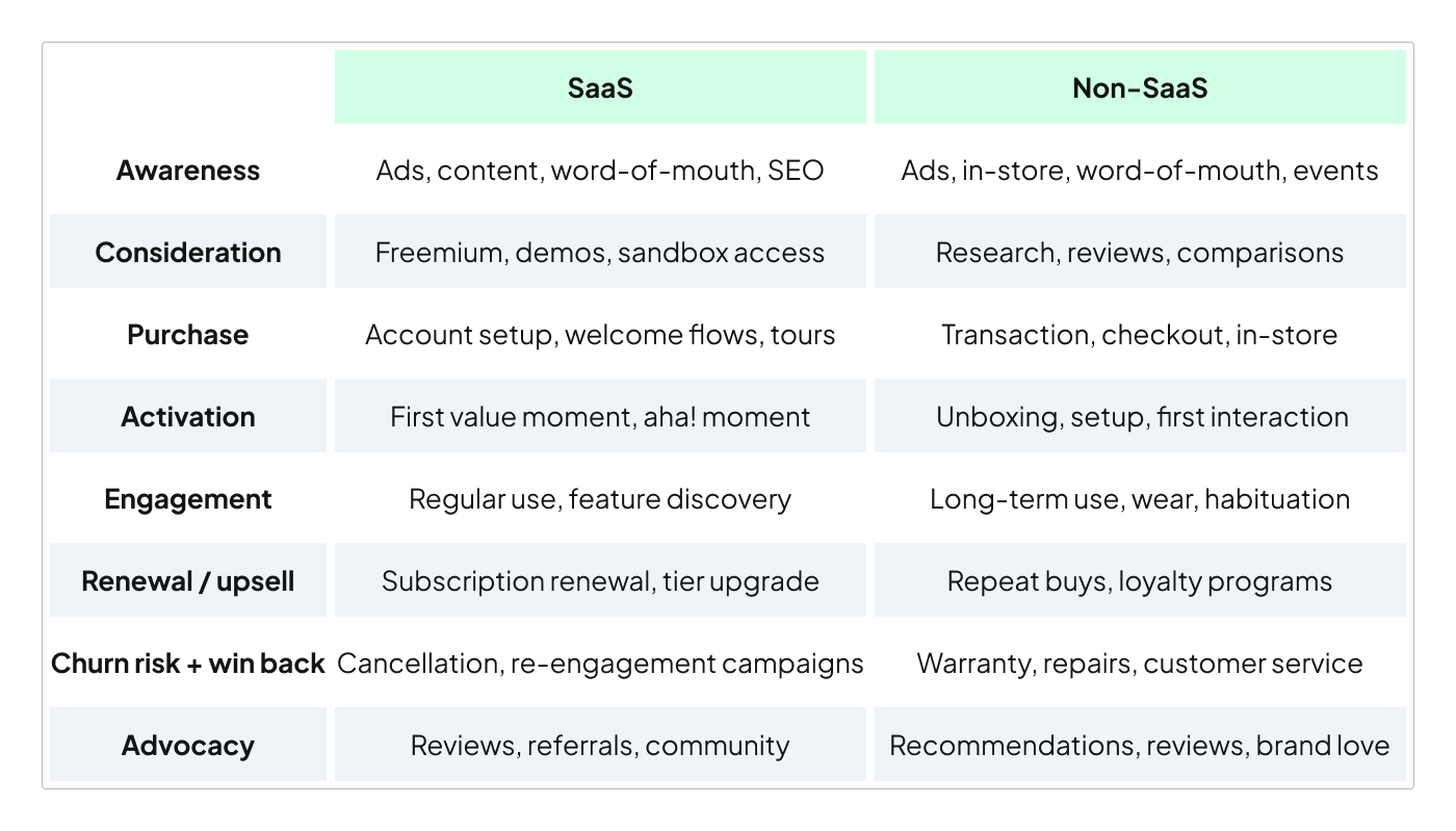
2. Purchase ≠ climax of experience
In SaaS, purchase is the beginning of the experience, not its culmination. Conversion only grants access to value; it doesn’t deliver value on its own. The real experience starts afterwards, during onboarding, user activation, adoption, and the long engagement period that follows.
This is also where the highest UX risk can be found. Users can become overwhelmed, disengaged, confused, or simply fail to integrate the product into their routines. Compared to non-SaaS businesses, where the purchase moment often receives the majority of strategic attention, SaaS requires design effort to shift heavily toward the post-purchase experience.
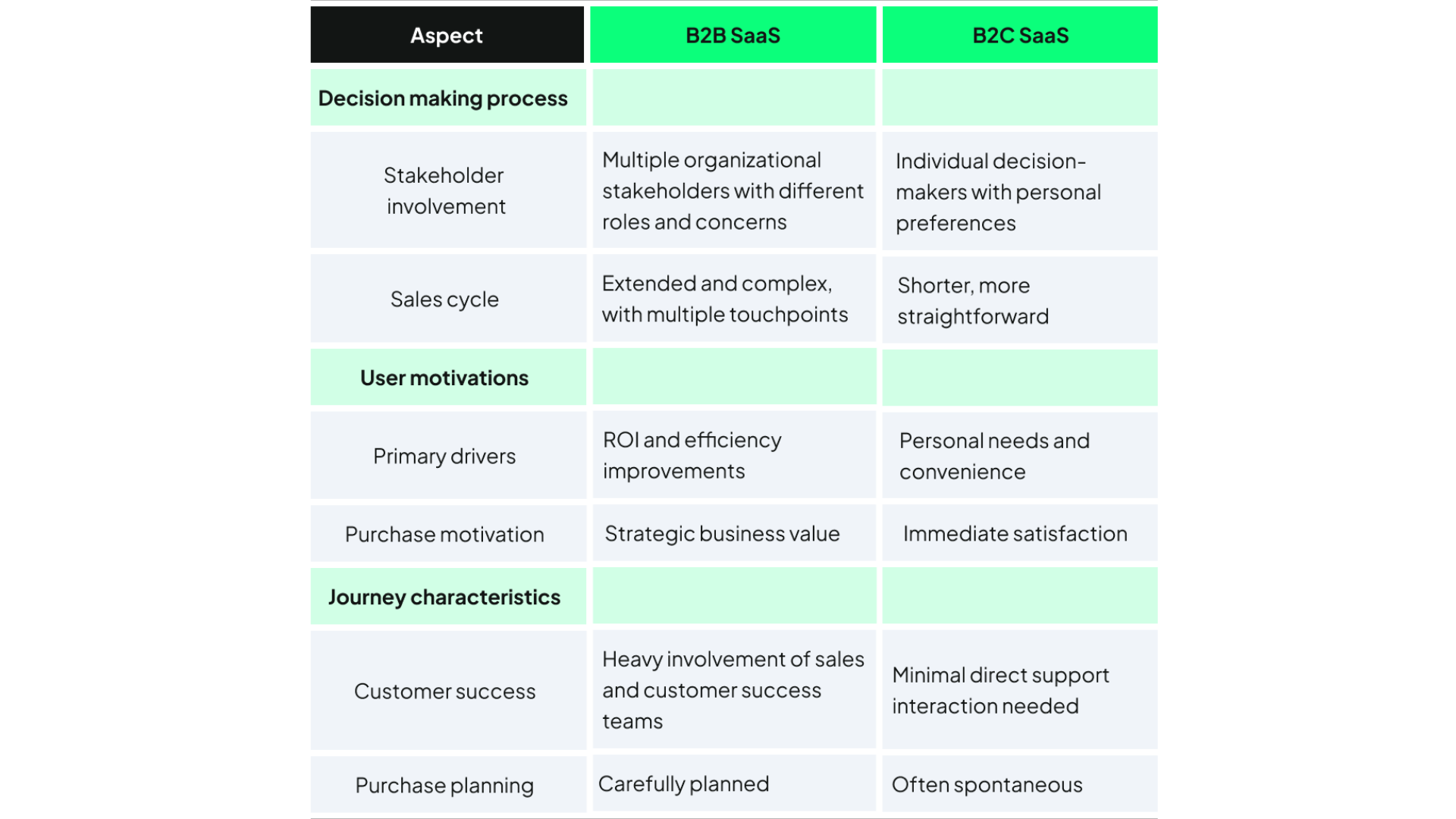
3. Multiple simultaneous journeys
Another structural difference is that SaaS journeys, especially in B2B, rarely belong to a single person.
In many traditional products or services, the buyer and the user are often the same individual. In B2B SaaS, these roles frequently split into entirely separate journeys:
- There is the buyer approving budgets and contracts,
- the admin configuring systems and permissions,
- and the end user interacting with the product daily.
Each of these people has different motivations, different frustrations, and different definitions of success. Yet they all interact with the same platform. This creates multiple parallel journeys operating simultaneously, which is exactly why single-lane customer journey maps tend to oversimplify SaaS realities.
4. Emotional arc
The emotional structure of the journey also behaves differently.
The onboarding phase tends to compress emotional intensity into a short period of time. Users are forced to learn quickly, make decisions rapidly, and navigate uncertainty under pressure. Anxiety, cognitive load, and friction become highly concentrated during these early stages.
Then, once the user settles into routine usage, the journey stretches into a long and often deceptively quiet engagement phase. The danger here is subtle: engagement can slowly erode without obvious warning signs.
Engagement slowly weakening or habits fading away, which significantly changes where teams should focus intervention and experience design efforts.

5. Churn as a stage, not a failure state
Most traditional customer journey maps treat exit as the endpoint or ignore it entirely. In SaaS, that is a major blind spot. Churn is not an edge case. It’s structurally part of the experience.
SaaS customer journey maps should include what leads users toward exit, what the offboarding experience feels like, and how re-entry or win-back can happen later.
Customers frequently pause, leave, return, downgrade, upgrade, or switch plans over time. The journey behaves less like a funnel and more like an orbit, with continuous movement rather than a clean finish line.
This also changes what the map itself needs to include.
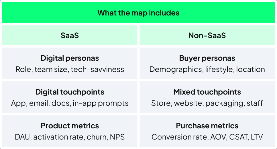
6. What the map includes
Yes, SaaS journey maps are heavily digital and enriched by behavioural analytics, usage signals, feature adoption data, and retention metrics. But the deeper difference is structural rather than technological.
A SaaS map must account for multiple parallel journeys across user roles, shifting emotional intensity over time, and recurring churn-and-return loops. Without those elements, the map may look visually complete while still missing the actual dynamics shaping the user experience.
How to build the map
Start with the right number of maps
Most commonly, in a B2B SaaS journey mapping, one of the biggest mistakes is trying to squeeze everyone into one single map. It sounds organised, but in reality it creates something that is accurate for nobody.
The buyer who approves budgets and contracts doesn’t experience the product the same way as the end user logging in every day. Their goals are different, their frustrations are different, and even the emotional stakes of the journey are different.
That is why SaaS usually needs multiple maps.
At minimum, create one for the buyer and one for the end user. And if your product has an admin role (someone configuring integrations, permissions, or settings), that often deserves a separate journey too.
A good starting point is the end user journey. This is where retention is won or lost. It is where the product’s value is actually experienced over time.
Then map the buyer journey alongside it and pay attention to where the two intersect. Evaluation, onboarding expectations, procurement, renewal conversations. These are often the moments where the gap between “what was sold” and “what was experienced” starts to become visible.
Account for the asymmetry of the SaaS timeline
A SaaS journey doesn’t move at a steady pace.
SaaS onboarding is short, intense, and emotionally heavy. Users are learning quickly, making decisions just as rapidly, and trying to understand whether the product is worth the effort. Small usability issues suddenly feel much bigger because the pressure is concentrated into a very short window.
This is why onboarding deserves much more detail on the map. Include:
- touchpoints
- emotional context
- clarity around what users are thinking, feeling, and struggling with.
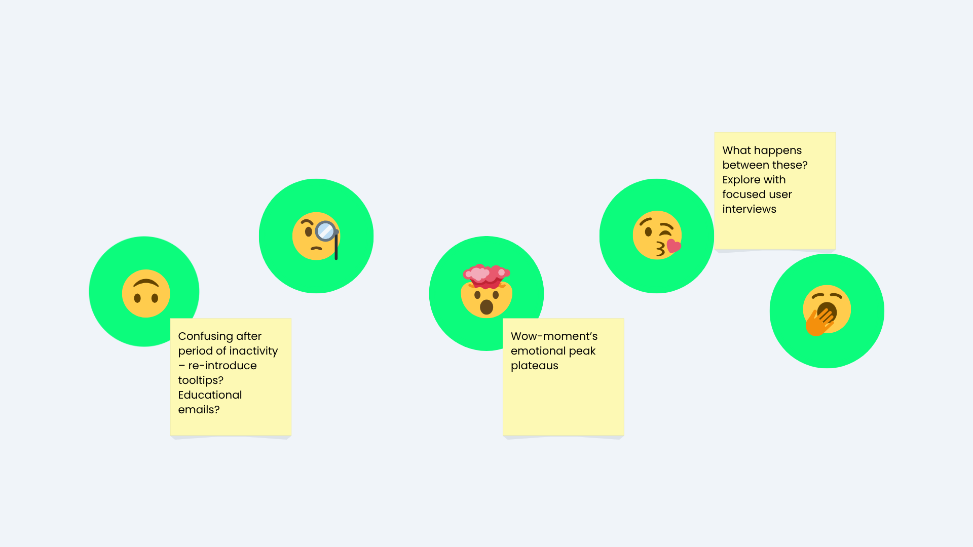
Then comes the long engagement phase. The quiet middle, where many maps fail, because the middle is where silent churn develops. Engagement slowly weakens, habits fade, and the product becomes less emotionally relevant over time, usually without giving any dramatic warning signs.
A good SaaS map makes this invisible churn visible. It highlights intervention points such as feature announcements, renewal discussions, usage milestones, or periods of inactivity. In SaaS, silence itself is often a signal.
Take emotional data seriously
Emotional feedback is the easiest to collect (e.g. through micro surveys, NPS, CSET), especially during onboarding or churn. The difficult part is understanding how users feel in the middle of the journey, during everyday usage, and that middle matters the most.
Customers rarely wake up one day and suddenly churn. Disengagement usually builds gradually. Expectations drift and friction accumulates quietly. The product slowly becomes less valuable in the customer’s mind.
This is why SaaS teams need more than onboarding surveys and exit interviews.
Lightweight pulse surveys, in-app feedback moments, and behavioural signals can reveal much more than traditional metrics alone. For example, a feature used once and never touched again often signals confusion, failed onboarding, or unmet expectations.
When mapping emotional data, avoid making the journey look too clean. SaaS experiences are messy. A customer can feel highly engaged one month and disconnected the next. That inconsistency is where the most important UX problems live. Don’t ignore it.
Treat the map as a living document
One of the most common problems with customer journey maps is what happens after the workshop ends.
The map gets exported, presented, maybe even printed on a wall, and then slowly forgotten while the product itself keeps changing.
But SaaS ideas evolve constantly. Features change, onboarding flows change, pricing changes, customer expectations change. And every one of those changes affects the journey.
A map that has not been updated for a year is more than just outdated, it becomes misleading too.
The best SaaS teams treat journey maps as living systems. Something continuously updated as the product and customer behaviour evolve.
When onboarding changes, when retention patterns change, when new friction points appear → revisit the map. Over time, the map becomes a record of how the team’s understanding of the customer evolves.
Final thoughts
Customer journey mapping in SaaS is not broken. Most of the time, we are simply using the wrong lens for the wrong type of business.
SaaS products are continuous, multi-layered, emotionally uneven systems. The journey does not end after purchase, the users are rarely just one person, and the most important moments often happen long after conversion.
Done properly, SaaS customer journey mapping stops being a static workshop exercise and becomes something much more valuable: a way to continuously understand how customers experience your product, where friction quietly accumulates, and where retention is truly won or lost.
If you need help mapping it all out, our academically trained UX researchers can join your team any time. Contact us for details.

This blog post was written by Dan Damsa, UX researcher
Proofreading & editing by Dr. Johanna Székelyhidi, marketing manager and copywriter