Emobox - our latest experiments with emotions

Analyzing and understanding yourself is exciting. That's why when we found an old psychology test based on picking colors we decided to turn this visual experience into a new application and even found that emoticons works better than colors. This is the story of our latest lab experiments with emotions.
The whole idea came from simple questions like: why do you have a certain feeling? Or why a feeling is coming back so frequently? Or is it actually that frequent or you just feel it comes often? Have you ever thought of it if you are rather happy and optimistic or rather negative?
Our UX company ended up designing a concept for an application that aims to track your feelings and give a great overview about your past so you can understand yourself better.
We started to explore the Lüscher psychology test that is based on picking from a group of colors the ones that makes you feel the best when you look at them first, then you repeat the process with the remaining colors until none of them leave. As a result you get information about your existing situation, your stress sources, your restrained characteristics, your desired objective and your actual problem.
This is a pretty fun and interesting test because you don’t have to think too much just intuitively choose colors, you don’t have to deal with words, or definitions. And the result is surprisingly satisfying, gives a good feedback and helps to think further about your feelings and problems.
Based on the Lüscher test we started to explore opportunities to combine feelings with colors and help the user to easily add his or her feelings, so it can become an everyday habit that could help understanding the past and maybe trigger some changes.

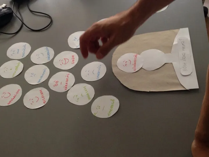
First of all we created a paper prototype to see the decision making process of the users. What helps them? Colors? Words? Faces? Is it good if the user is presented as an avatar?


It turned out during the user tests that there are two ways of selecting a single emotional state:
1) pick: you select the one right away,
2) exclude: gradually eliminate the emotions that are not playing until only one remains
We also observed some interesting things like some users like to organize the faces spatially before selection
- the initial disorganization of faces was a bit confusing. Maybe we should present the faces in an organized manner.
- the spatial metaphor, that some emotions are closer to you, others are further away works. They get it.
It was very interesting to see how they used the space around their virtual avatar, so they pulled the emotions closer to the head that has more connection to their current emotional state. It also turned out that they would like to pick more and maybe prioritize them and usually one is not enough to describe how they feel.
Furthermore we have created a digital prototype as well to see what happens if we group the emotions and the user has to go through a two steps choosing process.


It turned out that users prefer one step choices and when they saw the second screen with the list none of them were so happy about it. Also choosing from a list was kind of boring for them.
Regarding the copy writing: the question “How do you feel today?” was more confusing because they felt they should merge all their feelings from that day so far and it’s not a really easy task, the other question in the paper prototype test - How do you feel now? - worked better.
We created a design based on these findings from the users. We hope you like the concept! ;)
You can read more about emotional design here.


