5 Great Ways To Communicate Product Updates To Your Users

Sensing a sudden change in the environment frightens us. Constant updates inconvenience us and mandate relearning. How could anyone motivate us to update something unknown in our well-inhabited app? A well-prepared way to communicate product updates might do the trick.
This article covers how to communicate product updates and release notes in an app and the importance of articulating them.
.png)
Why are product updates challenging to communicate?
Imagine going home one day to find your bed painted green and put out on the balcony with a small post-it that says,
"We’re always making changes and improvements to your furniture. Please let us relocate and repaint your stuff regularly."
What would you say? Definitely not something nice. Why would it be any different in case of a digital product?
People care a lot about changes in their favorite apps
It’s a misbelief that users don’t care what product feature has been updated in their favorite app.
Think about it: they spend more time with it than talking to other human beings.
In fact, people out there
- hope for that new feature they requested
- wait for certain bugs to be fixed
- get upset if something unexpected slows them down, or
- just live as early adopters, ready for a new adventure.
You need to let your users know what the product update in a way they will appreciate it
Letting people know what’s happening with their favorite product builds trust and engagement.
Rolling out new releases without any handrail may result in grumbling, 1-star ratings, angry emails, or – in the worst-case – user backlash.
Conduct interviews and user tests, and create (tiny) user journeys. Fortunately, adoption speed, opening, and click-through rates in the release email, in-app tour viewership, etc. helpfully measure an update’s parameters.
You need to do the research beforehand
To analyze and create the perfect channels and methods for product updates our UX company runs user tests and metrics.
Big companies also realized their apps rank higher if they pull new releases more frequently (e.g. on a weekly basis). Also, their development phases likely to be agile fit more easily.
These mainly under-the-hood improvements and minor bug fixes naturally don’t need walkthroughs or tooltips. But doing this all the time without detailing the changes may cause frustration among users.
How do these version history monsters below make you feel?

People may ask, “Why constantly update if there’s nothing new, and the apps take up more storage day after day?” and just turn it off. In the following weeks new viruses would come out and WannaCry infects their hard drive.
Reasons To Communicate Product Updates
Read these three completely subjective opinions on why articulating product updates greatly benefits both designers and users:
#1 Users will feel at home
Communicating product updates demonstrates care about users. This shows them ❤️ and involves them deeper in the product. The more they see their questions answered in advance, the safer they’ll feel. So the more their needs and requests get heard, the more they’ll help you by suggesting new ideas, reporting bugs or writing 5-star reviews. Or they’ll just thank you for the effort.
#2 It helps with numbers
How? Let users know about fantastic new updates to increase the retention rate. Win back currently inactive users who were waiting for a certain feature. Also grow the percentage of early adopters to decrease optimizing for earlier product versions. And it helps many other numbers, based on the type of product.
#3 It invites for new adventures
Pro users wanna have fun and they need to discover new possibilities. New essential or delight features release their endorphins. Posted product update notes nudge them into beginning their adventure (probably the most subjective reason of all).

Unsure about how to move on with your design processes? Schedule a free consultation with us (it's free!)
5 Ways To Communicate Product Updates
Aaand here we are. These are my favorite and most recent examples from the world of digital products. May they help in crafting something amazing!
1. Release notes
Mobile and desktop app stores need product release notes, but they see overuse in many examples. These tiny little text boxes could create a window to a new world. Still, they feel like a secret kept for true fanatics. Although not many people read them, but those who do could represent your closest users.
No need to mention the Slack team’s amazing notes as you’ve probably seen them.

They
- get straight to the point, honestly;
- categorize changes based on type;
- include reactions to user feedback;
- apologize if something went really wrong, and
- of course, use laughter as a cure for every unsolved bug.

These notes additionally give a visual reinforcement of new updates in the desktop app, showing the important highlights when opened.
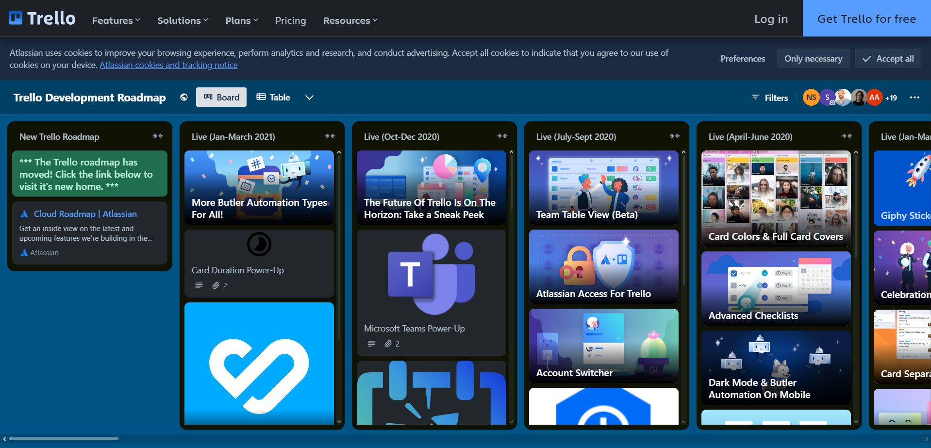
Trello has some great lines too, where they use their own product for release notes.
A simple but funny one: Tumblr makes them hard not to read sometimes (but I still miss some explanation for a bug fix as well).
Before revolutionizing a product’s release notes, don’t forget to:
- Compose: work with users’ phrasing and get straight to the point;
- List: use bullet points to make it easy to read;
- Divide: use capitals, white space and other characters;
- Multiply: use it everywhere e.g. in the Store, on your website, in your blog.
Read these best practices before trying it out.
Use Release Notes:
- anytime possible.
2. Modals
Modal windows can be used to communicate product updates through showcasing completely new features or a redesign besides their usual onboarding function. They can appear separately or in a series.
Modals draw attention to clear and simple messages, even in the case of inpatient users.
On the other hand, people want to skip modals. They want to use the product without distraction, so a modal series that explains too much obstructs people and breaks the process.

It's best when modals include:
- a simple and kind message,
- a value proposition (why is this update useful?),
- an option to test or ignore the update
Use modals when:
- Onboarding or
- Redesigning.
3. Tooltips
Explain new features at that exact part of the app. Let people discover the product and give them small bits of information to try new things. This way people will see these in context, but only when needed.
When Slack moved around things a bit, they used tooltips to tell users new ways to find things faster.

Use tooltips when:
- Releasing a new feature
- Redesigning.
4. Walkthroughs (first use + new feature)
Walkthroughs use blocking modals, tooltips, and other elements to guide tours through a product. They serve as the perfect handrails when changing many things at once.
But remember – let users discover the product. Keep the walkthrough more as a handrail than an education. Make them skippable, not required for opening.
Zeplin uses walkthroughs to help with onboarding, but also with new product updates including:
- Visible animations,
- Straight-to-the-point copy,
- Opt-in opening.

Use walkthroughs when:
- Onboarding,
- Redesigning,
- Doing complex feature release.
5. Empty states
Letting a feature explain itself functions usefully. These “feature empty states” keep up the joy of discovery, appear in context, and don’t disturb users.
On the other hand, they’re hard to find: users only meet them on that designated screen. So to highlight a new feature and put it out in front, use these empty states as an additional tool.

Use empty states when:
- Releasing a minor feature.
Conclusion: How To Communicate Product Updates To Your Users
To see further examples, reallygoodux.io explores a new app’s processes and useronboard.com provides onboarding examples with fine commentary.
Product updates: What could be your next steps?
1) Do research
- Read users feedback on updates
- Talk to customer support staff
- Create user journeys for updates
2) Define the update content
- Feature Release?
- Design update?
- Bug fixes?
- Performance improvements?
- Security updates?
3) Choose tool(s) related to your updated content
- Work consistently
- Don’t overwhelm
4) Measure and improve
- Test with real users
Take the next step to improve your website’s UX
Get in touch with us, and let’s discuss how we can help you manage your current needs and challenges. Our experts are happy to assist you with UX strategy, product and user research, UX/UI design, and much more.