Visual Hints That Drive User Behaviour

In this article I'd like to discuss a few examples about how you can use visual devices to help drive user behaviour. If we're talking about visual design, you might think it only refers to how things look, but it's goes much deeper than that. Visuality and good visual hints can add a lot to the understanding of how a digital product works and behaves. Over the course of these few paragraphs I'd like to emphasise the importance of good visual cues. ☝

Subliminal Perception
Now that may be a strong title - since it could be applied to nearly anything - but bear with me. First, I want to go through the main types of visual perception, just to lay down the basics, because a lot of these can easily be applied to UI as well. So let's see how visual perception works and what types there are:
- proximity based

Items that are closer together will be grouped visually. You use this to your leverage when creating long and complex forms, or just want to separate elements. There's no need to draw boxes and separator lines everywhere, you can just adjust the spacing between certain sections to achieve visual hierarchy.
- closure based

Our brain is quite good at filling in the gaps of negative space to create a whole shape.
- continuation based

This has a lot to do with directions of objects and even if they have multiple breakpoints your eyes can still tie them together.
- similarity based

If two or more items share attributes or are identical, it can create another level of grouping.
- figure-ground based

This has to do the most with the distribution of negative space, and how filled space can create a - so called - mask that will be eventually projected to the eye. If we're talking about this in "photoshop" context, think of this as you'd use your masks. It can be used to hide and also to reveal things.
(for a deeper, more scientific version on Gestalt Visual Perception go here)
The Thing About Colors
You see, colors are quite strange creatures, because they behave in a rather mysterious manner, and probably have the greatest emotional effect on us. Even the slightest changes in hues can make huge differences. And of course it always comes down to how a multitude of small changes add up as a whole, not about that one big change you make in your design.
Think of your UI as it were a real room you're leading your users into. Every object would be there for a reason. If you have too many, you might overload them. More objects mean more decisions. The colors would be carefully chosen, since it's the primary tool by which you can create the intended emotional environment.
Let's see a few references from film, because they are great examples of how color can affect our mood.
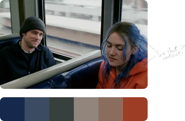
If you look only at the color palette below the image, you may notice how pale all those colors are. There's nothing too interesting about them. That deep blue is particularly boring, and if you saw that muddy orange on a piece of clothing I don't think you'd run shouting "take my money!"🙋... But if you view them together as used in the frame, they transform. Because colors come alive in relation to others. It's the context that determines how a color really looks. See how that blue starts to pop on Kate Winslet's hair? Because it's put next to a strong complementary hue that appears on her jacket. By this it creates great color contrast that draws your vision 👀.
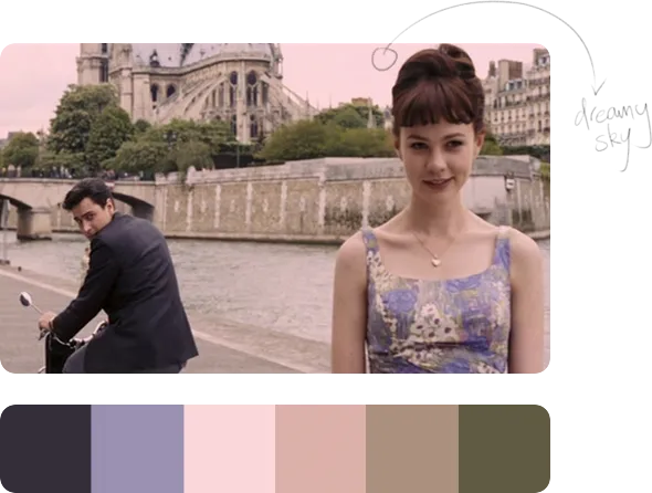
In UI, choosing the right background color is crucial, because it sets the foundation of your lighting, which will later determine how certain objects behave in that lighting scenario. It affects how long or short your shadows may be, or how strong or soft they are. Look at that creamy pink sky on the frame, and notice how dreamy the whole image becomes because of it.
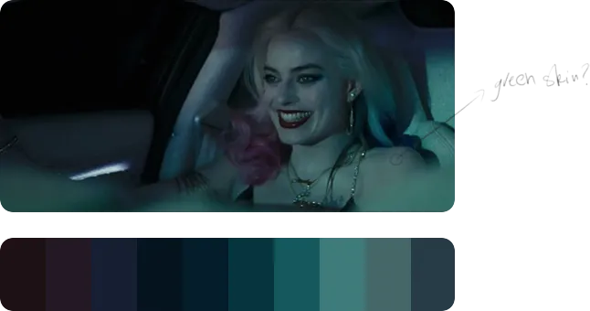
By now you could have noticed that many of these frames always have a dominant color as their main hue, which is often accompanied by an accent color. The orange-tiel complementary combo is Hollywood's favorite, but this example is fortunately quite different. Does pale-green sound like a natural skin color? Didn't think so, that's partly why this frame looks so twisted and evil, (of course, the makeup is there to help, too). All these small details and variations in hues are subconsciously perceived by our brains, and then are associated to something you've seen previously (past experience), or either stored as a new visual anchor (present experience).
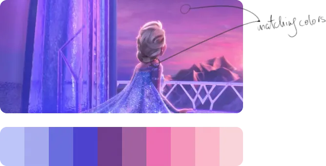
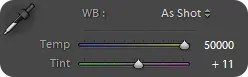
Elsa's skin color here almost matches the purple-pink sky, but somehow it still looks natural. This has to do a lot with bounce light and white-balance, which determines how cold or warm certain tones can be, and how much magenta or green is infused.
By now you can see that color can be a powerful tool that you can use throughout your work. Either to create logical differentiations between objects / data sets, create an overall mood, or draw users' attention.
In the end, I believe that our job as designers is to have a general understanding of how color psychology works in a specific culture. Then make decisions regarding color respectively, so that the associations to those help the understanding of our digital product.
Let's see some practical examples:

- Red: mainly associated with stop signs, errors, warnings, restrictions, NO, keep out
- Yellow: alerts, highlights, semi-friendly notifications
- Green: allowance, successful requests, YES, GO, good, friendly
These are so strongly tied in our brains - no wonder that these are the colors of traffic lights, which set up a crucial navigational rule - that if you mix these up you can cause some serious confusion.
Let's talk UI
The most obvious ways you differentiate certain elements on a UI can be based on:
- size
- position / relative distance
- color (brightness, hue, transparency)
- pattern / texture (if applied)
- alignment / orientation
- shape (if not text)
This way we can achieve a so called "styling" that can help create logical groupings.
I will show you a few examples of different buttons:
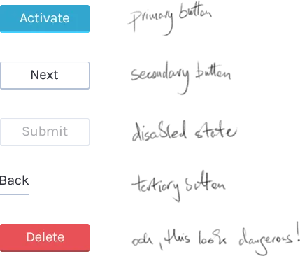
There are two ways these styling attributes can affect how we interpret certain objects:
- relative understanding: Based on what objects are already seen, so we can make easy comparisons.
- past experience: When there are not enough reference points, then differentiation is harder, because we have to rely on things we've seen previously, and compare the elements we see to those in our heads.
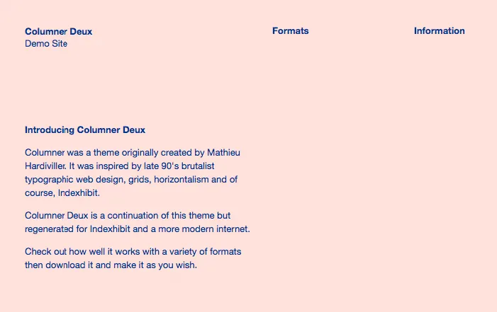
This site for example doesn't really help you differentiate between buttons, titles, basic text, or menus:
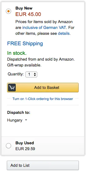
Although your attention will not really miss Amazon's yellow button:
These examples only scratch the surface of the deep topic about affordance, but I wouldn't like to go into detail in this article, but if you're interested, you could start off here.
Physical References
The shortest way we can understand digital interfaces is by connecting previously seen visual references -those from the real world- to certain interactions. This way our brain easily recalls the memory of how something works, which automatically creates an expectation towards a future event.
You can see a lot of these examples if you take a careful look at the iconography of softwares/sites.
The floppy disk was used as a primary tool to archive files, so it became the primary icon for saving things on the computer.
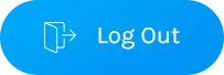
Recognise this?

The icon on the log out button below actually refers to the action of exiting through a door, so you can easily guess what it does if you press it.
Few more examples that are drawn from physical references:
- iBooks with its shelf layout and the flipping pages
- stop signs for blocking buttons
- knob controls for audio EQ-s
- phones for call buttons
- speakers for audio settings
- etc, you get the idea... 🙄
Of course digital interfaces can be a lot different and a lot more complex than real life interactions, so we can't and we shouldn't overuse them- or we'll end up in skeumorph reality 😱 - but they can definitely help us out when we're presented with a UI for the first time.
Constraints are your friends
Your digital product / website in many cases serves as a tool for something. I believe you're familiar with the famous Maslow anecdote: "if all you have is a hammer, everything looks like a nail". This saying explains the "law of the instrument" very well, because it extremely well illustrates how a tool can constrain one's behaviour.
But let's turn this around, rather than seeing this as a negative factor, we can use it to our advantage, too. If you manage to design your product in a way that its limitations lead your user on a desired path - without the trouble of thinking -, you're really doing a good job. I don't think constraints make you feel trapped. Instead they liberate you from the endless number of options that you could think about when making decisions even on a UI.
But how can you measure or create constraint?
- by the levels of navigation throughout the information architecture
- by the number of interaction types
- by the number of interactions used for a specific "user story"
- by the number of object types on a layout
- by the number of objects on a layout
- and by many more, I guess...
Usually the less of these, the better.
This should help you get a good start in designing your digital product in a way that will please your users, or at least, not annoy them.
So you can help achieve navigational clarity throughout a UI, if you know why you chose certain types of interaction patterns and how they guide people through the main user journey of the product.
Summary
When constructing a UI, you should consider:
- navigational clarity
- the correct use of color psychology
- the basic principles of visual perception
- logical visual hierarchy and clarity
- the primary objective/job that your digital tool is used for (and context)
- color theory
These things will all affect how efficiently you'll be able to drive user behaviour, so you have to be mindful about them.
I hope this article helped you lay down the basics of how we at our UX company use visual cues. If you found it useful, you may share it with your peers, and if you have any questions, ask away👇 !