Users running in circles - Lost in the labyrinth of a website

This case study is going to show you how quantitative user research can guide UI design and spare you massive amounts of drop-offs.
Bankmonitor is an online calculator helping users to compare loan offers of different banks. Some banks hate it, because it makes the choice so transparent that it is impossible to win customers with sub-standard offers.
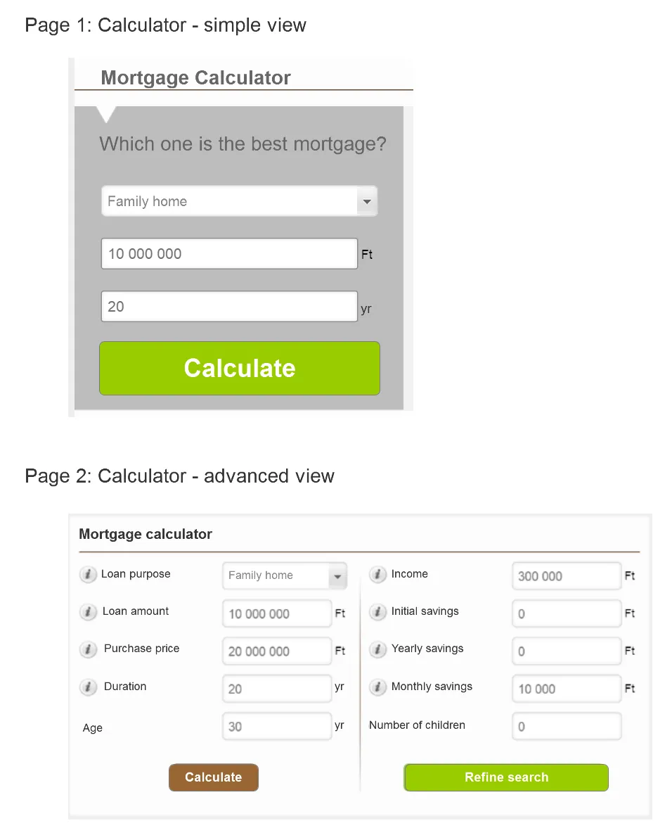
The loan calculator worked in the following way:
1) users arrived from organic search to page1 where they could fill out a simple calculator form to get some initial results: top loan offers.
2) they arrived at the results page (page2). At the top of the results page there was a more advanced calculator in case the user wants to fine tune their search.

Discovering the hidden loop, where users are leaking.

In Google Analytics' User Flows we noticed that users were going back and forth between Page1 and Page2, and there was a considerable drop-off in the process.

Our UX company did a couple of user tests to follow-up on the issue. It turned out that the calculator on Page2 looked so different from the calculator on Page1 that users simply thought it was something else, not a more advanced calculator. They didn't take a second look. As a result, whenever they wanted to refine their search, they went back to Page1 and resubmitted it.
In the new design we merged Page1 and Page2. A simple calculator was readily available at the top and advanced features hidden under a link. There were no two calculators anymore, only one.

Follow us on facebook where we share more case studies and great ideas!


