3 steps of a look and feel design process: giving character to the application

Imagine that you are about to create a product, so you decide to give it a cool design. How do you start? A popular method is to start with a look and feel phase, in which the product will gain its style.
What does look and feel mean in design?
While creating a look and feel design, we display a visual representation of the mood of the interface before actually working out the details. This is just one part of the whole design process, based on exploration and discovery, but it’s the one that will make you fall in love with your product.
Sounds pretty nice, right? If you now think that it’s almost impossible to create the perfect look and feel for your product, I have to tell you something: it’s actually not as big of a deal as you might think.
The basics of look and feel
We at UX studio have our tried and tested methods for creating look and feels to which our clients usually say 'yes, that's exactly what I wanted' - maybe they could just not express it in words.
Okay, but how does the magic happen? Well, first of all, we have to look around, searching for good examples of products' looks. When we already have something in our hands and start to create looks and feels, we also have to try a number of alternatives. Of course, talking about our ideas and their plausibility is also a key part of the look and feel process. It requires many steps and attempts to finally outline the real character of an application and thus have a great design that attracts the eye.
So, turning back to the magic part, we can talk about 3+1 steps that the look and feel phase consists of. In the following lines you can read about how we do this at UX studio.
Look and feel process
Step 1 - Preparation
So to start the look and feel process, first we need to talk. Yes, this very visual design work starts with talking. A lot of it. Creating the best design-mood requires this, so this way we can clarify what we wish to achieve.
The easiest and most effective way to do this is organizing a few-hour long workshop, during which we can talk through the design in great detail. It’s crucial that each and every business leader is present, since they have the most thorough knowledge about the product and the target group.
We can choose the exact ways of getting all the information we need during the workshops, but we have to make sure that some things will be talked through.
Things to be discussed:
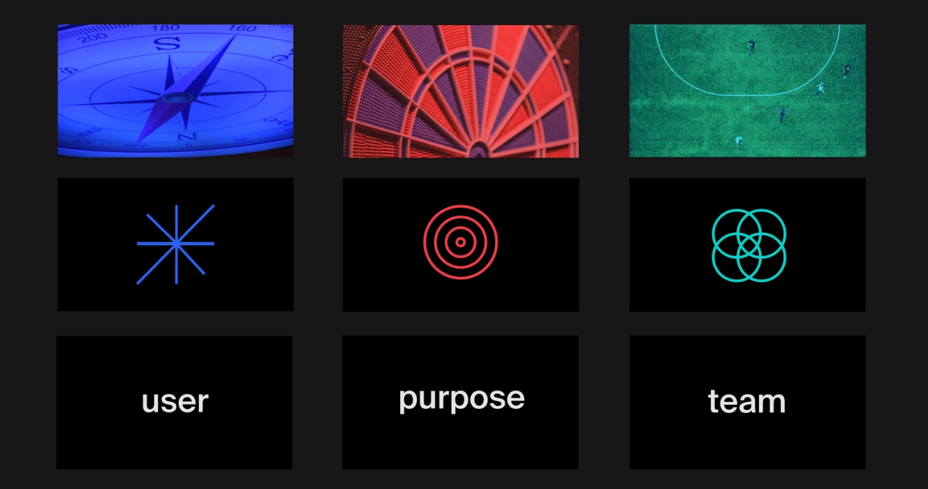
1. Values and style
Discussion on the target values (e.g. reliability, freshness, transparency) and style (e.g. modern, youthful, colorful) of the product. Having a clear idea about these things can give us a certain path which we can follow through our whole look and feel process.
2. Available screens and assets
We have to ask our clients if there are any existing design assets and screens, so we can keep these elements in mind, too. The existing and the new parts must be compatible with each other (e.g. the ongoing creation of the interface must be consistent with the existing screens; the functioning of each screen needs comparison, etc.)
3. Competitors
Checking out our rivals and discussing what we see agreeable and what we see avoidable in them. We like to ask our clients to show us interfaces they like, so we can clearly see what is the desired mood or style. It’s always better to actually see them with our eyes than trying to figure it out based on words: they might be the right words, but still there is too much space for misunderstandings and it is also more time consuming.
Step 2 - Gaining inspiration
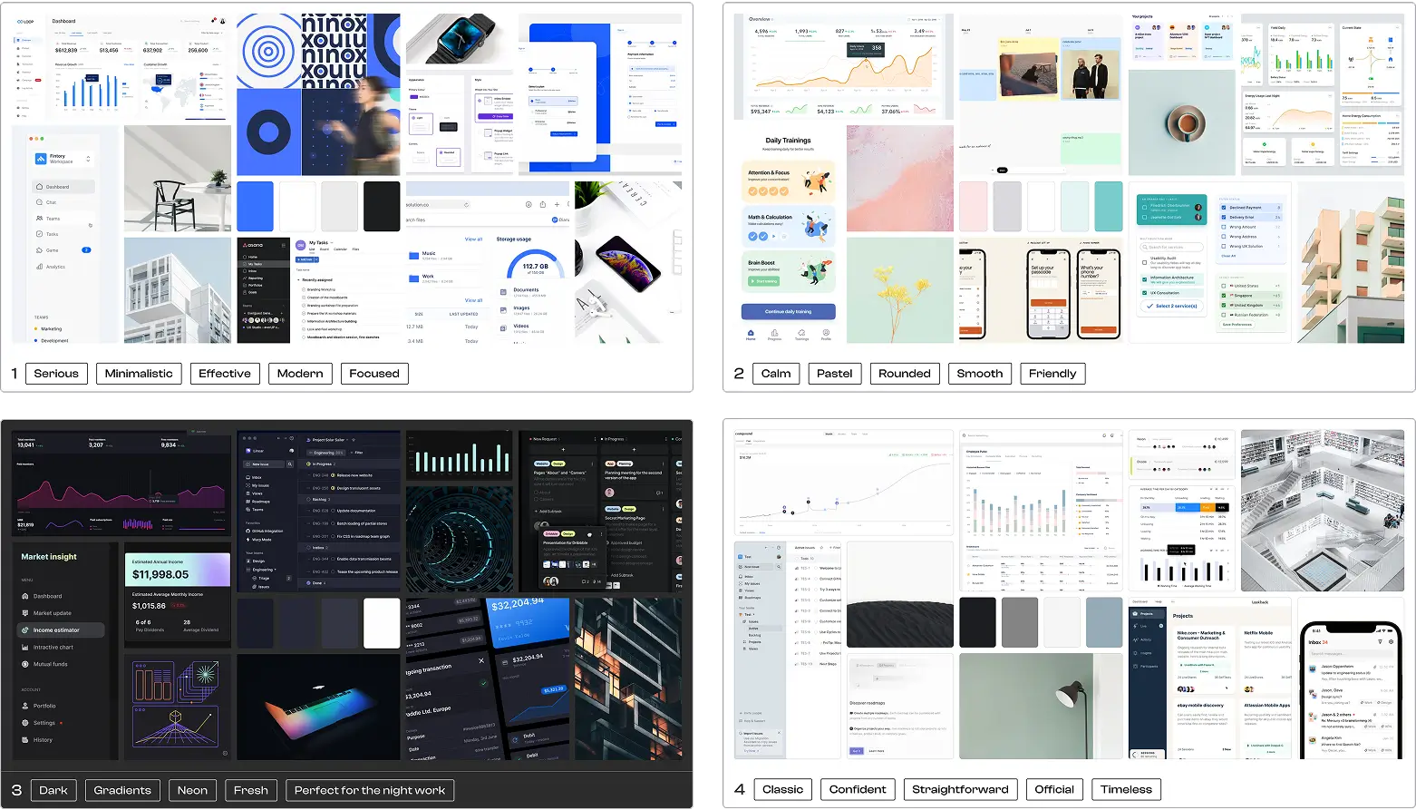
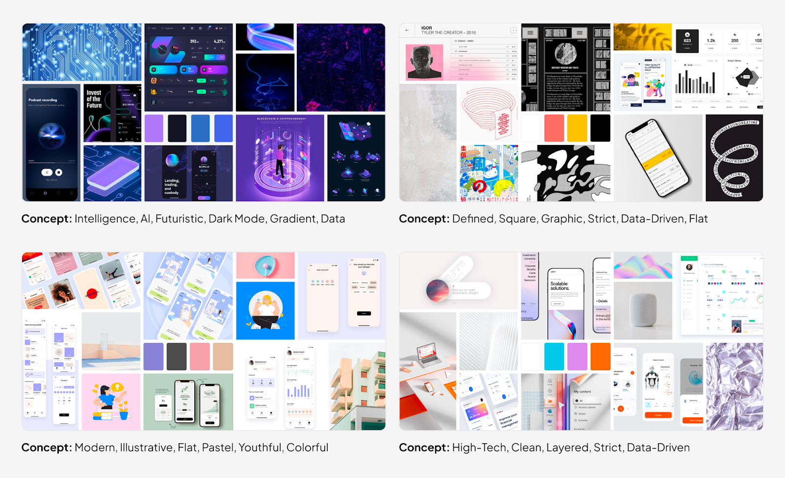
The designers' next task is to do some research. It’s necessary to find material that fits what has previously been discussed and can be a source of inspiration for designing the interfaces. Rival websites, other software interfaces, UX trends, for example, can all serve as resources for the look and feels. It’s useful to walk with eyes wide open, collecting plans for our interface, elements of user interfaces (buttons, form elements, menus, etc.), font types, icons and photos. All these can be laid out in one image, the moodboard.
By using moodboards, one can immediately see the imagined mood and look. We at UX studio like to create many of them: it’s not just useful, but a lot of fun. Check out these examples we made for a healthtech app!
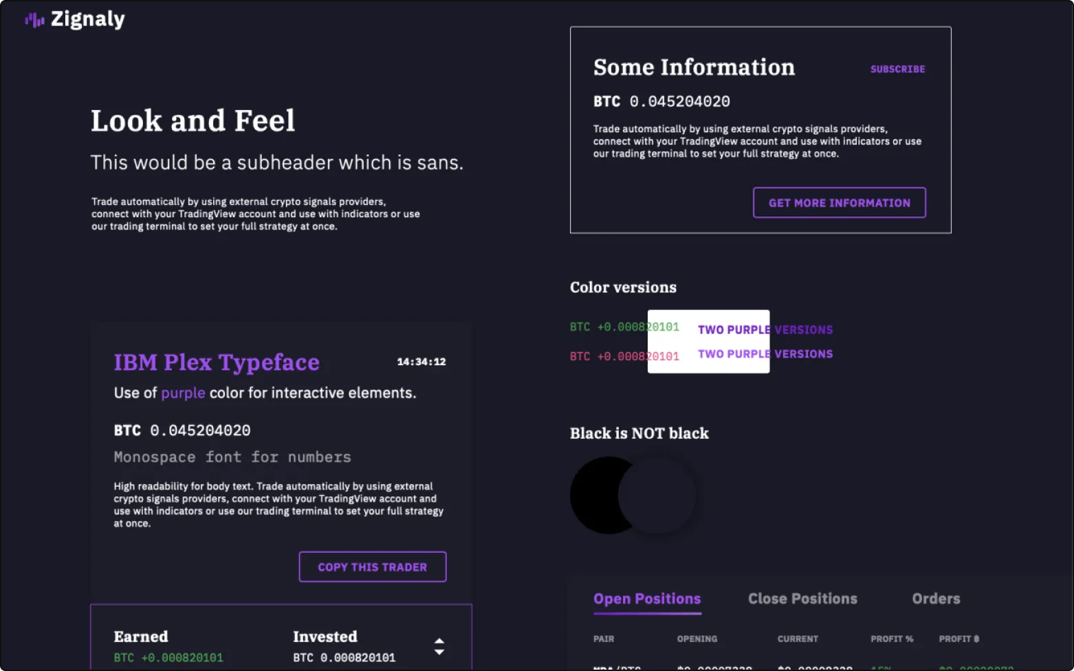
Step 3 - The actual Look and Feel design
After being done with the research, we choose a typical screen that can serve as the homepage to our website, or as one of the most important screens to our software. We create a bunch of colorful sketches for this screen, all with a slightly different atmosphere.
In the period of gaining inspiration, we (hopefully) have gotten closer to the desired character, so now we are just looking at slightly different faces of this character in a particular product.
Each version of the look and feel designs might differ in colour, shapes, font types or icon toolbar. Also, we often create at least one dark and one light design as well, so our clients can decide easier which kind of look they want to have as default for their products. Let’s see some more examples.
Look and Feel Examples
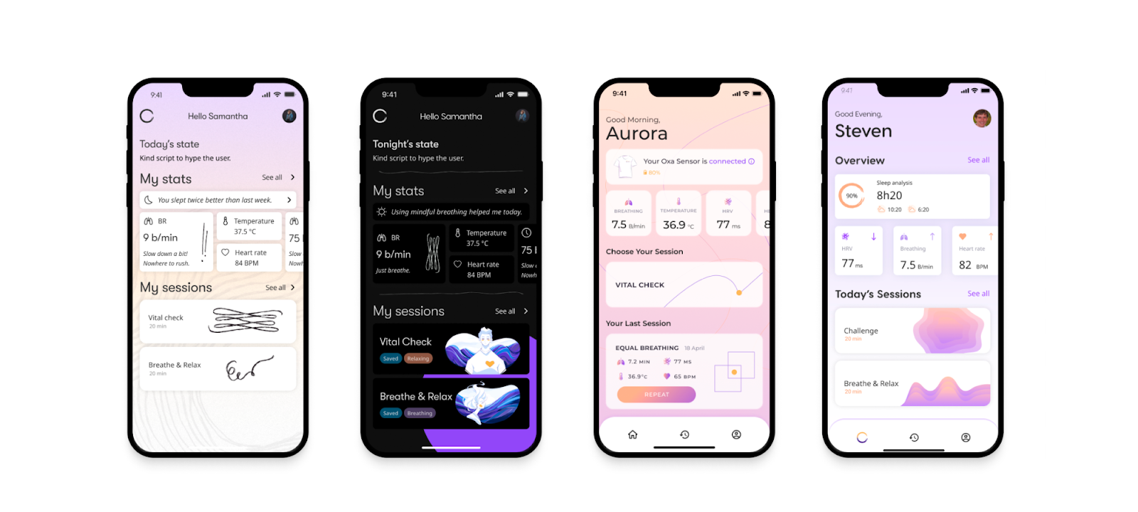
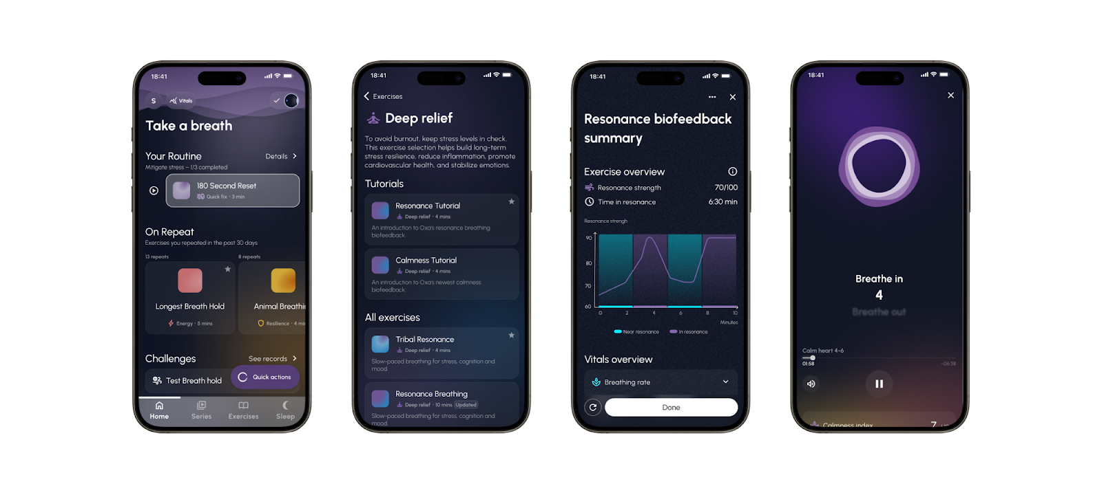
For our work with a healthtech client, Oxa, we created 4 different screens based on the previous moodboards
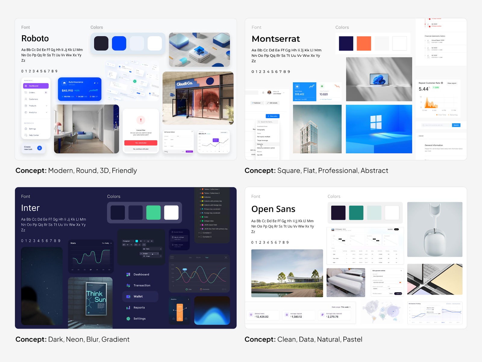
For this insurance client, we also created 4 different moodboards, and after the client selected one of them, we moved to the Look and Feel design.
What kind of feedback does the designer need in the Look and Feel process?
Design is not a ‘lone wolf’ kind of work: there is a constant need for feedback after the different phases, namely after gaining inspiration and look and feel in the design phase as well.
First, we need to discuss whether the values settled during early discussions are presented well enough in the plans. Afterwards, we have to choose from the different versions, knowing exactly why we chose that particular one. We can always combine different versions, if we like something in one and something else in another. In fact, that's the goal of the feedback: to be able to shape the look and feel for the client's wants as much as possible.
Secondly, we can also discuss details to a certain extent, but there is no point in going into extensive discussions about them: this is a phase of working out details, so there will be plenty of time for discussion when the look and feels are already finalized.
During the look and feel process, it’s easier to communicate through images and examples than through words. When the client sends a website or an image to us instead of trying to verbalize the feedback, ask good follow-up questions and pay attention to understand their needs and avoid misunderstandings.
Look and Feel design is not rocket science
So, after reading this article, you can see that the look and feel design process is not really rocket science: there are methods that help us in the development of the mood and character of the application well before working out the design in detail.
Creating look and feel designs are necessary, and following these few steps, so preparing, gaining inspiration, creating the actual look and feels and giving feedback, they can be easily done. So why not do it for your product? - it will definitely pay off. Want to read about the product design process? We are constantly sharing our thoughts and design tricks on this blog that help developers in creating applications. If you need expert help with your app, consider our UX consulting services.
Credits: This blog post was written by Bence Vass and updated by Ana Pérez Cajus, UX designer. Editing by Dr. Johanna Székelyhidi, marketing manager.