Logo design in 2026: what are the latest trends
Behind every memorable logo is a story: told through color, shape, and type. It's the cornerstone of a brand's identity, connecting businesses to their audiences. Find out how 2026 logo design is redefining visual trends and why keeping your branding fresh matters more than ever.
.png)
So, what defines a well-designed logo? As Joan Costa emphasizes, a good logo is a visual representation of a company’s core essence and values. It should be instantly recognizable, unique, and effective in communicating the brand’s personality and values. Consistency is also key: supporting a logo with cohesive visual communication across different media builds familiarity and strengthens the brand-audience relationship.
We've looked into cutting-edge design sources and emerging case studies to uncover the top logo design trends of 2026. These modern logo design trends reflect a world increasingly defined by dynamic technology, ethical consciousness, and personalized experiences.
Logo trends 2026
1. Dynamic and adaptive logos
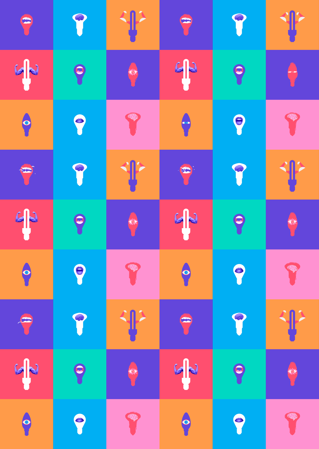
Dynamic and adaptive logos are now a necessary feature, allowing a logo to change its color, shape, or composition to suit its context: from a tiny app icon to a large billboard, or even based on the user's location or time of day. This movement is an essential component of the latest UI trends that prioritize responsive design and fluid micro-interactions.
This trend is a direct response to the proliferation of digital devices and environments. A logo must work seamlessly as an animated transition, a compressed favicon, or a full-scale brand mark. Current logo trends prioritize motion and fluidity to maintain visual interest and tell a story in micro-moments.

2. AI-enhanced & generative branding
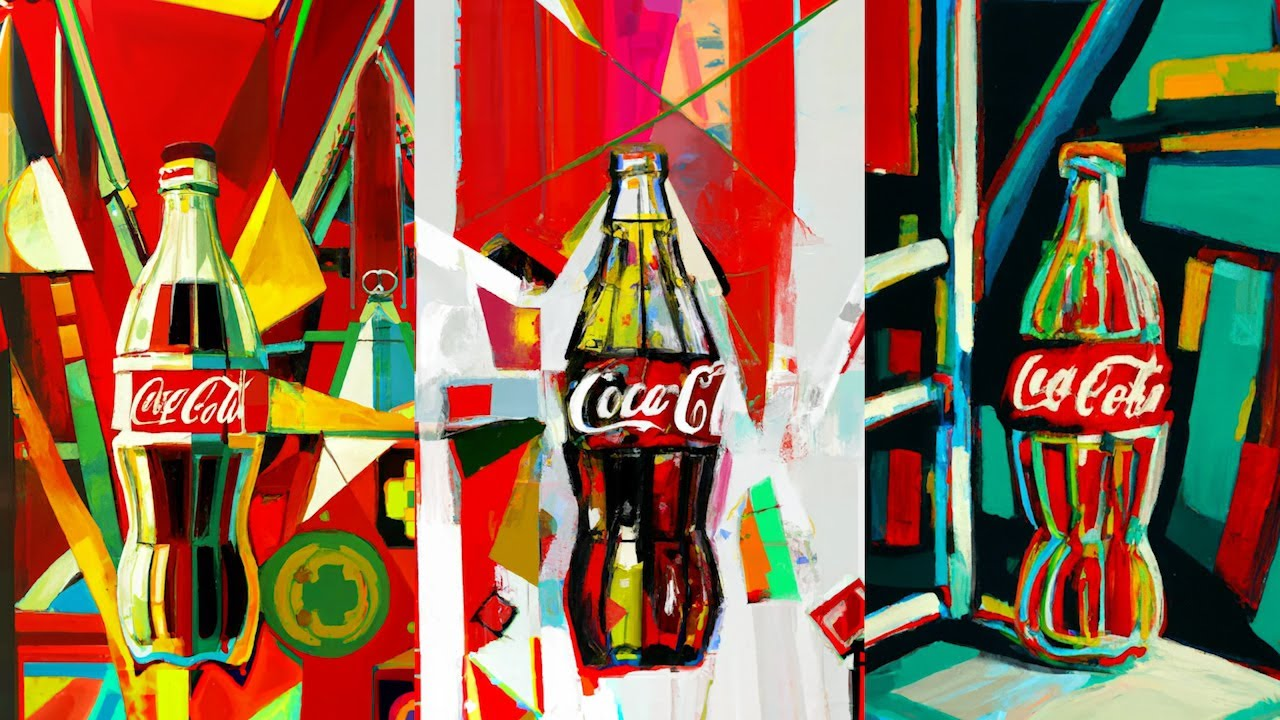
The rapid advancement of AI has introduced one of the most significant logo trends for 2026: the integration of generative AI as a creative partner. AI tools are being used by designers to rapidly produce endless variations, patterns, and textures that adhere to a brand’s core guidelines. This shift is primarily driven by emerging tech trends in artificial intelligence and machine learning, fundamentally changing the creative workflow.
This trend allows for true generative branding, systems where the logo's supporting assets (patterns, background textures, color combinations) are algorithmically created, ensuring hyper-personalization for every customer while maintaining brand consistency.

3. Neo-minimalism
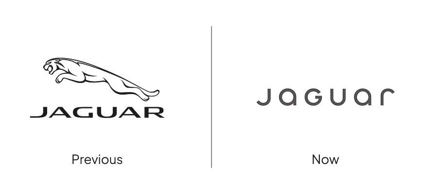
Minimalism is one of the longest-standing design trends, and it’s still in vogue for 2026, but it has evolved. Neo-Minimalism (or Minimalism 3.0) is a pivot away from stark, cold simplicity toward designs that achieve clarity with added nuance and warmth. This new aesthetic is crucial for effective UX trends, as it aims to reduce cognitive load and build user trust through authentic, non-intrusive visuals.
This new aesthetic achieves "emotional clarity" by incorporating subtle gradients with muted yet warm color palettes as part of strategic color use in design.

There’s also an emerging preference for softer lines to make the logo feel more approachable, and less corporate, with generous white space to emphasize intentional detail.
4. Hyper-expressive typography
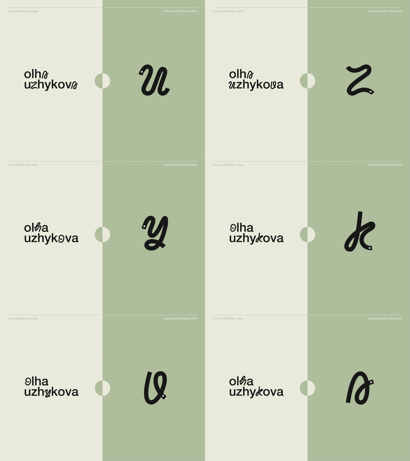
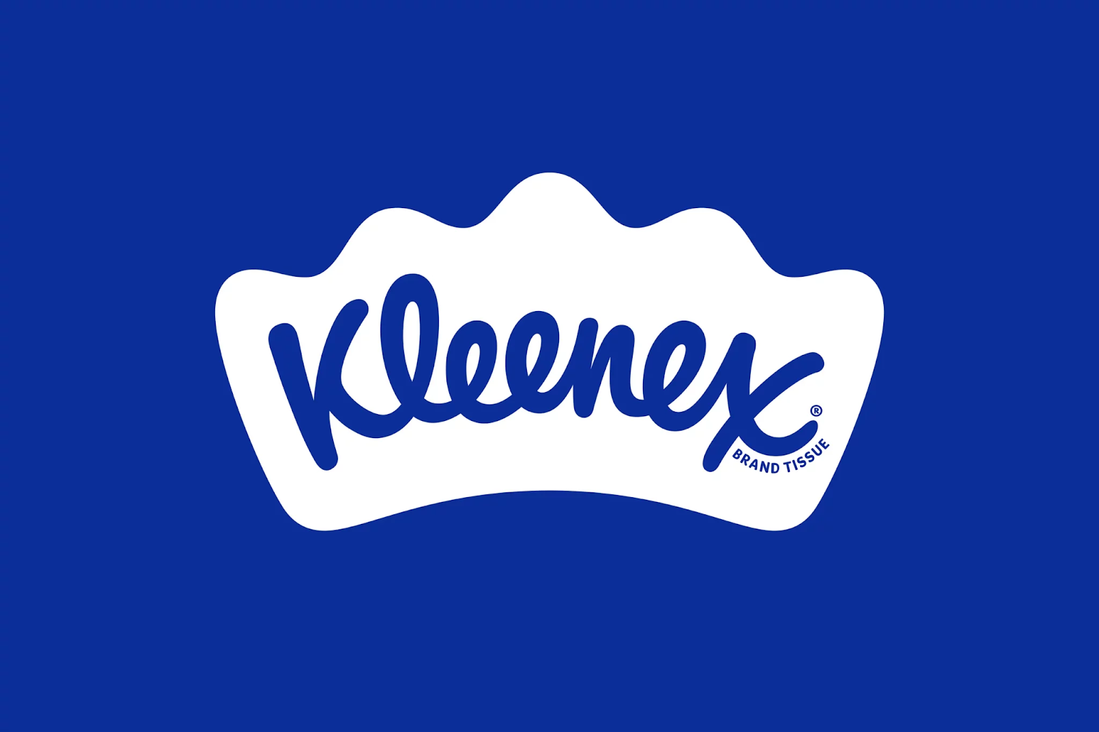
This trend elevates the wordmark (or brand name) into the primary visual mark. For 2026 logo design, designers are using custom lettering, variable fonts, and intervention techniques to give the type a personality boost.
Designers make the text stand out through exaggerated strokes, playful ligatures, uneven baselines, or tight kerning that packs a punch. It’s a rebellion against generic sans-serif fonts, favoring artistic typography that conveys the brand’s voice before the customer even reads the name. This approach is highly distinctive and memorable, but may not suit B2B enterprises.
5. Retro-futurism
Nostalgia remains a powerful source of inspiration, but it has been filtered through a digital lens in 2026. Retro-futurism blends the retro design of the past with modern and clean design execution, borrowing from the aesthetics of the 70s, 80s, 90s, and Y2K.
This trend is characterized by bold neon colors, high-contrast palettes, vintage-inspired sci-fi typography, and metallic or glass-like textures. It maintains clean lines and strong composition, celebrating the fun, optimistic futurism of the past while using contemporary design precision.

6. Sustainable & neuro-inclusive design
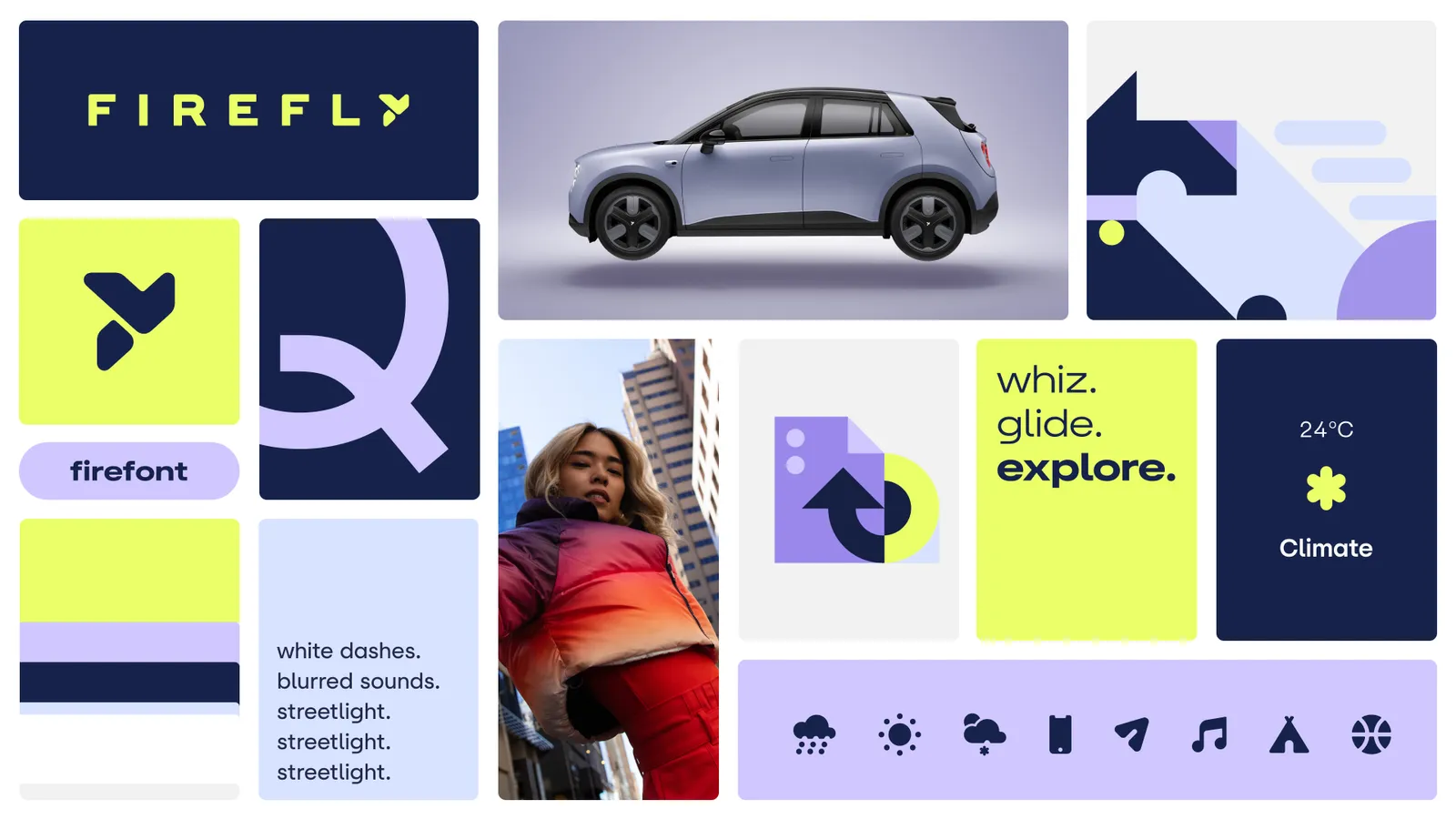
As ethical responsibility becomes central to branding, the most important modern logo design trends are rooted in social consciousness. This trend focuses on two key pillars: sustainability and inclusivity.
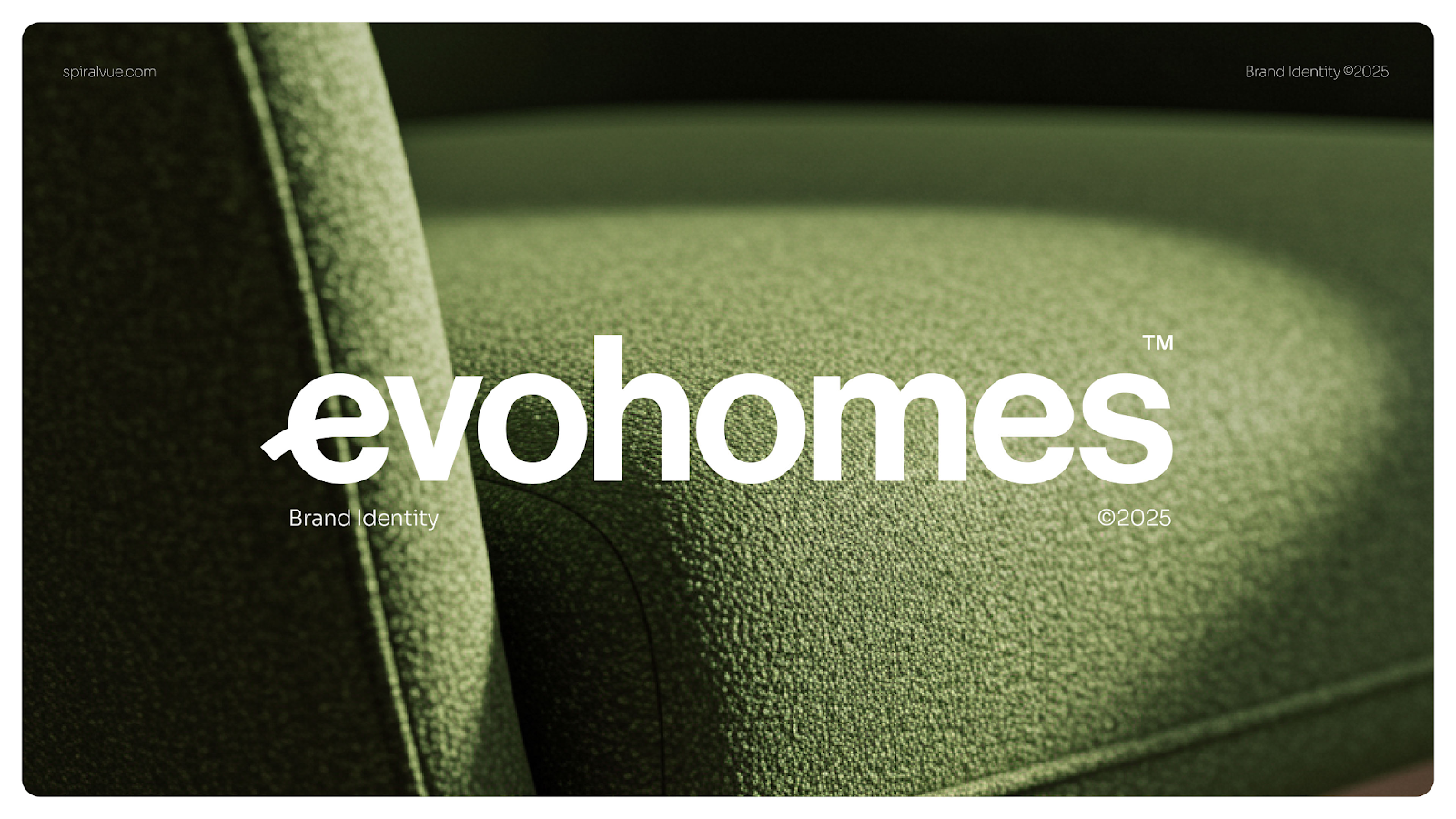
Sustainability evokes nature through the use of earthy palettes, organic textures, and nature-inspired geometry, but what’s more important is the adoption of sustainable design practices, from reducing the digital carbon footprint of design to establishing environmentally friendly design communities.
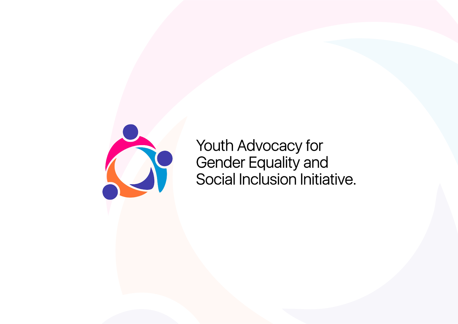
Neuro-inclusive design specifically addresses accessibility far beyond basic compliance. It advocates for logos that are low-sensory, utilize high-contrast color pairings for maximum visibility, and feature clear, simple iconography that reduces cognitive load, making the brand welcoming to all audiences.
Final thoughts
The first point to emphasize is that while a logo is often the quickest way to identify and represent a brand, it’s just one component of a larger strategy. Effective branding involves a thoughtful approach to all aspects of communication, integrating not just graphic design, but also marketing, public relations, customer experience, sales strategy, and research, among others.
A logo that is versatile, adaptable to different media, and capable of evolving over time can significantly enhance your brand's communication. It’s a comprehensive effort to convey a consistent message.
While trends may shift, one element should always remain timeless: the creativity to design a logo that is simple, memorable, versatile, and, above all, perfectly aligned with your brand’s essence.
At UX studio, we're always considering brand personas and ensuring that the logo reflects what a business does and resonates with its target audience. So, while logo trends may come and go, following this seven-step recipe will definitely set you on the right path for creating an effective logo:
- Is your logo distinctive?
- Is your logo visible?
- Is your logo adaptable?
- Is your logo memorable?
- Is your logo universal?
- Is your logo timeless?
- And ultimately… is your logo simple?
+1: If you want to dive deeper into what makes a logo, try playing around with this logo integrity experiment created by Jim Nielsen.

Credits
This blog post was written by: Agostina Marmai, UX designer
Fact-checked by: Gabor Szabo, UX designer
Edited by: Johanna Székelyhidi, marketing manager


