The 7 Commandments Of Designing Drag And Drop Interfaces


You would expect that in the era of JQuery, the construction of a drag and drop interface is a piece of cake. A little while back, we have been testing the drag and drop interface of a number of applications; namely, the interfaces of MiniCRM, Brickflow and Protopmail. We had some surprising results.
The more detailed the interactions are the more we have to work with it; still, it is easier for the users to handle the application and that being so they will return to use it.
Based on our experience back when we started out, most of our Hungarian test users of the above apps have never met with the drag and drop solution on the web, hence they find it hard to efficiently handle it. The situation is better in the West, yet even in the American market the following seven conditions need to be taken into account in the planning phase.
What is a drag and drop interface?
By the official definition, "on graphical user interfaces, drag and drop is a pointing device gesture in which the user selects a virtual object by "grabbing" it and dragging it to a different location or onto another virtual object."It's an interaction that is intended to be simple for users as it imitates physical movement. We UX Designers like playing with the concept but there are certain bottlenecks that might occur, and you really need to think through user flows and options.
In this article, I decided to gather the 7 key points when it comes to designing drag and drop interfaces. These are as follows:
- Drag and drop tangibility should be immediately visible
- Decide: hover or hand cursor?
- Define short and long clicks
- Illustrating movement: drag and move
- Landing area: where can I place my object?
- The moment of dropping the item
- Have a clearly visible palette
1. Drag and drop tangibility should be immediately visible
The moveable objects have to indicate their tangibility, even when there is no actual interaction.
The classic method to indicate this has long has been in use as the knurled surface.
Two examples of indicating the drag and drop interface:

2. Decide: hover or hand cursor?
When I as a user bring the cursor above the tangible object, I should get a repeated confirmation of that I can uplift it.
Partly, it is practical to use some kind of hover effect (e.g. a more vivid color), but the appearance of a distinctive cursor plainly connected to the drag and drop interface is important as well.

The hand cursor has the advantage over the hover cursor, because there is a difference between hover and drag mode, so the user gets a feedback when dragging the given object. No wonder we suggest using the hand cursor.
3. Define short and long clicks
Regardless of how well the drag and drop interface is designed – with visible tangibility, hover effect and cursor – most of the users become uncertain when first running across the drag and drop interface.
Most commonly, the users’ first move is a tentative attempt to see what happens if trying a click.
With continuous testing, we’ve pinpointed two types of users: one who does one quick click (short click), and one who holds the mouse button for long (long click). Most of the users do either of the above before actually starting to move the objects.
The problem is that the greater bulk of latest JavaScripts don’t deal with the above cases: nothing happens when doing a short click, and long click is only effective when actually moving the mouse, which most of the users are not likely to do at first.
So, our great task is to deal with these two cases:
- when doing a short click, the object must budge and then drop back to its place instantly
- when doing a long click, the object must move without actually moving the cursor and remain in its new position

4. Illustrating movement: thedrag event
When we start moving something, the position of the object changes matching the position of the cursor. Thus, there is a budge at the beginning of moving (right after clicking), which evokes a feeling of ascent. Later on, the object just follows the route of the cursor.
A common convention is to make the moving object transparent. It is also important to create a stylised miniature equivalent for the moving period, given that the original object is too big and hence moving is complicated.
5. Landing area: where can I place my object?
It is important that the user sees where they can place the raised object.
It is often difficult to reach the given place, because by moving the mouse the landing area is constantly switching places. This mainly happens when there are many smaller objects next to each other.
On this occasion, the user only sees the annoying flashing. It is easy to pull the plug on this feeling, if we make the time to set the borders of the different places.
Let's look at this example? Is it straightforward (without speaking this language) where you as the user are supposed to place this item, and what will happen when you do so?

6. The drop event
When we drop the object, it just slides to place and take its final form. If the UX-ers did a good job, the whole thing will be over in a moment: the moment when we reap the fruit of our labor.
Small animations and sounds can comfort the user tremendously.
Here, you can see some examples of great drag and drop solutions.
7. Have a clearly visible palette
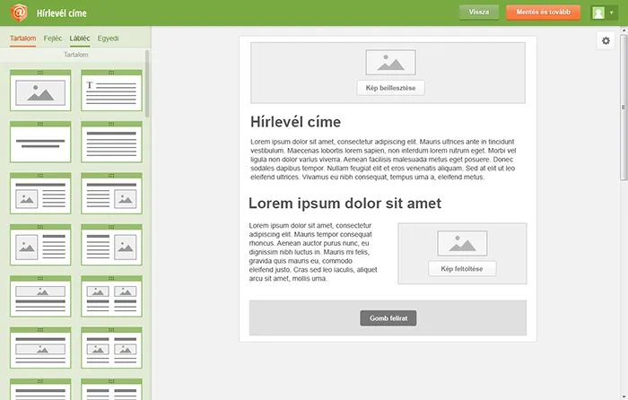
The palette is the area from which we can select the objects that we could drop in to the editor screen. Not every drag and drop application has this tool, but in the case one has it, the clear visibility of the connection between palette and editor interface is extremely important.
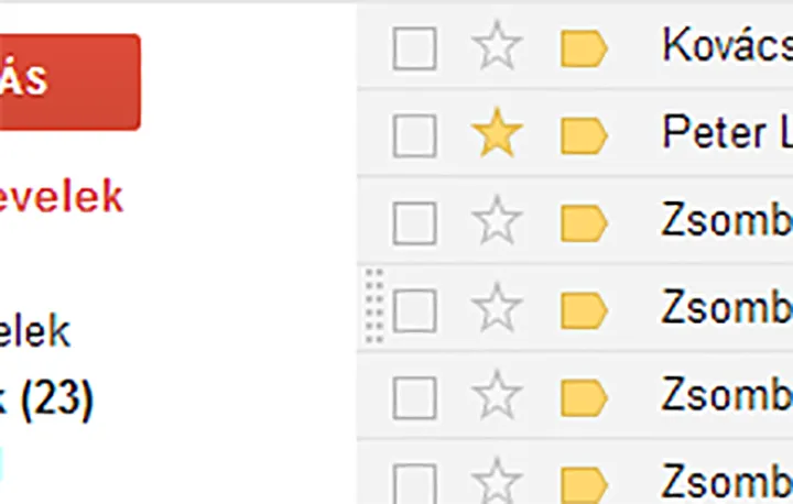
On this interface, for example, most of our testers couldn’t figure out that objects from the right column can be dragged to the left column.
On this interface, it is easier to differentiate between the column on the left side and the editor column on the right side:
Most of the pictures above are from our new design for Protopmail. It is clear that we need to design the form and functioning of seven different conditions even for an “easy” drag and drop interface.
Where to go from here?
If you haven’t done it yet, make sure to download our free ebook, a quick guide to UX and the way we work.
Did you know that our CEO David Pasztor wrote a Product Design Book last year? In the book, he describes our UX process, and through examples, he teaches the reader all the basics of UX design and research. Order it today – with free shipping to Europe and the US!