Mastering TV UX: 8+1 essential design tips and real-world examples


Imagine settling into your favorite spot on the couch, remote in hand, ready to immerse yourself in a new show. The experience should be seamless, intuitive, and enjoyable—yet, this simplicity is the result of careful design. If you have ever wondered how this is achieved, you’re at the right place: we’ll show you.
We collected 8+1 key principles that you should consider when designing for the big screen. These will include advice about how to choose the sizes of your elements and your font. We’ll show you how to place and highlight your content, as well as how to keep your designs simple and accessible for users. We’ll also tell you what to pay attention to when it comes to colors and contrast, or usability testing.
At UX Studio, we have worked together with multiple streaming giants and gained varied experience in TV design. So with each of these principles, we’ll give you hands-on tips, and show you real examples of how we solved these problems on one of the projects we worked on. Let’s jump right into it.
How users interact with the big screen
Crafting a TV user experience (UX) requires more than just replicating what works on smaller screens; it demands a deep understanding of how people engage with TV. TV viewing is mostly a passive experience, typically enjoyed in a relaxed, seated position, while smartphones, computers, and tablets offer more portability and quick access.
Another main difference is that watching TV is generally a collective experience. This is in contrast with other devices, which are typically used individually. Additionally, people tend to consume more long-form content on TV than on other devices, especially compared to smartphones.
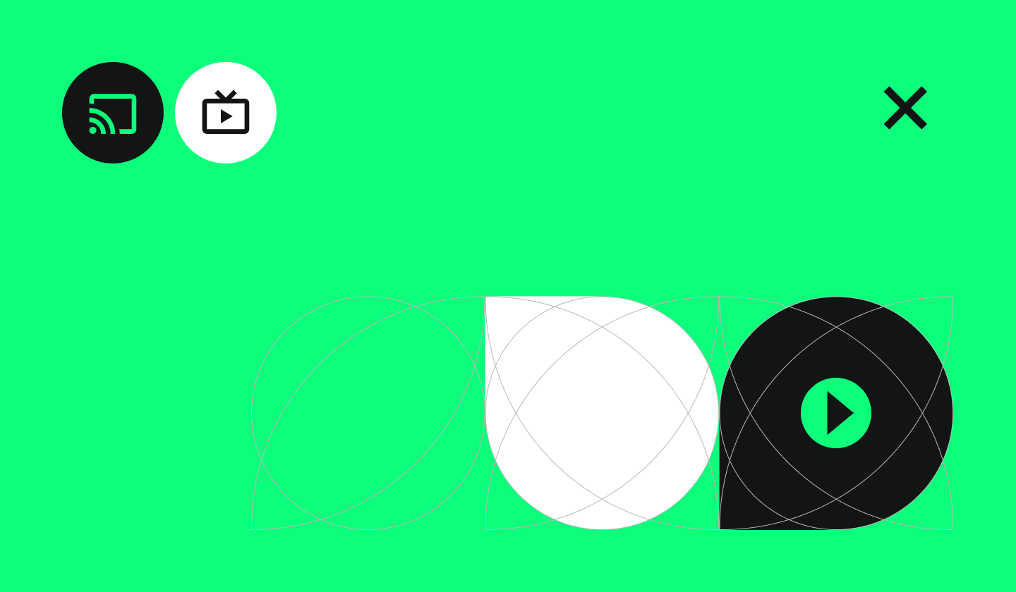
1. Pay attention to sizes and legibility
Even though TV screens are generally larger than mobile and desktop devices, people tend to view them from a greater distance, namely 3 meters (10 feet) on average. Thus, unlike mobile apps designed for close interaction, TV interfaces must be easy to understand from a distance. This will have great design implications on the size of the text and other elements.
Another thing to keep in mind about distance and legibility is the typeface you want to use. Google Android TV, Apple tvOS and Amazon Fire TV use different default system fonts. If you’re building for one specific platform, you can use its system font. Even though custom typefaces are also possible, be aware that many of them can be tough to read at a distance, especially if they’re too thin.
Generally speaking, sans serif fonts that are not too bold, yet not too thin, with a relatively high x-height (the height of a lowercase “x”) work best. If you decide to use a custom font, for example for branding or marketing purposes, make sure it’s readable from across the room. Consider pairing it with a system font or a more suitable font for ease of use.
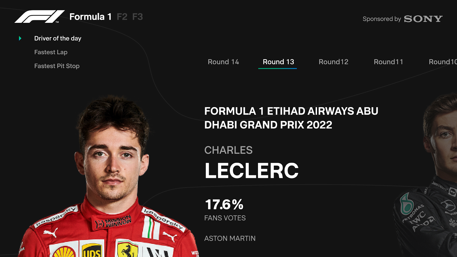
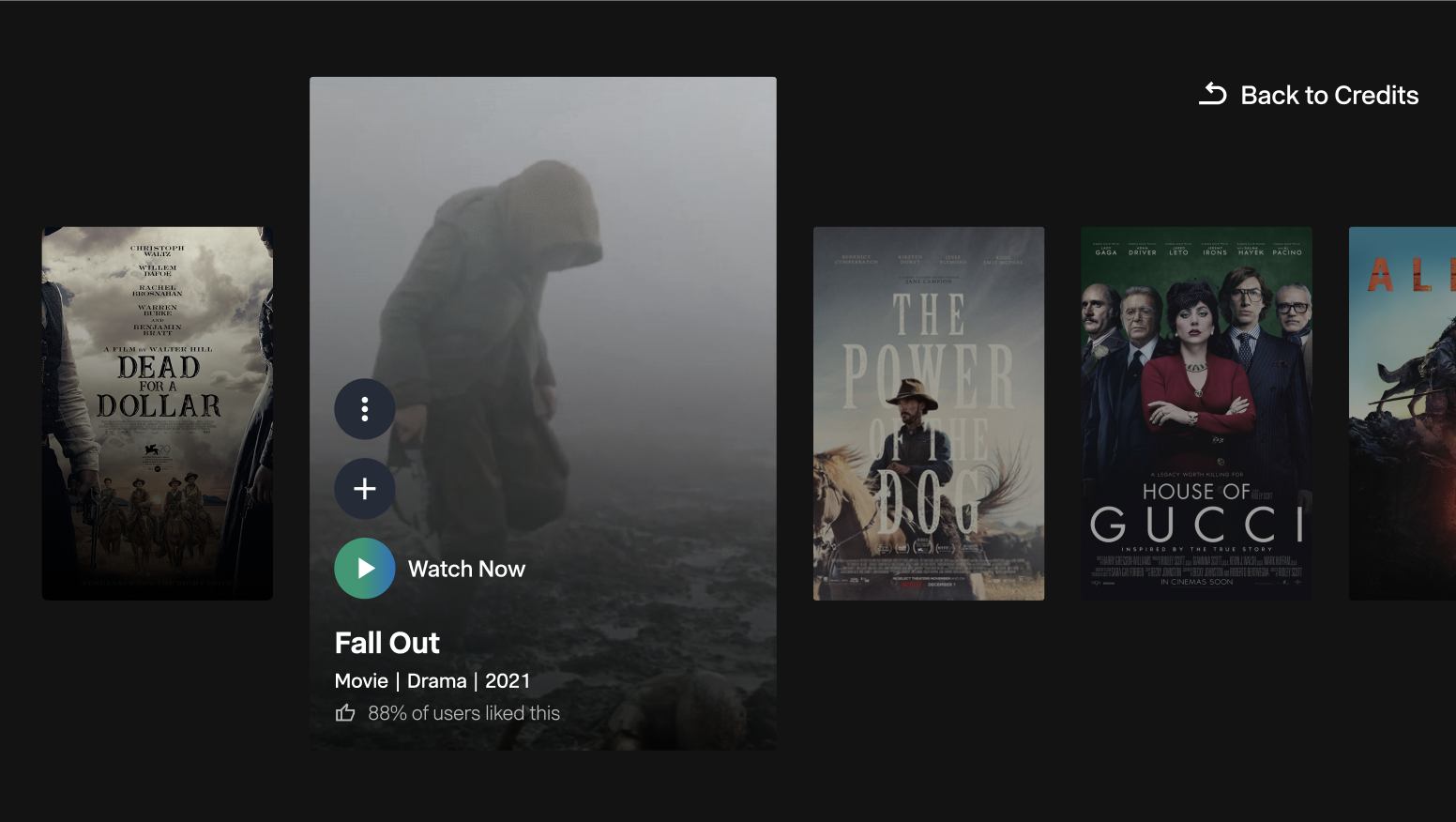
An example to follow
Let us show you an example from the project we worked on. As you can see in the picture below, we highlighted the key information and created a visual hierarchy by using different text sizes. We also made sure that all the text was legible from around 3 meters or even a bit further. We used the streaming platform’s default font which consists of thick letters that are easy to read from afar.
2. Place your content strategically
To effectively place content on a TV screen, you should know the answer to these two questions:
- Where do users look on a TV screen?
- What do overscan and safe areas mean?
Several research groups have conducted eye-tracking studies to answer the first question (see an example abstract here). Based on these, people tend to focus their gaze on the center of the TV screen. Unlike scrolling through a phone, TV viewers expect content to be available without excessive eye movement. This means prioritizing clear and concise information presentation.
The other thing you should know about is overscan. Overscan is a behavior of certain television sets where they adjust the picture size so that the picture is bigger, but the edges are cut off. To avoid this, not all TVs display content all the way to the edges of the screen. Instead, they set a certain margin where they don’t show content; the inside of those margins is called a safe area. Google Android TV, Apple tvOS and Amazon Fire TV set different safe area guidelines, but they all keep a 5% margin at least.
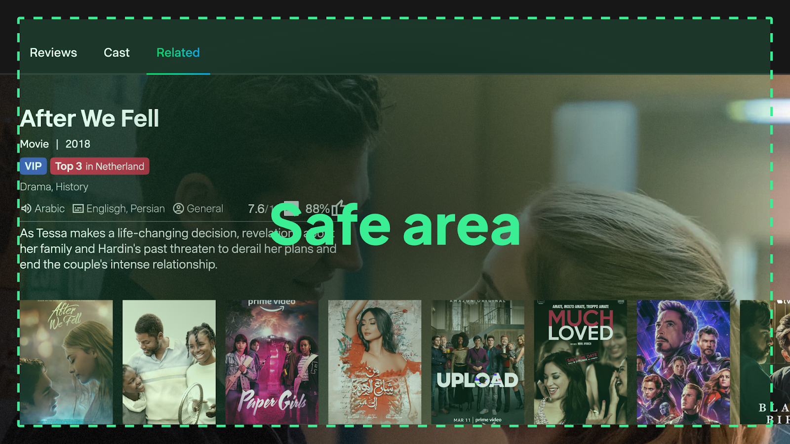
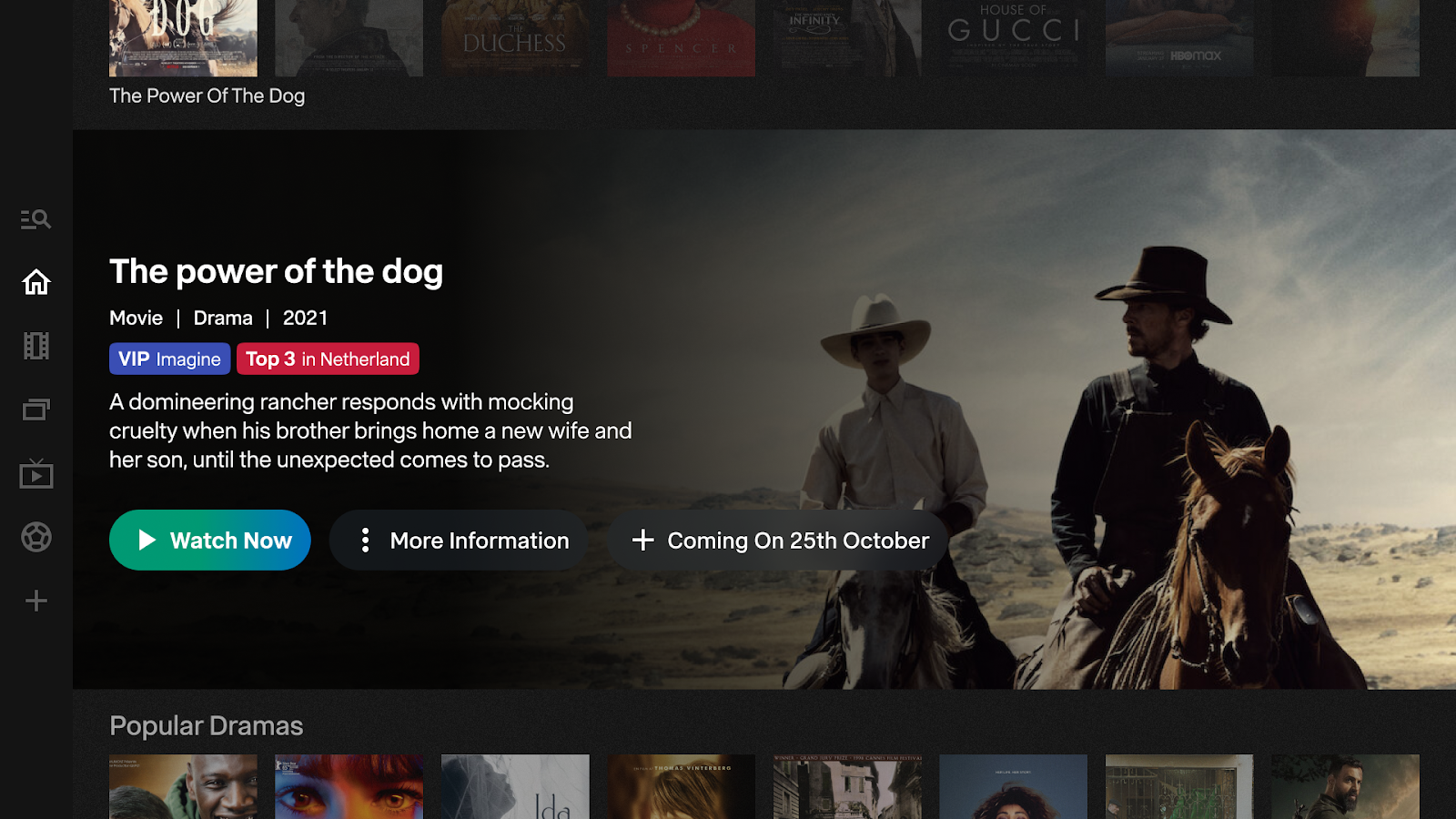
An example to follow
Here is an example from our project of effective content replacement. The main content (the information about the specific show the user selected) is placed in the center, where TV viewers tend to focus.
We also avoided putting any crucial content in the margins as illustrated in the picture. We followed the 5% guideline, as this is a 1920 x 1080 screen, our margin is 27 pixels from the top and bottom edges and 48 pixels from the right and left edges of the picture.
3. Consider different people using the same device
Another big difference compared to mobiles and PCs is that TVs are often shared household devices. This means that people of varying ages and technical abilities might use the same TV. Thus, TV apps have to be accessible and intuitive to use for a broad demographic.
Also, be aware that there are often multiple accounts set up and used on a single TV device. Therefore, special privacy measures should be considered when designing applications for TV that require personal information.
4. Optimize your interactions to TV controls
The standard remote control is typically the fundamental control for TVs. There are other unusual control devices that designers should consider: for example gamepads, dedicated apps, or alternative input devices.
Because of the nature of the remote control, complex navigations are not intuitive on a TV. Therefore, navigation should be simple and clear. Make sure that all the interactions you decide to use are optimized for remote controls. Also, try to provide instant feedback that is noticeable from afar- after each interaction.
An example to follow
As you can see in the example below, we created a simple navigation system to ensure intuitive interactions for remote control. Users can easily choose between the different channels by using the up and down arrows. We also provided additional information when the required interaction was more complex. For example, by explaining that users have to press the left button to see other categories.

5. Keep your designs as clean as possible
You should keep things simple and clean when designing for TV for several reasons.
Typically, people like to relax when they watch TV, as it’s a source of entertainment for most. Therefore, any frustration can quickly become a major annoyance. The viewing distance and the screen resolution could also hinder their ability to process a lot of information. This could all contribute to a cognitive overload if they had to handle a great amount of information all at once.
When you think about the amount of information you should display on a TV screen, it should be more similar to how you would do it on a mobile phone, rather than on a desktop. This is also why smooth and intuitive navigation is crucial. Every click or button press should be effortless.
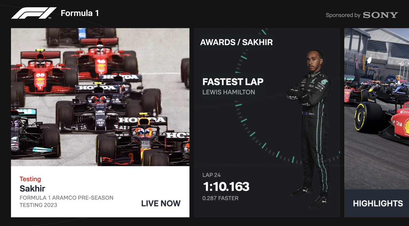
An example to follow
In the example below, you can see how we showcased lots of information without overwhelming the viewers. The different pieces of information are organized on individual cards that users can easily navigate between. It also follows a logical sequence as the cards are arranged according to their relative importance to the viewers. The importance of the elements was discovered with the help of usability testing, which is the topic of our next recommendation.
6. Always check light exposure, contrast, and colors
Another thing to keep in mind is connected to the lighting, contrast, and colors. TV screens typically get a lot of light exposure during the day and lots of contrast during the night. This can have a great effect on the legibility of your designs.
Colors on a TV screen are also displayed differently. They seem brighter and more vibrant because TV screens have a higher contrast than PCs. Also, the range of displayable colors is more limited than that on a computer screen.
Our recommendation therefore is to change your monitor/TV position from time to time, so you can check the legibility and contrast of your designs according to the sunlight exposure. We also warn you to use less saturated colors and preferably cooler ones (blue, gray, etc.) rather than warmer colors (red, orange). If you work with a brand guideline where the color palette consists of brighter tones, you could define lighter or darker variations of the same colors to make sure they are nice to look at on TV.
Check your designs on the big screen whenever you can and pay special attention to your color choices there. It’s also a good idea to use multiple different TV devices if possible as certain models can have significant differences.
An example to follow
We also tried to use less saturated colors, while still paying attention to the contrast of the important elements, like call-to-action buttons. We also checked the colors, the contrast, and the light exposure on different TV devices during several periods of the day.
7. Make sure the content takes center stage
While some TV apps share similarities with browsing apps like Instagram, there's a key difference. TV viewers typically have a specific program or program type in mind. So, while browsing is helpful for discovery, we essentially want to help users find something to watch, not to scroll endlessly.
The ultimate goal is for users to spend most of their time interacting with the content they want to watch, not struggling with menus and navigation. This means designing user flows that prioritize content discovery and minimize unnecessary steps.
An example to follow Here’s an example from the Explore page, where we tried to highlight the key content as much as possible. At the same time, we also wanted to allow users to continue browsing if they are looking for something different.
8. Find the balance between familiarity and innovation
Designing a TV app requires a balancing act. Spending too much time crafting a perfect UI can lead to an interface that's difficult to use with a remote. However, focusing solely on quick prototypes might limit creativity. The key is to strike a balance: use well-known and easily recognizable patterns while trying out new things from time to time.
People appreciate familiar design patterns in TV apps, as they make things easy to learn. However, there's also lots of room for innovation as designing for TV is a relatively new and unexplored territory compared to other devices. The goal is to find the sweet spot between user-friendly layouts and fresh, engaging interactions.
An example to follow
Here you can see an example of how we created an innovative layout so that the different pieces of information are organized on cards that you can scroll through horizontally. The sizes of the different cards also represent their relative importance.

+1. Iterate based on usability test findings
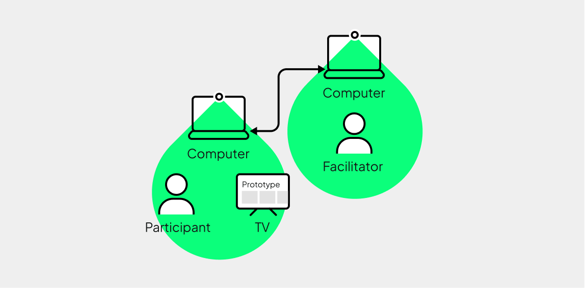
There are no surprises here compared to other platforms: design fast, test often, and be willing to adapt your designs based on user feedback. Usability testing is essential when it comes to complex applications for TV. Since you differ from your users in multiple ways, you won’t be able to create a successful product without learning from actual user behavior.
We also recommend you test on a TV device whenever possible. Here at UX studio, we make sure that our designs are intuitive and practical by testing every single iteration with members of the target audience - as we did when we were designing on TV for the streaming service platform as well.
Summary
If you want to create effective, user-friendly designs for TV, you will need to pay attention to additional things compared to designing for other platforms. In this article, we introduced some of these key principles and give you examples of how to approach them on real-life projects.
Designing for TV is more crucial than ever as smart TVs and streaming services dominate the entertainment landscape. With the rise of 4K and HDR technologies, the demand for high-quality, user-friendly interfaces and compelling visual storytelling on large screens is growing. In this highly competitive market, effective design is crucial for capturing and retaining audience attention.
By applying the essential UX principles discussed in this article (like optimizing text legibility, simplifying navigation, and considering shared device use) you can create intuitive and engaging experiences that will help you stand out in this competitive market.

Credits
This post was written by: Fanni Zsófia Kelemen, UX researcher
Design and project insights by: Farhad Soheili, UX designer
Proofread by: Johanna Székelyhidi, marketing manager