UX Case Study: Graphisoft Redesign Project

In this case study we’ll introduce the methods we used in our UX design process to make a complex system more user-friendly. In this project, we redesigned the information architecture of the cloud-based permission system for Hungary’s best-known architectural design software.Redesigning information architecture in UX projects can come with risks. But using continuous research and idea validation, you can keep your design efforts moving in the right direction.
In the article you will read about:
- The design challenges we faced
- How we assessed the current system with heuristic evaluation
- How we interviewed stakeholders and real users to discover their needs and pain points
- How we created role personas
- How we created the new information architecture, workflows and prototypes
- How we validated our design ideas
- What we learned during the project
The project
The well-known Hungarian architectural software developer Graphisoft reached out to us to improve the permission system of their cloud-based teamwork platform. It needed simplification and the client team already had some initial hypotheses in mind about potential problems they wanted to solve.
The problems affected not only the layout but the whole system logic and information architecture as well. They expected in-depth research and idea validation to support our design efforts and to find the best possible solution. It definitely made for an interesting experience from a UX researcher perspective.
The product
The cloud platform helps architect project teams cooperate on the same project at the same time while greatly increasing efficiency. The platform forms an extension of their architectural design software that enables users to store project blueprints in the cloud and provides simultaneous access and editing for multiple team members.
This makes the whole design process faster and more efficient. The logic might seem familiar from other cloud-based platforms. A team member downloads the file, reserves the parts he or she wants to work on, then releases and uploads the modifications into the cloud. It then synchronizes the recent changes between the two files.
The product had three versions: basic, premium (with extra features) and SaaS (software as a service with all the extra features and premium support).
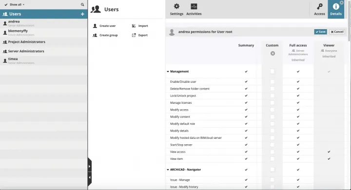
The cloud platform had its unique permission system which allows administrators to assign team members to different projects with different access levels. The system offered some default permission settings called Roles. They describe what the owner of the role can do for specific element types or data types both on the cloud and in the teamwork projects.
- Draftsmen: the most limited access to modify elements
- Architect: still limited access, but able to modify more elements
- Lead architect: full access to the project
- Project administrator: full access to all folders and projects
- Server and project: full access to the cloud and all folders and projects
Besides the default roles, users had an option to create generic roles with customized permission settings. For this, they had to select from a list of more than 150 elementary permissions in the free version. The premium version gave them even more.
Creating proto-personas
To better understand our users, we created proto-personas based on information we gathered from stakeholders (product owner, head of product development and head of product design) in our kick-off meeting.
We learned that three types of users typically had access to the cloud:
- Architects: They mostly use the software, not the cloud, only to upload and download blueprints. They don’t touch the permission system and have limited IT knowledge.
- CAD managers: They function as architects, IT and project managers in one. They hold responsibility for the efficiency of workflows and processes.
- IT managers: They serve mostly as external consultants responsible for operating the servers, databases and networks. They have limited knowledge about the architecture field, the software itself and also the permission system. However, internal IT managers in big companies who had worked together with CAD managers have more experience in the field.
We used these proto-personas as a base and refined them with the insights we gathered from the user interviews later. We found that these roles can mix in some cases, especially in smaller companies. For example, a small team of four or five architects would have no dedicated CAD manager or IT manager. One person – usually an architect with high interest and agility in the IT field – would perform all these different functions. They handled the setup of the cloud and settings of the permission system.
This insight led us to investigate different user needs and workflows in smaller and bigger companies and differentiate two main use cases.
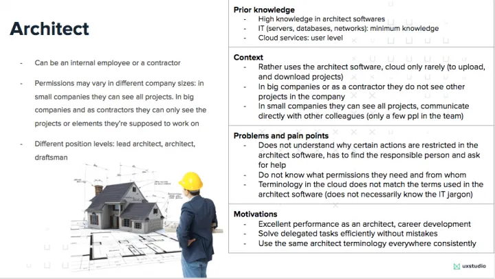
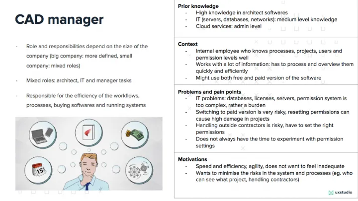
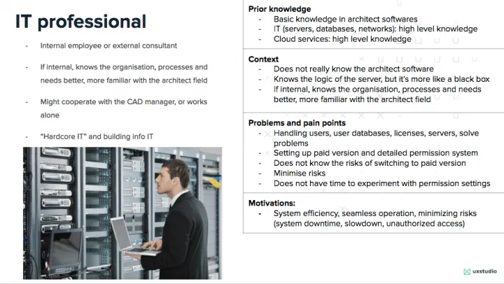
ease communication within the team.
Use cases: Assessing different user needs and workflows
The cloud platform tended to serve the needs of both big and small architecture companies. Small offices typically used the free version with limited permission settings and no IT support. Big companies usually picked the SaaS option with the extended and detailed permission system.
The permission system served two types of workflows: low- and high-trust. Typically big companies used the former, where not everyone had access to all project elements and actions. They kept them restricted according to team member’s position and experience. For example, lead architects could access all project elements and modify them, while draftsmen could only access some and perform limited modifications.
Smaller companies typically used high-trust workflows where fewer (four or five) people worked on the same project in more or less the same position. That left no point in differentiating users in much detail and everybody had access to everything.

Logically, that meant a higher risk of someone making a mistake in the high-trust workflow. It also made catching and correcting them smoother than in big organizations.
Users in high-trust workflow communicated directly face-to-face. However, in low-trust ones, hierarchy levels separated them not just theoretically but even physically. Communication and detecting errors, therefore, became much more difficult in big companies. Prevention in the form of giving limited access to certain users proved easier.
The problem
As one of the main competitive advantages of the premium product, it could serve big companies’ low-trust workflows with its detailed permission system. These companies also had the resources and qualified IT professionals to set up this complex system.
However, most users did not belong to the “big company” segment, but rather smaller ones with much simpler needs. They did not necessarily have a dedicated IT person in-house, so architects with an IT vein did the configuration. The complexity of the permission system became rather a burden for them. This meant they needed more support to set up a system that ran well.
As small companies grew, their demand for support in rebuilding their permission system and switching from high-trust to low-trust workflows also increased. For example, when a small company started to work on more projects, teams grew much bigger and more versatile including external contractors and other professionals (eg. statics, interior designers, etc.).

It got harder to manage them efficiently and to supervise and communicate with architects who worked on the same project. Sooner or later this required them to change to the paid version. This transition to the detailed permission system brought lots of risk especially when they had stored many projects in the cloud with different permission settings. They didn’t have enough information if their settings would reside safely on the cloud or not. Therefore, the software developer company’s support team usually assisted the transition.
UX challenges
They decided to keep the difference between the free and subscription-based models for business reasons. But we had to create a better interoperability between the two. The problem had two sides.
- Both systems had too much complexity, making them hard to understand. Also, each needed simplification to minimize risk of mistakes.
- The transition between the free and paid versions came with difficulties. Users could rarely do it without support, and that hindered conversions.
The backend system had a lot of potentials. Designed in a way that it could serve different needs at the same time, it lacked good presentation and intuitiveness. We had to redesign the structure, the logic, and the layout so users could find their way in both settings more easily, suit their company needs better, and also educating and driving them towards the premium version at the same time.
We had to assess both versions to create an intermediate step where the user could transparently see how the permission system worked in both versions.
Let’s see which process we followed!
Research phase
Heuristic evaluation-assessment of navigation and information architecture
In the first few weeks of the project, we started by acquiring domain knowledge about the software, the permission system’s logic, and the meaning of each setting. The company’s support team really helped here.
After getting an in-depth introduction, we continued with a heuristic evaluation to identify major usability issues and set up initial hypotheses. We could also take a look at real-time user databases to see how some companies use permission settings.
We set up a list about our initial observations based on Nielsen’s 10 Heuristics:
- Visibility of system status: The user had not received information about what takes place in the process (eg. why they can not edit certain project elements and what permission they need to access it).
- Error prevention: Users got no notification about the consequences of risky actions or confirmation options (eg. no information that they could revoke a denial of access)
- User control and freedom: It included too many options to reach the permission settings on different levels: user, project and cloud. It lacked clarity on which level they were trying to make changes on and what consequences it would have.
- Recognition rather than recall: The system did not help users with localized information about what each setting meant and how they related (eg. some permissions worked only when given together but the design didn’t obviously indicate so) They hadn’t made instructions for use visible or easily retrievable.

Gathering user insights: Stakeholder and user interviews
After assessing the current system, we had a list of hypotheses in mind that we wanted to validate with stakeholder and user interviews.
To support our hypothesis about potential problems and gather more insights about how users apply the permission settings, we conducted twelve interviews. In the first round, we talked with six stakeholders from the company’s support team about their experiences. Due to their position, they keenly knew the most common problems why users turned to them regarding the permission system. In the second round, we interviewed six CAD managers from bigger and smaller companies. We could also take a sneak peak into their current system to learn more about their settings.
The major findings we uncovered with the interviews:
- Validation of most of our hypotheses about potential usability issues
- CAD managers needed a surface where they could easily overview each project, users and access levels and modify them if needed. In the current system, they had to navigate to many different places and levels to gather this information.
- They found the logic and ruleset behind permission settings not transparent enough. CAD managers had a hard time overviewing the system they’d set up.
- The logic and consequences behind their settings.
The stakeholders’ expectation towards the new system included:
- Compatibility with the current system
- Keeping the difference between free and paid versions but educating users about advanced settings
- More transparency in the system
- Transparency in the rule sets (or ACL rows) that define the structure of the permission system in use (CAD managers gain the ability to create and overview rules that define three major components: WHO can assess WHICH project with WHAT PERMISSION)
- CAD managers gain the ability to see the effects of these rules.
Mapping out the information architecture
After assessing the current system and talking to users and stakeholders, we wanted to summarize our learnings about the information architecture in an easy-to-understand, visual manner. We started to draw the information architecture in three steps:
- Identifying and defining the site’s content and functionalities
- Identifying the underlying organization structure and nomenclature that defined the relationships between a site’s content/functionality
- Visualizing the relationship between the two.
We didn’t just map out the navigation because IA spans way beyond navigation and defines the whole UI. While we don’t make the IA itself visible in the interface, it definitely impacts the user experience. While users don’t see the structure of the site, dividing and connecting content should match their needs and expectations. IA informs UI so we had to take a look under the hood and start by defining or redefining it first.
Mapping out the structure also helped us identify contradictions and illogical parts and draw a new version that fit user needs better.

Content and functionalities are defined by small companies’ structure
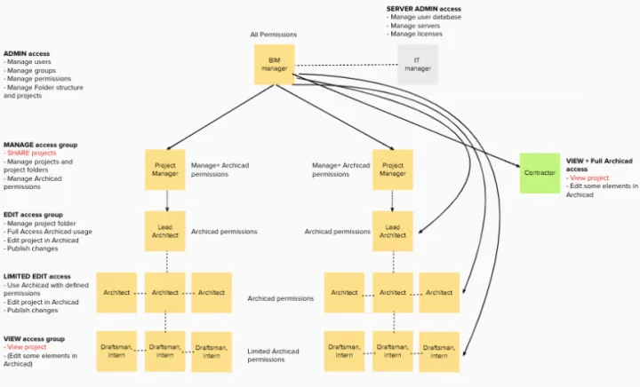
Big companies’ structure defines content and functionalities.
Prototyping phase
Once we had our new IA structure outlined, we started to “dress” our skeleton. We drew up a workflow diagram and sketched out the structure of each screen. Then we organized all the screen sketches into a screenflow diagram.
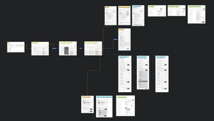
As I mentioned, CAD managers had a hard time overviewing the system they’d set up that included all the projects, users and permission settings in one place. They had to gather this information from many different places.
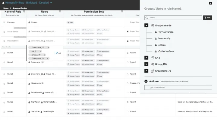
Therefore, we created an additional menu with a separate entry point from the home screen that we named Access Center. This interface served as an overview page of all the projects, users added and the permission sets they possessed. One datarow defined a set of rules so that CAD managers could quickly see a summary of their system and settings. The new menu point also provided entry point to other parts of the existing system such as: user profiles and settings for each user, default role settings, project tree.
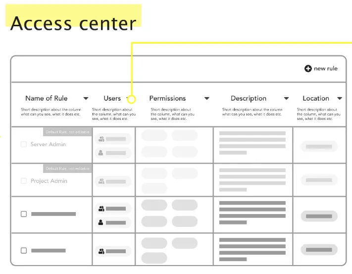
The Access Center basically served as a database that contained all the project-related information in a spreadsheet-like format. To make the interface scalable and suit bigger companies’ needs as well, we had to consider how it would work with hundreds of datarows. We had to make the database searchable and provide filter options to narrow down the information set.
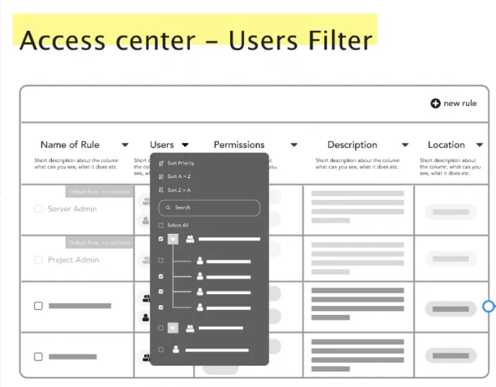
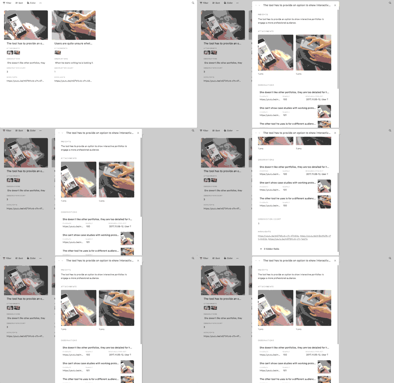
To come up with this solution, we gathered some inspiration from Airtable, a database platform we like to use in UXstudio to build research systems. We use it for its flexibility and easy navigation. Also, it nicely makes the connection between data points very transparent and provides deeper insights about an element.
We followed the same logic and organized element specific information under modals.
To provide your audience with informative and engaging presentations try out these presentation templates.
Idea validation
To validate our design ideas, we ran thirteen usability tests with architects and CAD managers from smaller and bigger companies and also showed the prototypes to stakeholders (support team, product owner, head of product design, head of development) to provide their feedback and help us estimate the impact of changes on existing clients. Considering and incorporating all these different points of views into one interface posed a challenge. After three rounds of iterations we came to the final version (unfortunately we can not publish the final version yet).
Based on user feedback about the Access Center concerning usage, we found out:
- It helped to see what rule sets define the permission system the CAD managers established that made the system more transparent
- It clarified the effects of the rules
- It became more scalable – instead of thousands of projects in the project tree, it contained up to 100-150 elements (rules)
- More flexible, searchable, sortable, with filter options it can satisfy different needs for information
- Compatible with the existing system and provides more entry points into it

about a different mindset gets exciting!
Summary
In this case study you could learn more about our the process we applied in redesigning an information architecture of a highly complex system. We introduced you to
- The design challenges we faced
- How we assessed the current system with heuristic evaluation
- How we interviewed stakeholders and real users to discover their needs and pain points
- How we created role personas
- How we created the new information architecture, workflows and prototypes
- How we validated our design ideas.
We hope you’ve found our insight useful! We’re curious about your experience that you can share in the comment section below.
Would you like to find more interesting readings?
We hope you enjoyed this post and you could learn more about UX. Do you have a question or a story to tell? Feel free to leave a comment.
If you want to dive in our case studies and learnings, check out our Product Design book by our CEO, David Pasztor. We ship it worldwide!
Or if you’re interested in our main UX design processes, download our free ebook what can help you to understand our them better.


