AI Powered App Design for the Hearing Impaired Community

Korero is an AI powered communication sidekick concept aiming at bridging the communication gap between the hearing and hearing-impaired communities through innovative technology.

2 mockup screens showing the multiple inputs feature.

Client

UX Studio

Industry

Healthcare and Accessibility Services

Team Setup

1 Researcher
+ 3 Designers

Timeline

3 Months

Goal

Develop a solution to facilitate communication between individuals with varying hearing abilities, bridging the gap between the hearing and the deaf or hard of hearing with the latest tech in mind.
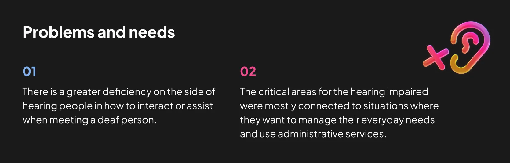
Challenge

Partnering with SignCoders, a group of highly skilled IT professionals coming from the deaf community, we aimed to address inclusivity by delving into the world of the hearing impaired. This involved the exploration of unfamiliar fields, showcasing what's possible starting from ground zero.
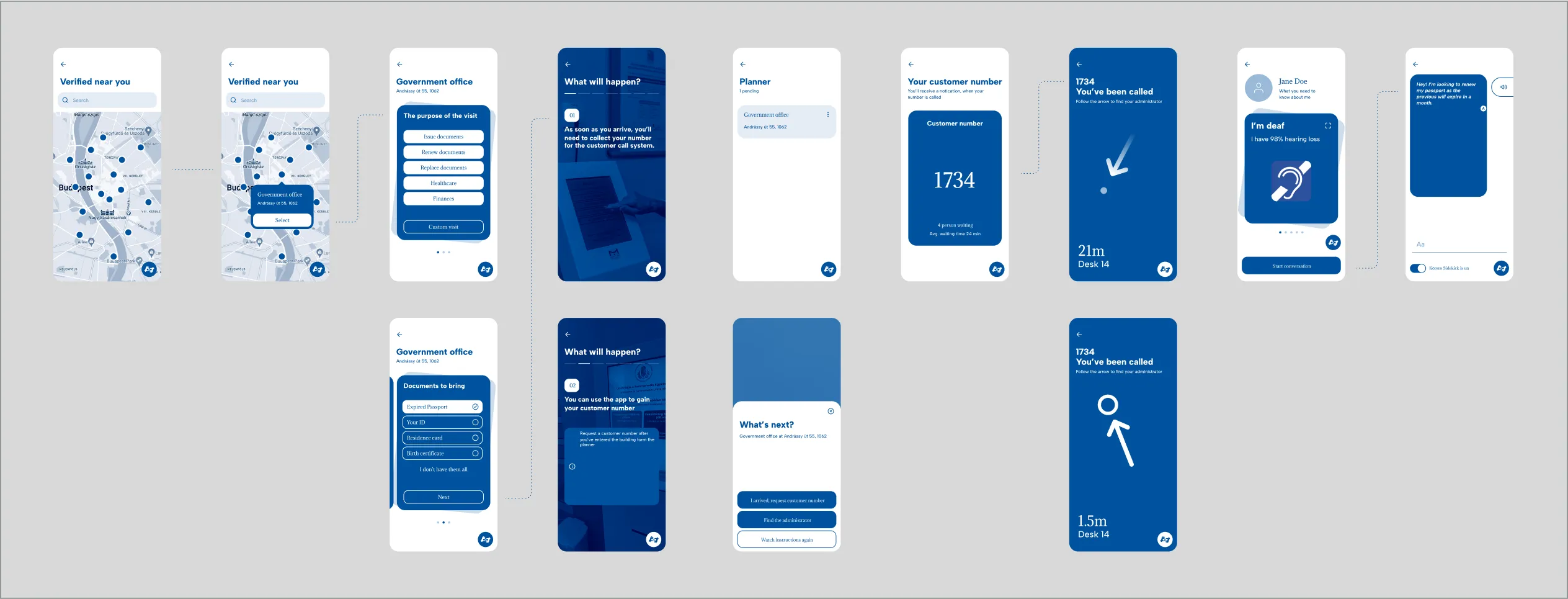
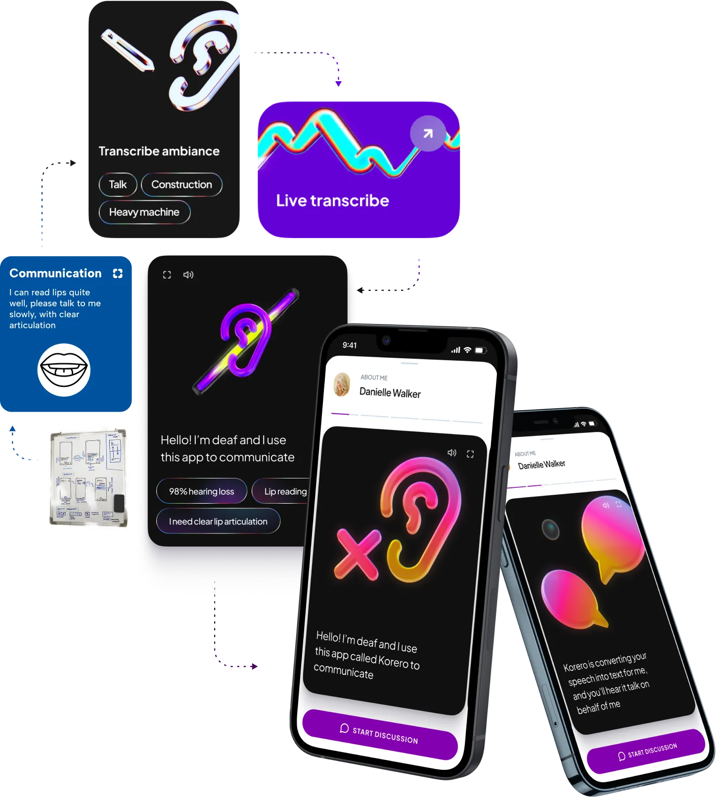
Outcome

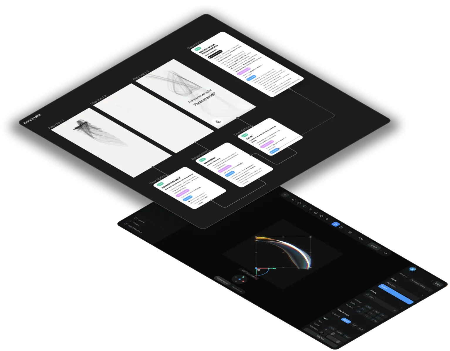
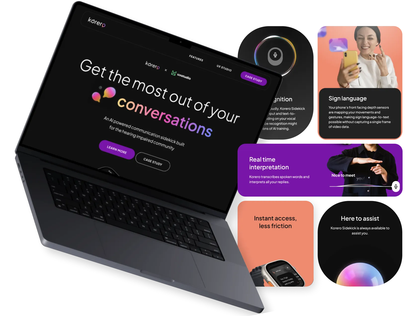
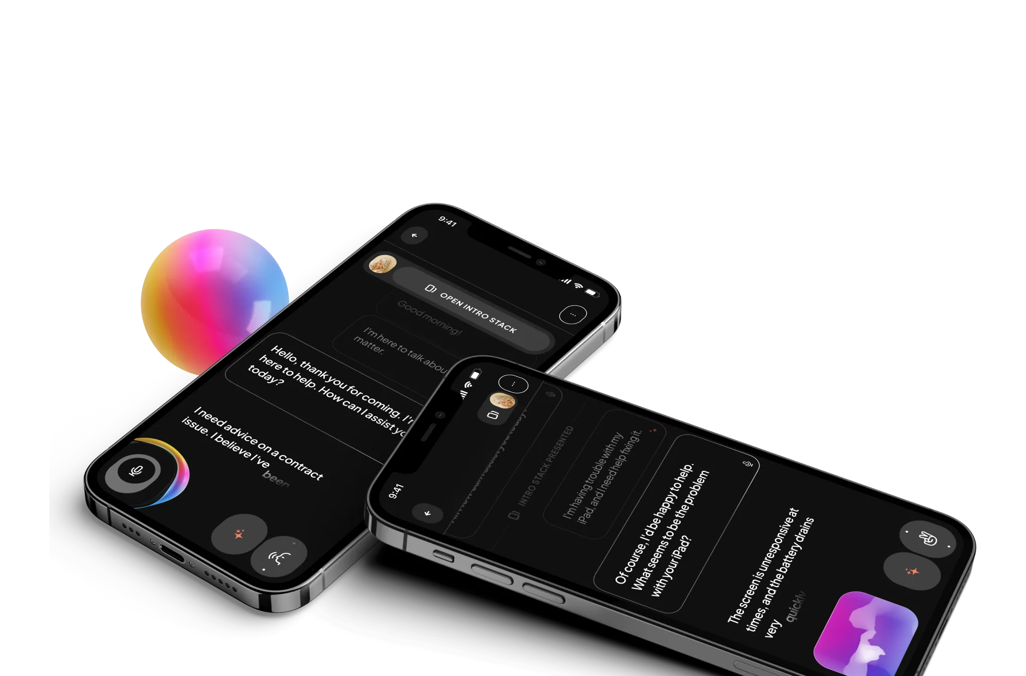
We created a new mobile app idea called Korero which features AI-assisted live transcription and frictionless input methods focusing on accessibility. Additionally, a dedicated website has been created to help users better understand the product.

11
Iterations
7
Primary userflows
3
Key features
01

Discovery

How we started

We did an extensive discovery phase combining different methods, as follows to come up with a problem statement

  • 1. Conducted desk research about the deaf community and their struggles, including institutional, educational, and attitudinal barriers, personal struggles and needs.
  • 2. Held an in-person workshop with the SignCoders team, with the assistance of sign language translators to gain more insights about the actual user problems.
  • 3. Synthesised the outcomes and previous materials to create our and problem statements that could bring us closer to the ideation part.
  • 4. After shortlisting ideas we mapped out different experience flows, worked on the concepts, and defined the features of the minimum viable product.

These steps helped us lay the foundation for our project and set us on the path toward designing a successful solution.

02

Specifying the Core UX

Denoising ideation, defining the feature set

Our solutions were focusing on supporting hearing-impaired users in administrative discourses by connecting them with hearing people, making the other party also at ease without the need of sign language interpreters.

  • ✦ The low fidelity workflow of the core features allowed us to quickly explore supplementary functions and features.
  • ✦ Our focus was on ideation, solution and concept generation and iterative refinement of the Information Architecture.
A workflow of core features with low fidelity designs.
Workflow of core features with low fidelity designs
03

Defining the Look&Feels

Key considerations

  • ✦ Our design direction prioritized evoking emotions over creating a futuristic assistant.
  • ✦ We aimed to harness the power of visual communication by utilizing soft colors, friendly shapes, and forms.
  • ✦ Building confidence between the user and the application has to be emphasized, considering the application's real-time reliance. We prioritized the Peak-End Rule throughout our design process to ensure user trust.
A collage featuring some screens, first sketches and cards from the app.
04

Incorporating New Tech and Tools

  • We successfully integrated Spline, a 3D design software, to create engaging and interactive visuals.
  • Spline enabled us to generate minimalistic, kinetic shapes representing communication and sound-waves without overwhelming the user.
  • We explored data visualization techniques using p5 JavaScript. This approach aimed to enhance spatial awareness, particularly for users interacting with a small screen.
A snippet of how we created the animated graphs in Spline.
05

Final Designs

Key features

  • 1. Sidekick: AI providing quick replies and reply triggers during live discussions to reduce communication friction.
  • 2. Intro Stack: Cards to let the user present their circumstances for the participant of the discussion and set expectations for the use of the app.
  • 3. Multiple Inputs: Other than the traditional keyboard, users can rely on the AI trained voice recognition or 3D skeletal sign language input enabled by the phone’s front facing depth sensor.
A collage of screens, cards and UI elements, such as menu, stepper and buttons.
06

Webflow Implementation

  • Korero also received a standalone Landing Page that we could regularly update with new improvements and features.
  • We opted to use no-code web builder Webflow as it is flexible enough to have effortless updates, but it’s embracing confident control over consistency and interactions.
Webflow logo
Check out the live website
A mockup of the website we created for the app concept next to cards explaining the main features.