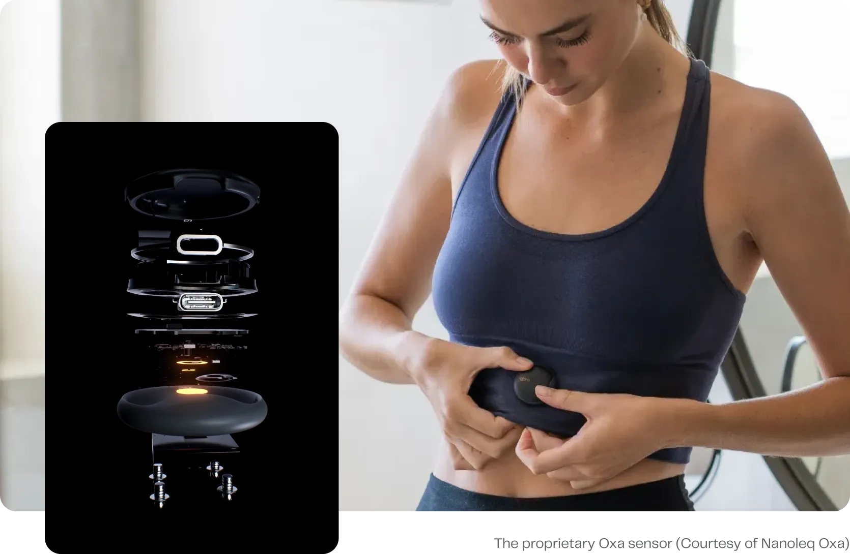
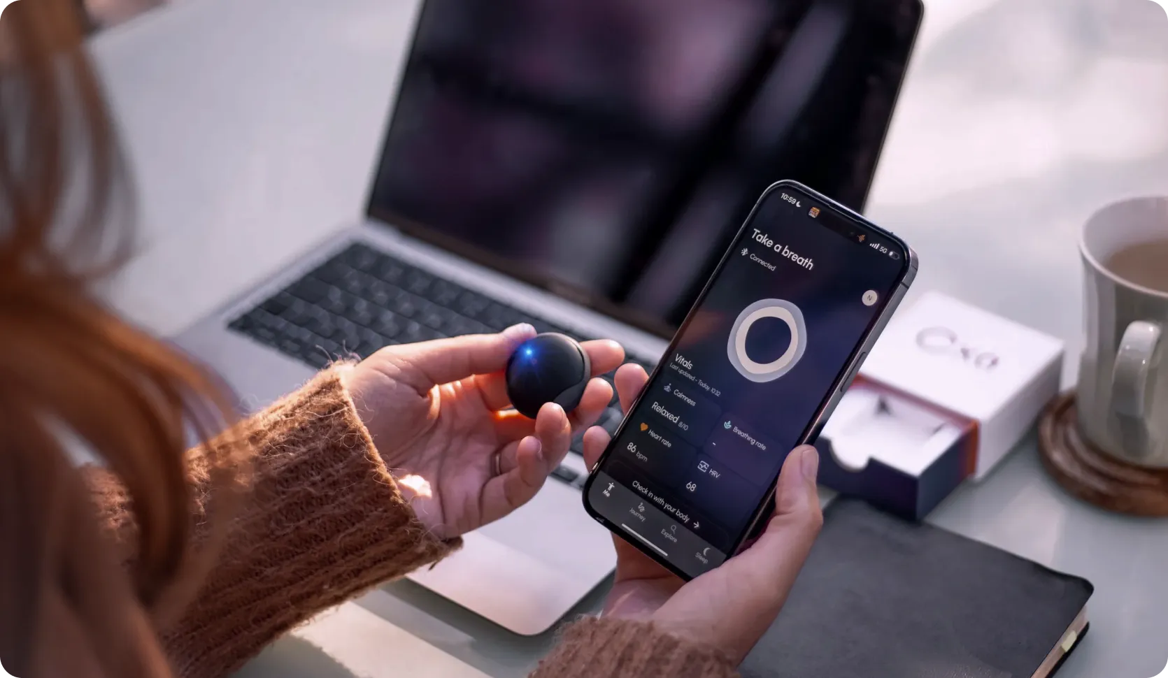
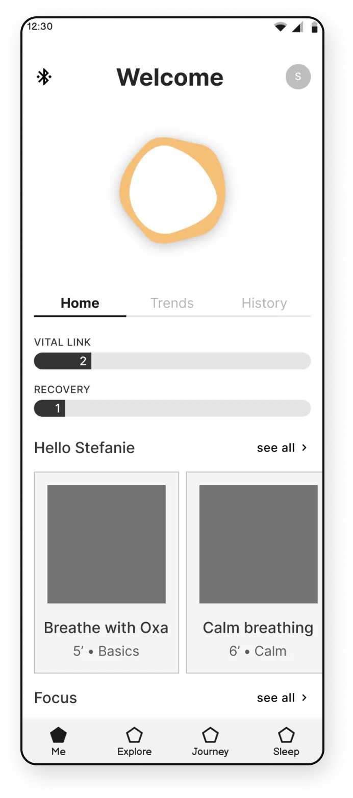
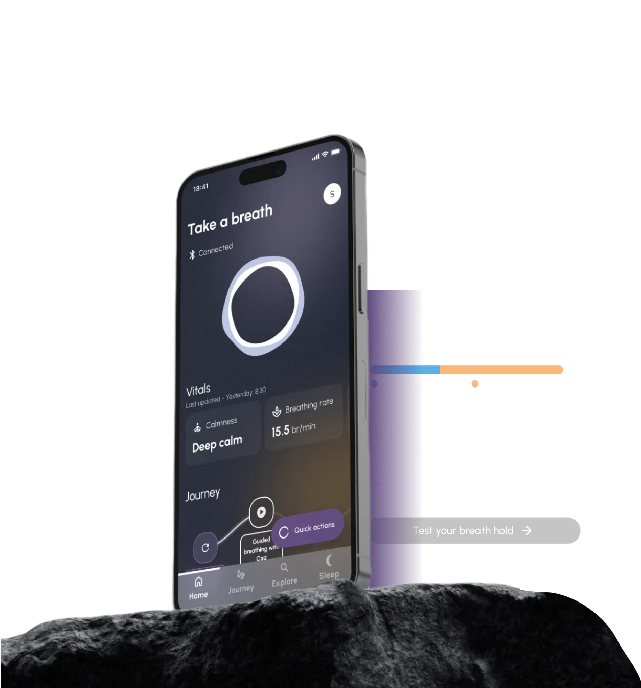
Reddot Design Award Logo

Oxa App Redesign: Breathing Innovation for Well-Being

Nanoleq partnered with us to redesign the app for their innovative wearable device, Oxa. This advanced garment provides real-time biofeedback to enhance well-being through mindful breathing.

Mockup of the app home screen where vitals, weekly highlights and lifetime records are displayed.

Client

Nanoleq - Oxa

Industry

Health and Wellbeing

Service

UI/UX Design
+ UX Research

Team Setup

4 designers
+ 1 researcher

Timeline

Ongoing 1+ Year

Goal

Nanoleq partnered with us to revamp their Oxa app, seeking a distinctive design that matches with their smart wearables and brand. We aimed to ensure the app’s high-quality and user-centric experience by integrating the concept of breathing and incorporating user feedback and data.

Challenge

One significant challenge was understanding and representing the complexity of medical data, which demanded deep domain knowledge and user empathy to ensure accuracy and easy-to-digest visualizations. Additionally, capturing the essence of "breathing" through the app's design required creative approaches to provide users with a seamless and engaging experience.

Outcome

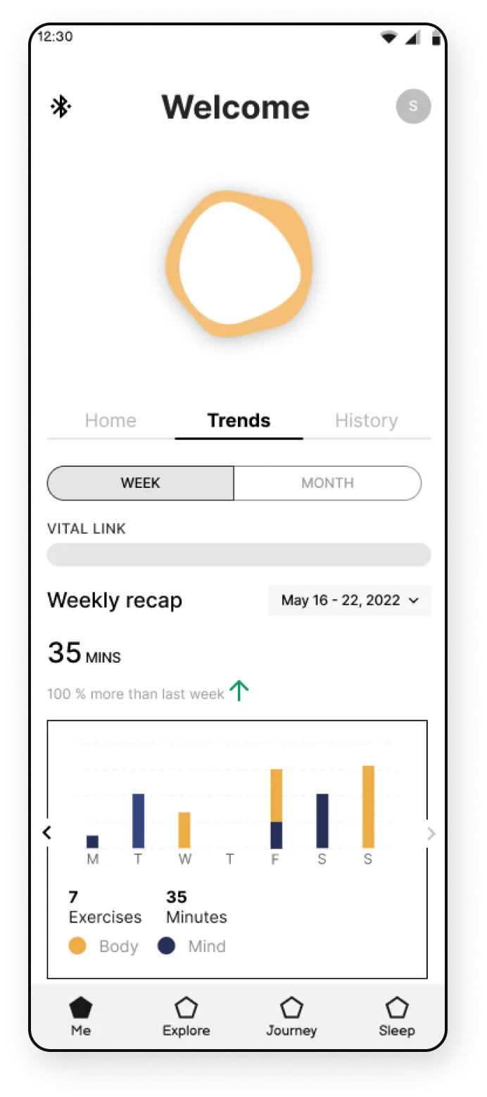
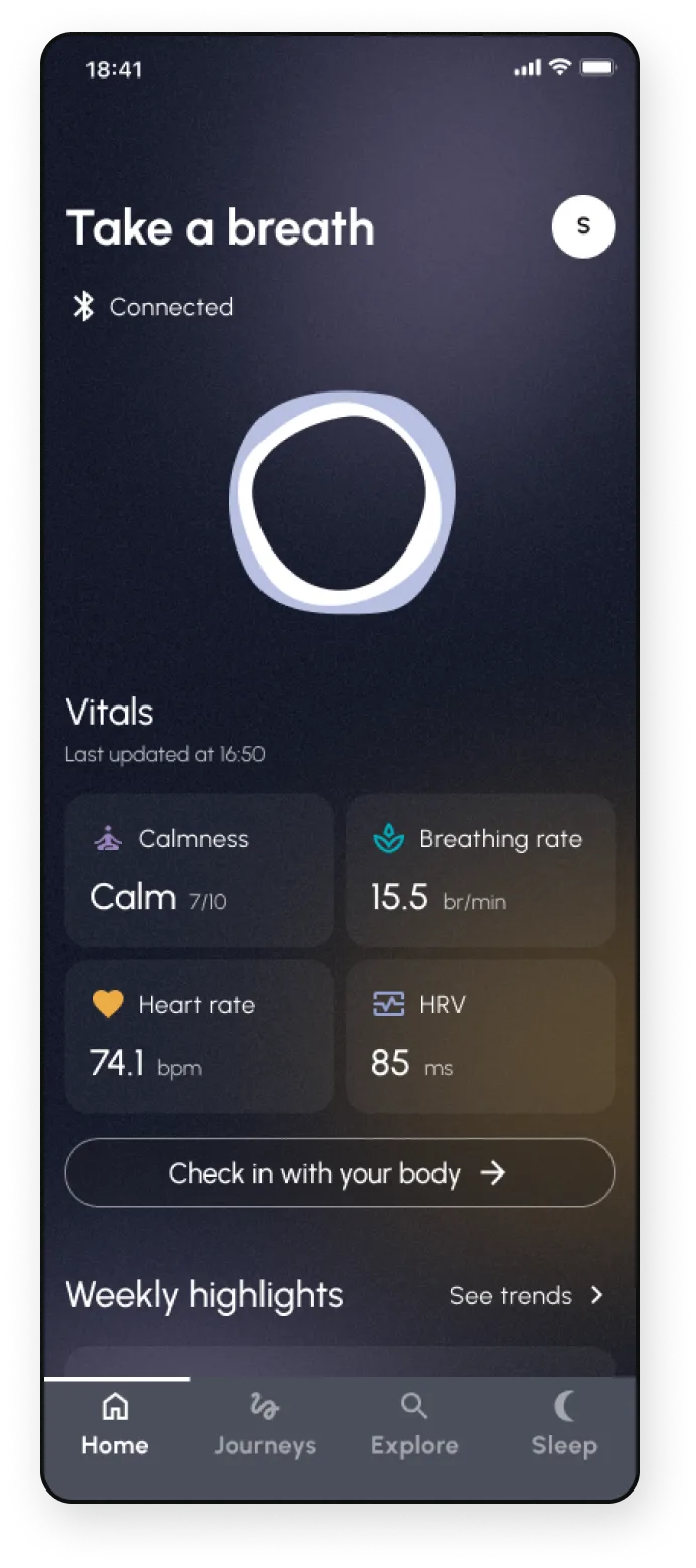
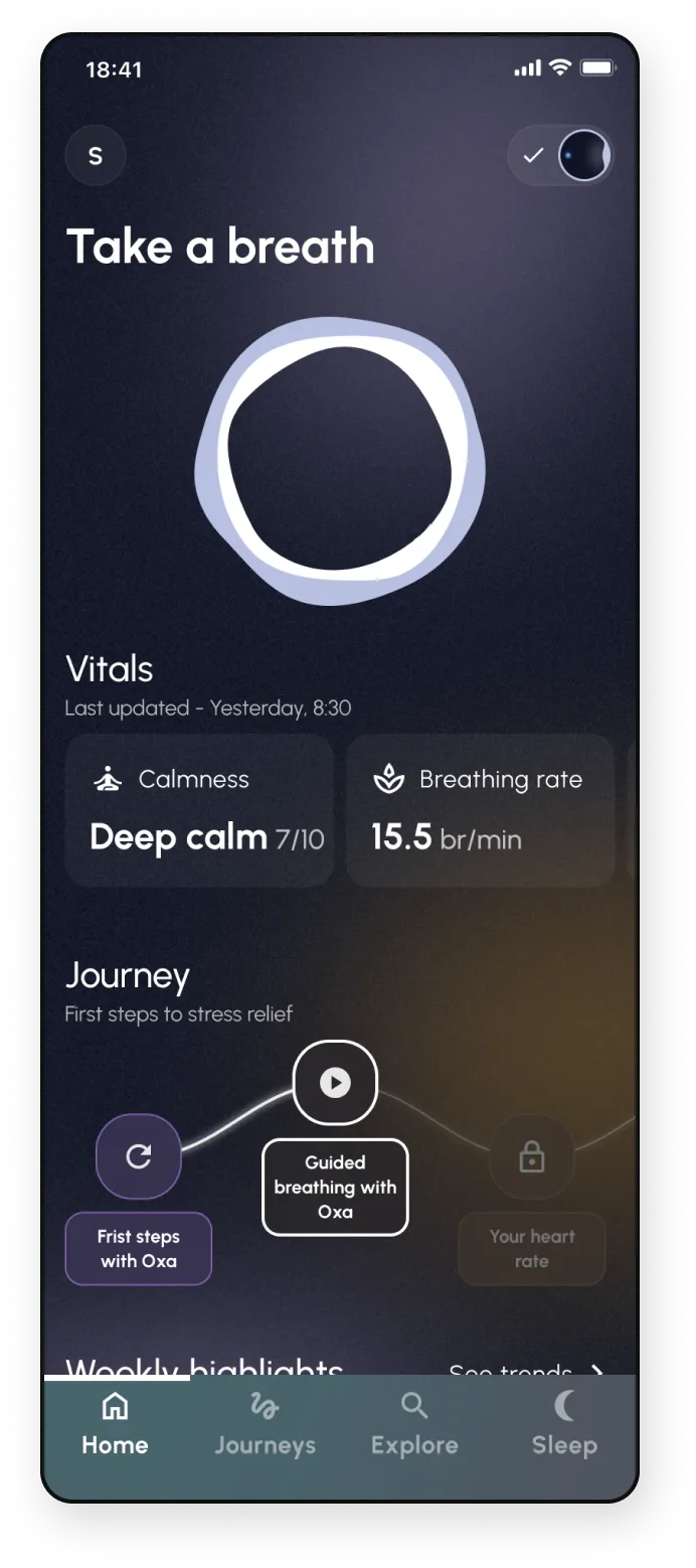
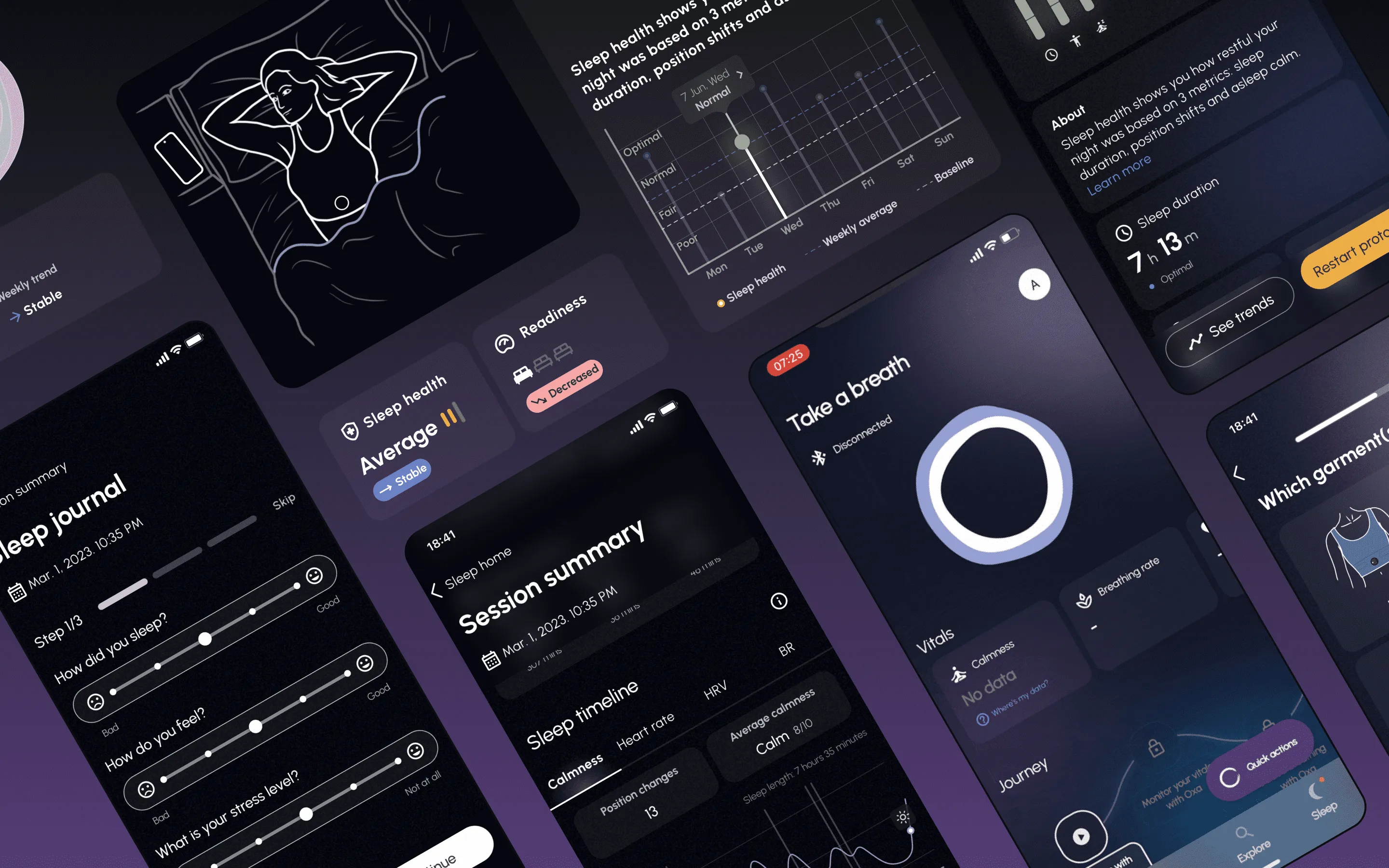
The collaboration resulted in a user-centric platform that seamlessly integrates complex data with interactive and engaging experiences. The Oxa app provides users with a digital mirror for their breathing and overall well-being, offering real-time feedback, gamified elements, and detailed performance summaries. Our commitment to excellence have earned us a long-term partnership with Nanoleq and the prestigious Red Dot Design Award.

20
months of collab
25+
USER FLOWS
1
Full app redesign
01

How we started

A deep dive into vision and goals, studying target audience preferences, and identifying potential areas for development kickstarted the collaboration. We also started to learn about the sensor's scientific and technological principles, gaining a thorough understanding of how it works.

Furthermore, we conducted a detailed competitor analysis revealing market trends, successful strategies, and areas where Oxa could stand out. Additionally, we familiarized ourselves with the Nanoleq's organizational structure, ensuring smooth collaboration and integration within their framework.

On the left: all of the components used to built the Oxa sensor.
On the right: photography of the sensor being used by a woman.

Our step-by-step process

  • 1. Tone-of-voice: to establish a consistent and coherent communication style
  • 2. Look and feel: to explore different design directions
Four different moodboards we presented to the client.
First moodboards

Our research efforts played a pivotal role in the project's success by providing a strong foundation for well-informed design decisions based on the research findings.

02

Understanding
the Domain

Main challenges we overcome

  • 1. Medical data complexity: training ourselves with expert medical and science resources to gain a deep understanding of the domain.
  • 2. Empathizing with users and conveying breathing: applying interactive visualizations and gamification to effectively communicate breathing concepts and engage users.
  • 3. Balancing gamification with relaxation focus: carefully integrating gamification elements to enhance engagement while maintaining the app's core purpose of promoting relaxation and breathing exercises.
  • 4. Data visualization within limited screens made us leverage creative problem-solving techniques to design intricate yet effective visualizations within the app's interface constraints.
A woman holding the Oxa sensor in one hand and a phone with the Oxa app open in the other hand.
03

App Redesign

Highlights

  • 1. Our design team successfully rebuilt the entire application from the ground up, focusing on enhancing its core functionality and overall user experience.
  • 2. We also recreated the application's information architecture to improve navigation and usability.
  • 3. Additionally, we revamped the app's UI, creating a fresh and appealing look that aligns with industry standards and user preferences.

Research done throughout the entire project

  • ✦ Months-long diary-study
  • ✦ Market Research and many more

This research also guided critical business decisions, ensuring that the app's features and design align with the target audience's needs.

Evolution of screens
The app home screen featuring different exercises.
The app home screen featuring a weekly recap of the exercise done by the user.
The app home screen featuring information of vitals such as, calmness, breathing rate, heart rate and HRV.
The app home screen featuring information of vitals such as, calmness and breathing rate, and a journey with steps for stress relief.
04

Further Collaboration

Fresh ideas by ever changing characters

After 1 year of stable collaboration with the core team (3 designers + 1 researcher) we continued with 1 designer and 1 researcher on demand.

Our collective wins

  • 1. Our collaboration with the client company improved their UX maturity.
  • 2. We provided training and workshops to teach UX principles and methodologies.
  • 3. Receiving the Red Dot Award for the project in the "Interface & User Experience Design" category.
  • 4. User experience for the application, including its innovative design, interactive data visualizations, and seamless user journeys.
  • 5. Design System with foundational elements, components and guidelines to maintain a cohesive website.
  • 6. We conducted usability testing, user interviews, and iterative design to ensure the app met the expectations.
Visit Oxa’s website
The final designs we handed over to Nanoleq's team.

Nice to know that we can count on your support.
The meeting went very well. The investors were very happy with what we showed them with the live demo and with the new designs.

Serge Weydert
Chief Science and Business Officer, Nanoleq