Material Design On Desktop

We all love material design. The well-designed structure, the consistent visuals and the freakishly well-documented guideline. And yes, the guidelines are easy to use on mobile but parts of it fail on desktop applications.

Here at our UX company we have some desktop/web app projects where we use material design. After sketching we concentrate on visual hierarchy and interactions with wireframes.
So, way before the detailed UI design it becomes clear: the guidelines don't cover desktop applications that well. So we have to be creative - invent new patterns or tweak the existing ones, yet stick to material design. Which eventually leads to inconsistent solutions in different products or even on different platform.
Here are our solutions for the three main problems.
1. Cards
Oh, the good old cards! Nice shadows, great rounded corners - but what if not everything can be grouped on cards? Or I want to group blocks of cards? Or I have three actions but I can't use the raised button because it would conflict with the Z-axis? Cards have great rules, such as: don't overload the card with content or don't use too many actions.
Since desktop applications are wider and the content needs a container I often put every information on cards. When it comes to categorizing elements on cards I can't use new cards - although that would be the easiest solution. Basically, the way Inbox puts cards on cards - even though you shouldn't.
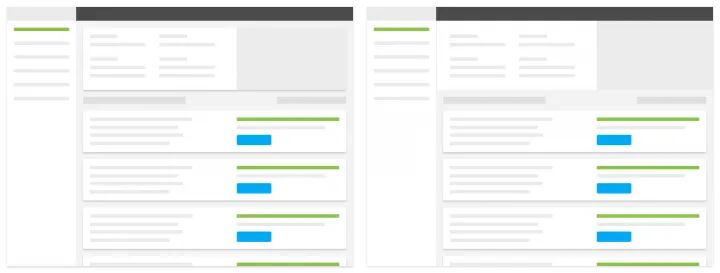
On this search page we displayed the filters and the results on cards - but users got confused. They couldn't distinguish between the two elements. So we grabbed the contents of the filter and put it right below the header without a card.
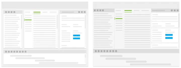
Here we have different modules for a desktop application. The easiest solution seemed like using cards for each module. Users could rearrange cards or close and open new ones. But the content of each card proved to be way too much to put on one card. Certain modules needed further navigation or complicated state changes.
We couldn't sacrifice the flexibility by building a left navigation and putting content on different pages, so we devided the screen instead. This way we are not sacrificing the flexibility and are not overcrowding the card with content that shouldn't be there. Plus bonus: we could use cards to group smaller blocks instead.
The takeaway
The first thing I learnt from designing desktop material: forget about cards when it comes to the full layout. Whenever cards seem to be the easiest solution to divide up a huge space always think about the content first. Things to consider: number of actions, length of content, number of content blocks and even other elements outside the cards.
2. Dialogs
Let me start by saying dialog handling is amazing on mobile and small screen devices. It’s a simple decision-making process: Will I have to open a new modal at some point? If the answer is yes then full-screen modal it is, if the answer is no a simple dialog box will do.
On desktop, however, this simple thought process fails. Sometimes I have to use a new modal in the process but I can’t open a whole new window. Because with a new window I don't have enough content or the user would get lost in the process.
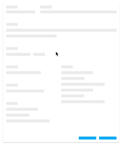
Here the user can choose an item from a list. A drop-down menu was not an option because of two things. One: the items sometimes have long names and two: the list itself is a multiple level tree. Having all these in one dropdown would have been far from ideal. In this solution when the user clicks on the item the list appears and the previous content disappears. When they chose they hit done and are taken back to the previous ‘state'.
The takeaway
Always keep the item the user clicked on and only change the other content. I found this more understandable than just using the item’s label as the title for the next state. This way the two states are visually connected and the users will know exactly what to do.
3. Floating Action Button
If you mention material design to someone they’ll be familiar with at least the FAB. It might be the most debated part of material design: some people hate it some people love it - you can’t be ‘meh’ about it. While we at UXstudio love using them in different mobile products, on desktop we are not huge fans. On a small screen it’s straightforward because there is usually one main action. On desktop applications there are usually two main problems. First, there are more elements on one screen so the FAB becomes hard to notice. Users sometimes can’t find it at all or are looking for a more traditional action button. Second, most of the desktop applications call for more actions on one screen. If there is more than one action with the same priority you can't use a FAB. If you have different blocks with different actions the user won't know what the FAB does.
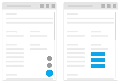
The solution here is simple: we avoid using a FAB on a desktop application when we can. We either use buttons where the user would look for it or use button groups if we can't highlight one single action.
The takeaway
If you have too much content or many actions stick to traditional buttons. If you have less actions and a simple page go for a FAB. The most important thing to remember is to always remain consistent.
From what I’ve learned from designing for desktop with material is that the rules which work on mobile are sometimes not the best on desktop. These can be because of visual noise or simply because users can’t use the interface with ease if we follow the guideline too rigidly. But this is why it’s called a guideline and not the Bible.
Did you enjoy this article?
I really hope you did!I’m curious what challenges you guys might have faced in your projects, let us know in the comments below. Do you feel we missed something important? Tell us.
Download our free ebook written specifically for Product Managers to help them learn more about our product design process.
Do you feel like reading even more? Our CEO David Pasztor wrote a Product Design book about our design philosophy. Order it today - with free shipping in Europe and the US!