
Contents
Just imagine how you’d feel if you walked into a shop, collected everything in your basket, but couldn’t find the cashier. In the end, you’d likely get extremely upset and leave everything behind without spending a cent. Well, exactly that's what happens with bad form design in your checkout process.
Bad form designs have saved me hundreds of dollars. Long, painful forms have potentially lost your company a couple thousand bucks by scaring your customers away.
Forms look like the most innocent and straightforward UI components, yet they handle the most important interactions with your product. They channel your users to sign up and pay.
I don’t need to tell you the important role these steps play in a well-functioning business. But I’ve got some good news as well: Getting good form design does not have to come that hard after all.
In this guide, I’ve collected 33 form design best practices which you can apply right now. It provides a superb starting point to start testing and experimenting to find out what works best for you. Some of the things we’ll cover:
- Copy matters!
- Optimizing for mobile form design
- Using the correct input type
- Getting smart by doing the work instead of your user
- Proper layout for good form design
- The devil of form design in the details
Copy matters!
You know copy matters. A lot. We have even written about it on our blog here. You can make huge improvements in your conversion rates by just modifying the copy around your forms.
1. Let users know the benefits they get by completing your form
“In my free time, I like to fill out different online forms. I just love it!” said no one ever. Users need a solid idea of the benefits they get by investing their time in such an undesirable activity.
In a checkout process, the benefits make themselves pretty obvious but what about in a signup? At the top of your form, highlight what they can do once they register. They could access exclusive content, a community or a free trial. Don’t shy away from getting them excited.
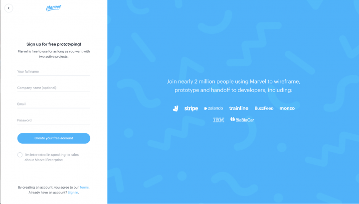
2. Use social proof next to the registration window
As humans, we all want to belong somewhere. We need to know if a product merits our time, money and attention. And showing the proof that other users like us, who have already joined the club and enjoy it a lot, really makes your case.
Your product has some big names on board? Show those logos right next to your signup form! The number of satisfied users you already have? That can make your hesitant visitors feel more comfortable about signing up. Now take pride in what you’ve achieved!
3. Be specific about errors
“Something went wrong.” Well, thanks, I realized that… Still, how many times have I read this? It makes me extremely frustrated when I don’t even get a hint about what exactly went wrong. Has someone already taken my username? Haven’t I made my password strong enough? Do your users a favor and make it as specific as possible.

4. Display error messages next to the respective field
Errors happen. When they do, show where. Imagine a user has submitted a form with three errors, and you display them all at the top. In this case, they need to scan through the whole form to find which ones need attention.
Show your errors contextually, and don’t forget about people with color blindness. Use more than just a red accent to indicate the faulty fields. Icons provide a safe bet, but read more about accessibility in this article on our blog which I highly recommend.
5. Have a crystal clear call to action
Users should feel confident about the consequences their actions have. Forget about general CTAs like “Submit”, “OK”, “Proceed”. Describe the action the user will take. Think more about “Sign in”, “Pay now” or “Create account”.
6. Give your users feedback when their action succeeds
You might think this whole form design thing ends when the user presses “Place order”. Wrong. Users need clear feedback on the success of their actions. Also let them know the next steps to expect.
For example, after someone has placed an order at your webshop, show a screen that indicates successful payment and order placement. Maybe even provide a timeline about the expected next steps such as when the product ships.
Optimizing for mobile form design
Optimizing our forms for mobile has two sides. On the one, we need to pay extra attention to certain things. On the other, our phones have a lot of features which could make filling out forms a lot less painful.
Put a bit of thought into your designs. This section will give you a couple of handy examples specifically to improve forms for mobile devices.
7. Include big enough tap areas
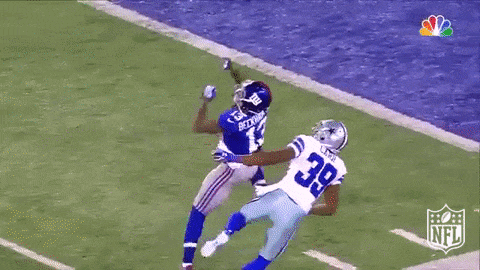
On Sunday nights I like to watch the NFL on television. The players’ athleticism always amazes me, as do their how-the-hell-did-he-do-that catches. They need huge hands to make those catches. These football players could be your next customer.
These guys seem strong, so you don’t want tiny tap areas on your form making them angry. Google suggests a minimal 48x48px, which could serve as a good rule of thumb (pun intended).
8. Don’t shy away from making use of the phone’s hardware features
Around 99% of your users who fill out your forms on a phone have a functioning camera. Have you thought about utilizing it?
With the tap of a button, they could scan information from an ID or credit card which would otherwise take a lot longer. Taking it even further, think about the possibilities of using GPS or biometric authentication.
9. Use a keyboard which matches the expected input
If you expect your users to type an email address, open that keyboard with the text field active. If they need to enter a phone number, show them the number pad.
It only takes a little attention, but you can save users precious time by not requiring them to switch between different keyboards. It also helps them understand what kind of input you expect.
10. Use native inputs
Both Google and Apple have put an enormous amount of research into designing their different UI controls. Most people have already encountered these, so unless you have a very strong reason not to do so, stick with the native controls.
Using the correct input type
It might look obvious, but in reality, it doesn’t always come that easy. Don’t make users’ lives hell by asking them to pick a country from a dropdown list of 200+ or selecting yes/no answers from dropdowns.
Checkboxes, radio buttons, dropdowns, short and long text inputs – everything has a place in the world of forms. Just make sure they get used whenever appropriate.
11. Avoid super long dropdowns
The holiday season is receding quickly now, but you very likely ordered some presents online. To do that, you needed to pick the country where you wanted to ship the item. And at that point, it irritated you to scroll through all 200-something countries looking for yours.
When it comes to form design next year, better let the users type and select the country from a preset list. It’ll need some additional work from your developers, but your users will thank you for it!
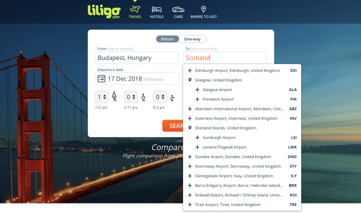
12. Use smart search-as-you-type solutions
Why not take the previous tip one step further? Take some time to think about likely scenarios users might encounter.
One living in Scotland might start to type “Scotland” although your site only accepts the UK as a country of residence. In an ideal scenario, they should see “United Kingdom” as a suggested item even if they typed “Scotland”.
The same could apply for “Netherlands” instead of “The Netherlands”. Think about these scenarios and spend some time developing this logic so users don’t need to guess the exact wording.
13. Use radio buttons when you have six or fewer items
While dropdowns might not bring the optimal solution for long lists, the same applies for very short lists. Why make users open a dropdown everytime they need to answer a yes/no question?
Just use good old radio buttons for choices of six or fewer items. For even better form UX, users scan vertical stacking more easily. Excessive dropdowns probably makes for the number one sign of bad form design.
14. Have proper date input
So many forms still get date inputs (one of the most frequently requested pieces of information) wrong. How many times have you scrolled for ages below a default year of 1900?
These websites either think the 100+ Club makes up the majority of their users or they don’t care. I lean towards the latter. On mobile, use the default date picker or implement a masked input solution like in this example from FOX News.
Take care with the expected date format, which varies from country to country. Typing eight digits on a numeric keyboard (even on mobile) can go a lot quicker than scrolling through three dropdowns. If you stick to the native iOS or Android date picker, make sure to have a realistic default date, not 1900 or the current year. Unless you’re designing an application form for the Centenarians Society Annual Gala.
15. Match field length to the expected length of the input
You might want to make sacrifices here, but keep in mind that short input fields for postal or CVV codes work better.
When you expect users to type longer answers, use a bigger text box. Sometimes making all those different length input fields look nice together can pose a challenge. But hey, we like challenges! We became designers, didn’t we?
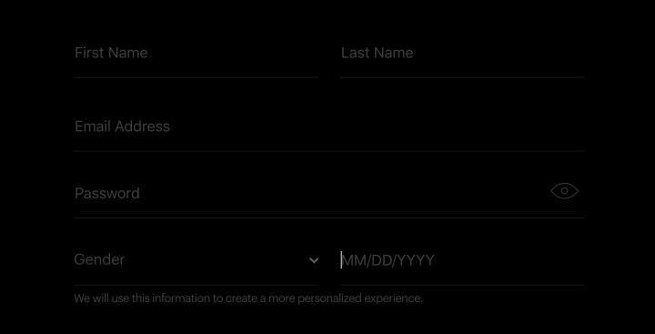
16. Lose the “confirm password” field and add a “show password” option
Typing passwords can get especially annoying on mobile, so don’t make users type more than necessary. But why ask them to confirm their password? Want to make sure they don’t make a typo in their passwords?
Put a small eye icon (or “show password” text) next to the input field so they can see any typos they’ve made. More and more websites use a solution like this, which I find as definitely a sign of good form design.
Getting smart by doing the work instead of your user
The number one thing to keep in mind when you ask yourself how to design a form: Don’t get lazy! Developing forms carefully and properly can save you a lot of time.
When designing it, think of what you could guess from your already existing information without the user typing a character. Some will definitely take up more development resources than a “good enough” solution, but your users will love you for it.
17. Offer login when a user tries to register with a taken email address
If a user tries to register with a taken email address, it likely means they have registered previously. Why not offer them a quick way to log in? Prefill the verified email address field so they only need to type their password.
18. Use smart defaults
This gets a bit general, but it really depends on your form when can you use smart defaults. You can make guesses based on the IP address, device language or in some cases, even device location. Spend a few minutes to think through all these projects every time you design a form.

19. Avoid captcha
Captcha can annoy humans, but we still use it to avoid thousands of fake accounts in our database. However, some better, less annoying solutions also do this. When thinking about using captcha, think about alternatives, some state-of-the-art solutions, before implementing the laziest out-of-the-box idea. Some pretty good articles discuss the topic.
20. Address information based on postal code
E-commerce shopkeepers will likely need to ask for an address at some point. You could let your user type everything, and then enter the postal code at the end. Alternatively, start with the country (as ZIP codes are not unique globally) with postal code first and auto-populate state, city or in some cases even street information. For this, you’ll likely need a third-party plugin.
21. Accept multiple formats
Phone numbers provide a very good example for this: Not your users, but you must make sure you store the data in the correct format. Accept phone numbers (and other information) in multiple formats and then standardize them yourself. If not possible, at least provide a crystal-clear example of the format you expect.
23. Display errors before submitting the form
This might sound like a no-brainer, but many forms still miss this. If a user has entered an incorrect email address, show the error before they submit the form.
However, take care not to validate too fast – it can get extremely annoying when you’re still typing but the form “shouts” that you have an invalid email address. “Hmmm OK, but you could you just wait until I’m done typing? Thanks!”
Proper layout for good form design
The following tips get more general, so use them in basically any case when gathering data from users. Unlike some of the tips above, they don’t require crazy development magic, simply good design. And well-designed forms always start with a well-selected layout!
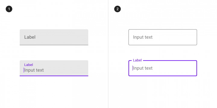
24. Always show labels
In recent years it has gotten really trendy to use form labels as placeholder text. In many cases, it works well as it definitely makes design cleaner. But just imagine your user will have no clue about what information each field should contain once they’ve filled them in.
In some cases like an email address, it may seem obvious, but messing up the first name and last name happens so easily. So even if you decide to use the labels as placeholders, keep them visible when the field is filled, just like Google recommends.
25. Only ask for the necessary information
“The marketing department made me do it!” Yes, I know you may have great pressure on you (or us) to ask for even the user’s shoe size. The more information we have, the better we can segment our different newsletters, etc.
However, filling out a huge form with a ton of unnecessary information not only gets frustrating and intimidating, but it can also make users distrustful. Just imagine you’ve just met someone in a bar and after 30 seconds of small talk, they start asking you extremely personal questions.
Don’t ask for things you don’t absolutely need, or at least make it optional. If you really require that information, communicate your reasons and tell the user how it will improve their experience.
Progressive profiling when you collect additional data after your users have gotten more engaged with your product provides another option.
26. Mark optional fields
Instead of using asterisks to mark required fields, just explicitly identify the optional fields.
27. For long forms, group input categories and use multiple steps
Getting long-form design UX right poses so many challenges. No matter how hard you try, some cases just need you to deal with very long forms. In these cases, two things can help get a better completion rate.
First, group related fields together. Have one section for personal information and another for the address. Also consider breaking up your form into multiple steps so not to intimidate your user with a massive number of fields at the beginning. If you do, make sure to use some kind of progress indicator to indicate how much remains.
28. Avoid left-aligned labels
Research has shown that people complete forms with labels on the left-hand side of the input fields more slowly. Just imagine, your eyes need to jump all over the place while completing a form. Stacking all your labels vertically can increase the height, so use labels as placeholders that move to the top as you fill in a field. Just the way Google recommends.
29. Have a single column layout
The same goes for the overall layout of your form. If the fields cover multiple columns, users’ eyes need to jump all over. Scanning just one way goes much faster. Of course, exceptions can arise when they expect multiple fields in one row, like first name and last name. In general, though, a single column layout works better even if it increases the overall height.
30. Start with the easy questions
In addition to forms intimidating users, yours might contain different types of data, some more sensitive or complicated to provide. Start with easy, common fields which users feel comfortable filling in. Ease them in and later move to those which require more engagement.
The devil of form design in the details
Making it this far shows your dedication to improving your forms’ user experience. Not everyone will do the following, as it forms the icing on the cake, but it could provide users a wow factor. If you are aiming for the Best Form Design UX title, definitely keep on reading. So let’s jump in, shall we?
31. Show and update password criteria
Probably my favorite tip, and as it turned out as one of my projects, not complicated to execute. Many sites have strong criteria for passwords regarding the different characters it should contain. Some websites display these criteria in a tooltip. Not the best.
Users will only know of their password’s weakness once they’ve entered their usual password. So display the criteria once the field comes into focus at the latest. Even better, update them in real time as a user types. This makes it a lot easier to recognize what exactly they are lacking.

32. Disable the submit button until the user completes all required fields
It can get pretty frustrating when you try to submit a form but then it turns out you haven’t filled in all the required fields. If you mark required and optional fields properly, you can probably avoid this.
Having the “Submit” button (which you won’t label “Submit”, right?) disabled until they fill in everything can provide another way to shift focus to those remaining parts.
33. Embrace inclusivity
If you have online forms as part of your business, you likely have pretty diverse customers. You don’t want to make any of them feel excluded, right? We could write a whole post on this topic (indeed we have), so let me quickly give you a few tips. First of all, don’t validate names – how would it feel to read that you have an invalid name?
Gender provides another sensitive topic. At least one person at your company will likely say properly targeting customers makes this information absolutely necessary. But does it really?
More and more apps and products have stopped asking. So, Tip Number One: Don’t ask. If you do, make it optional. In the latter case, provide an option for those who identify as neither male or female. You can easily implement an “Other” option (although that label can also offend).
To take this one step further, add a custom input field like Facebook does. Last but not least, don’t forget about accessibility. Make sure users can navigate the form with the keyboard and find labels big enough and with sufficient contrast. Read this great guide from our blog to find out more about accessibility.
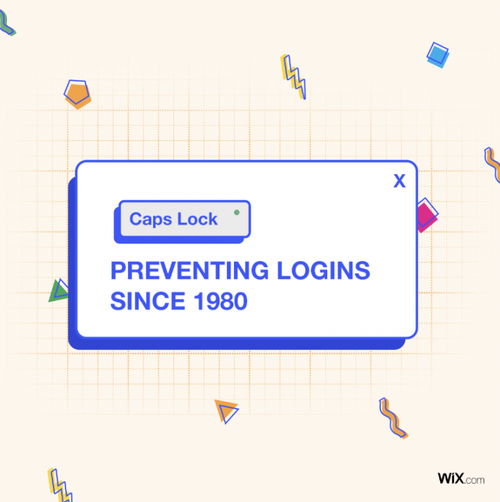
+1 Warn users when they have caps lock on
I really like this feature on the MacOS. Why not use it on your forms as well? When entering passwords, we sometimes accidentally hit the caps lock. It has happened to all of us. Why not save users a few seconds by warning them?
What next?
Well, if you’ve made it this far, you’ve taken the first step: You’ve committed to well-designed forms in your product.
Some of these tips will increase completion rates for your form or just simply reduce the time users need to fill it out. Others represent just small tweaks which show you care. And what could make users love you more than showing them that you value their time?
I’ve presented 34 tips – let me know which one excites you most to try! Leave a comment below. We always love to hear how these small guides help you improve your product.
If you want to know more about the way we work here at our UX company I can recommend you our free ebook about our UX process. We also have a proper hardcover book on the topic. It could make a nice Christmas, birthday or anytime present to anyone, as we ship it in Europe and US for free.
But after all the reading, promise you’ll take action and improve the design of your forms, OK?
Need help with form design, or another well-defined design problem with business implications? Let us run a design sprint for you!

